-
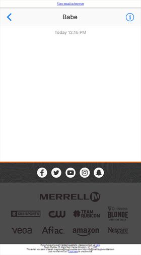
Clever use of a sexual innuendo by creating a 'real life' iPhone message between a couple. View this interactive email here: http://bit.ly/2CyX1da
Texting Babe
swagnone
-

E-mail is awesome! And because modern e-mailclients are allowing us to take e-mail to a higher level, we want to introduce 2018 to our clients as the year where they will finally share that opinion with us. Most of our clients just don’t know what the possiblities are. Via this futuristic/spacy looking e-mail we want to showcase some simple techniques to show that their e-mail can really make an impact in the inbox of the recipient. We’ve blended GIF and CCS3 animations into the design to show what the possibilities are. This way we made sure that our specific target audience would get the full experience. So be sure to check out the online version and experience it yourself! http://goo.gl/Ruqryp The e-mail is originally written in Dutch. But since we’re really proud of our first showcase e-mail we’ve fixed that and wanted to see what the opinion of the rest of the world will be. So feel free to share your feedback :D Thanks, and may the best e-mail design win!
The E-mailky Way
Robin Sprang
-
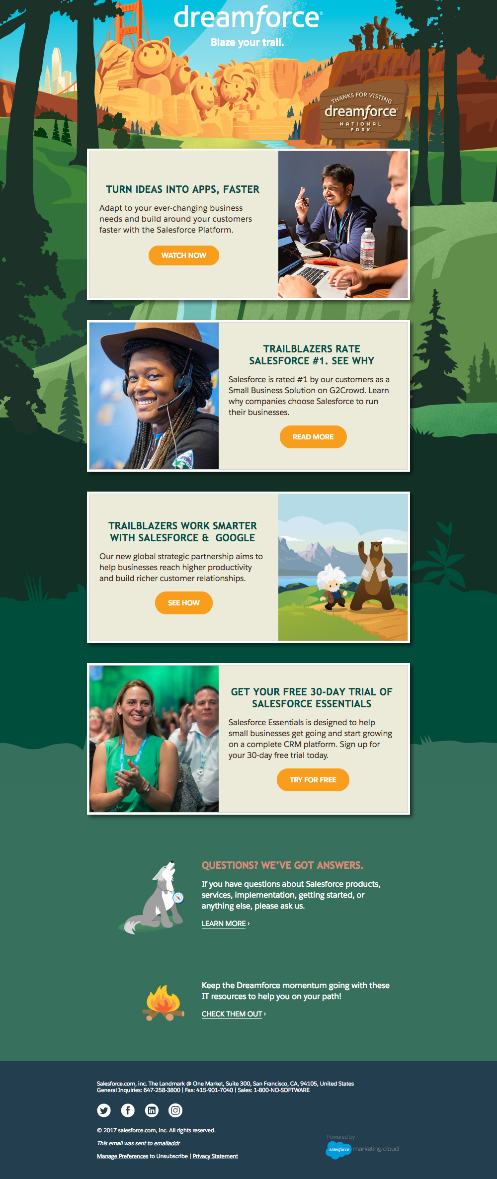
This responsive email is based on Mark Robbins' table layout structure which he introduced in his "A new table structure" article. This allows us to code for a narrower fixed-width while progressively enhancing the experience for users with larger screens. Other slight progressive enhancement features include animated text, and a CSS drop-shadow effect for each of the content boxes. The content stacks for mobile users while the width adjusts accordingly for varying small screen sizes. Accessibility was also top of mind while coding this email: border-bottom is implemented for text links, header and paragraph tags are used, and each table is assigned the attribute role="presentation". We utilized CTAs with rounded corners (where supported). It's all HTML text, so it remains a good experience even when images are turned off or background images are not supported. We aimed to provide every user, regardless of their email clients, the best possible experience.
Dreamforce Follow-up Email
gulben
-
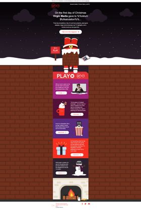
This was our 1973 Ltd "Christmas Card" email sent out this year. Our team has a few musically talented people so we had a music theme creating a Christmas Spotify playlist as a fun free gift in our email, each picking 2 tracks to feature in it. We're well known for our specialism in email marketing so were keen to demo this with a nicely designed responsive email featuring an illustrated Christmas scene flowing down the email from the chimney at the top to the presents below the fireplace. We included animated gifs, CSS animation, background images, rollover effects, web fonts, styled alt text and VML coding to swap out images for Outlook. We also created a landing page which demo'd our web dev skills as well as introducing the team's varied skills alongside their song choices to hint at other areas we cover, without being too salesy at Christmas!
Meet the 1973 Team with the Gift of Music at Christmas
lawharrison
-
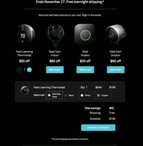
"This year’s Nest Black Friday campaign was our biggest ever - we’ve offered deep discounts on a large number of products and wanted to make sure that our emails stand out from the crowd. To make the shopping experience truly stress-free, we brought the shopping cart functionality right into the email itself. Customers can add products in their cart and see the total discount we offer, enhancing the overall experience and facilitating the purchase decision. The "proceed to checkout" CTA button bring them to our Nest Store with their cart already pre-built. This experiment was a result of a close collaboration between our creative and engineering teams. We’re inspired by finding ways to redefine the boundaries and bring delightful experiences to the inbox.
Nest Interactive Black Friday
ericlepetit
-
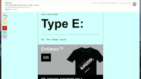
Type E: has been conceived and created to inspire and equip designers and developers in their implementation of HTML typography in email. What makes Type E: unique, and unlike any other educational email, is that the techniques it covers are demonstrated within the build of the email itself, allowing subscribers to take a deep dive into the HTML and CSS, to gain a greater understanding of them. This issue features the Accessibility Switcher™, which employs the use of interactivity to empower the subscriber with the ability to change the emails appearance according to their preference. Subscribers can enlarge the text size for example, and change the background colour to yellow, which can help people living with Dyslexia or Alzheimers. Finally, a geeky T-Shirt brand has been created – Entitees™ – for the purposes of illustrating the techniques, adding a little fun to what is a serious piece of communication.
Type E: 08. The Image Issue
Paul_Airy
-
Fantastically fun and engaging email design. The use of animation brings the email to life and displays subtle hints of brand awareness using the Virgin Media icon throughout. The tone of voice throughout is light-hearted and fun. Hope you like it :)
Virgin Media - Christmas Ezine
Ben Clay
-
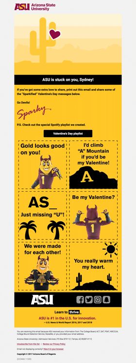
A fun campaign sent to potential university students was eventually shared by students, staff, and alumni through social media. The images below the fold were downloadable files to be shared as valentine cards.
ASU is stuck on you.
ASU
-
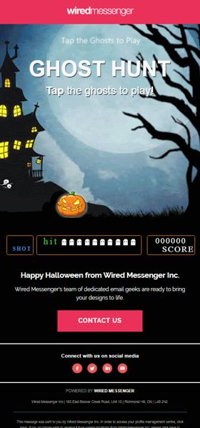
Interactive email using CSS animations and counter to create a fun 'duck hunt' style game, playable in iPhone email clients. View Online Here: http://bit.ly/2Cms7oi
Halloween Promo
Daniel_Sivan
-
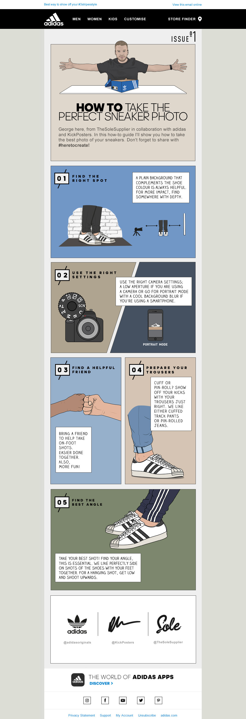
This 'how to guide' helps adidas consumers take that perfect adidas sneaker photo for gaining social glory! The design looks fresh, simple and stands out as something different. Even potentially motivating some people to save or print it out (if you are really old school). This is also the start of a series of 'how to guides' designed for people who purchase adidas products to ensure they get the best out of their purchase online. Content was done in true adidas collaboration styles with Sole Supplier, KickPosters and TBWA.
How to take the perfect sneaker photo
TeamCRMAwesome
-
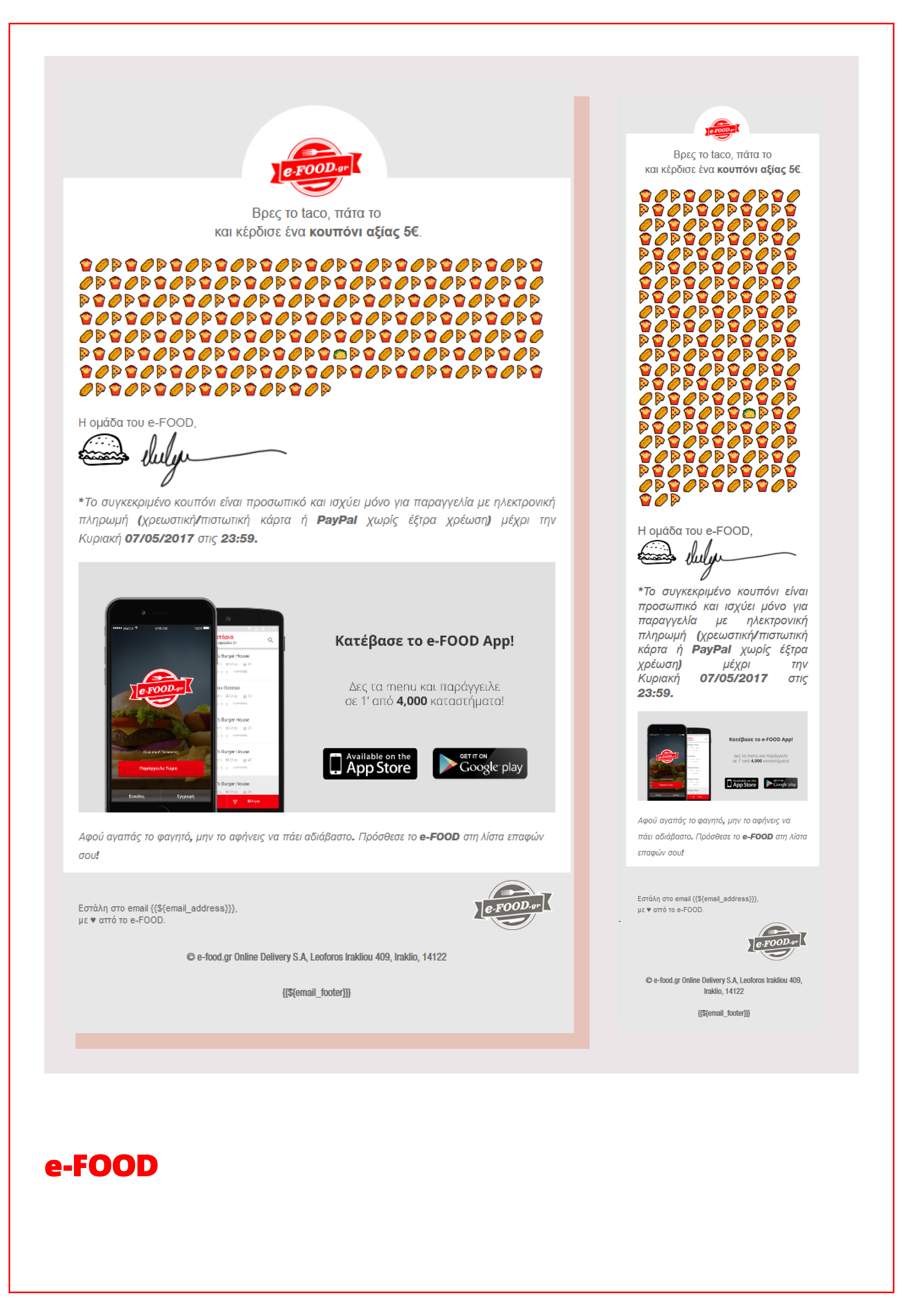
This clever email from efood asks users to find and click on the taco among a cute emoji wall (where all the emojis are linked) for a chance to receive a voucher, adding an element of gamification. The effect is further enhanced by landing pages linked to the incorrect emojis, which instruct users to try again in case they chose wrongly. Clear instructions above the emojis make the email simple to follow and straight to the point. The interactivity and simplicity of this email made it a great success, with a 627% higher Click Rate than the efood average.
efood 'Find the Taco'
mattdyson
-
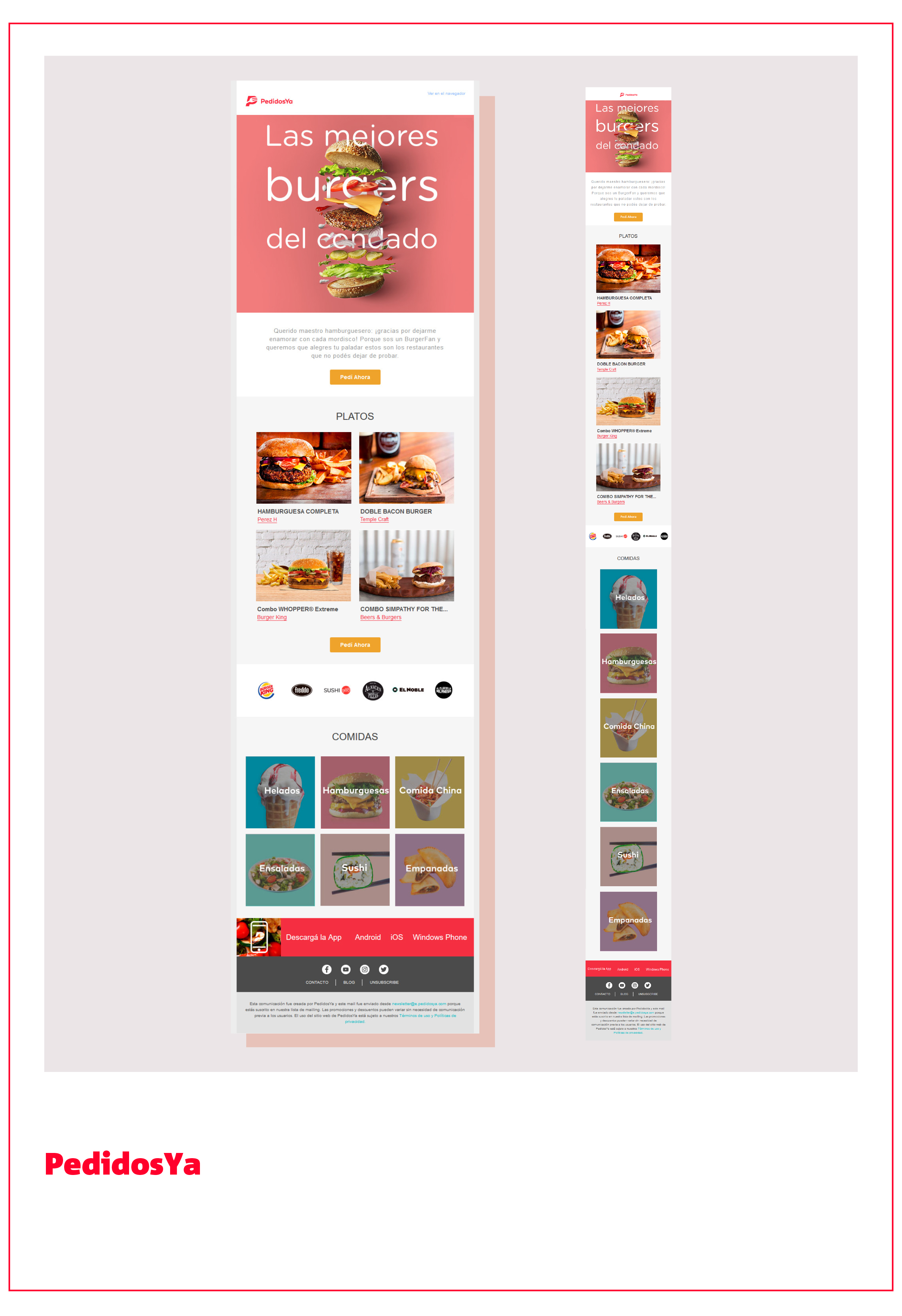
This email from PedidosYa uses a clear, modern template with a vast array of food imagery making the visual presentation enticing. The colour of the CTAs compliments the overall layout - captivating, yet not overpowering, and easy on the eye. The aim of the message is to draw attention to Burgers. This is achieved by showing a deconstructed Burger in the key visual with the text cleverly fitted around the ingredients and then presenting tasty Burger dishes from specific local restaurants for the user to order. Just in case the user doesn't fancy a Burger, the template showcases popular restaurants and the many other cuisines on offer. View online here: http://hero-award.com/email/PedidosYa_Argentina_Burger_Campaign.html
'BEST BURGERS OF THE SHIRE' - BURGER CAMPAIGN OF PEDIDOSYA
igorluba
-

Our “Map to Miles” holiday in-store shopping email invites recipients to do something radical: leave laptops behind and earn Alaska Airline miles holiday shopping at brick-and-mortar stores — all while enjoying a perfect winter day of festive fun. Fully responsive and perfectly designed to embrace Alaska’s four brand colors, the “Map to Miles” email enjoyed a 23% open rate, a 10% click-to-open rate, and inspired countless hot cocoa breaks along the way. Does our design give you chills? Snow us some love and vote below! View in browser here: http://bit.ly/2ml2HOw
Mileage Plan Shopping Holiday In-store “Map to Miles”
britney.francis@cartera.com
-

Ferguson Showrooms continually receive STUNNING images of kitchen, bath and laundry room makeovers using our products. We were timely (right before the end of the year) to thank our customers for their business and inspiration. As a way to pay them back we shared a couple of the "favorite" design inspiration posts from social media for the year with links to the original post. While this email was not trying to drive a particular sale it helps to break up the noise during the holiday season and give our customers a digital hug.
Ferguson Thanks Customers for Their Inspiration
MP Abrahamson
-

Slate grey colorways envelope deep navy for an eye-catching focus on the function and fashion of the 3 in 1 Tech Jacket product from J.Hilburn. The .gif element of the rain droplets falling onto the product adds a deeper understanding of how this product is a workhorse for a man's wardrobe. Clear calls to action pop in white on the dark background which lands the audience on a product-guide page that expands the details of the email with a video component and tighter crops of the product: https://jhilburn.com/product-guides/3-in-1-tech-jacket
J.Hilburn | 3 in 1 Tech Jacket Email
J.Hilburn
-
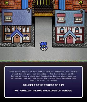
SuperMailQuest is my first foray into the world of interactive email. It's essentially a choose your own path adventure game. The aim is to work through the game solving puzzles, fighting monsters and putting an end to the Warlock of Outlook Mountain! Fancy a go? play here http://supermailquest.co.uk/smq
SuperMailQuest
Aaron
-
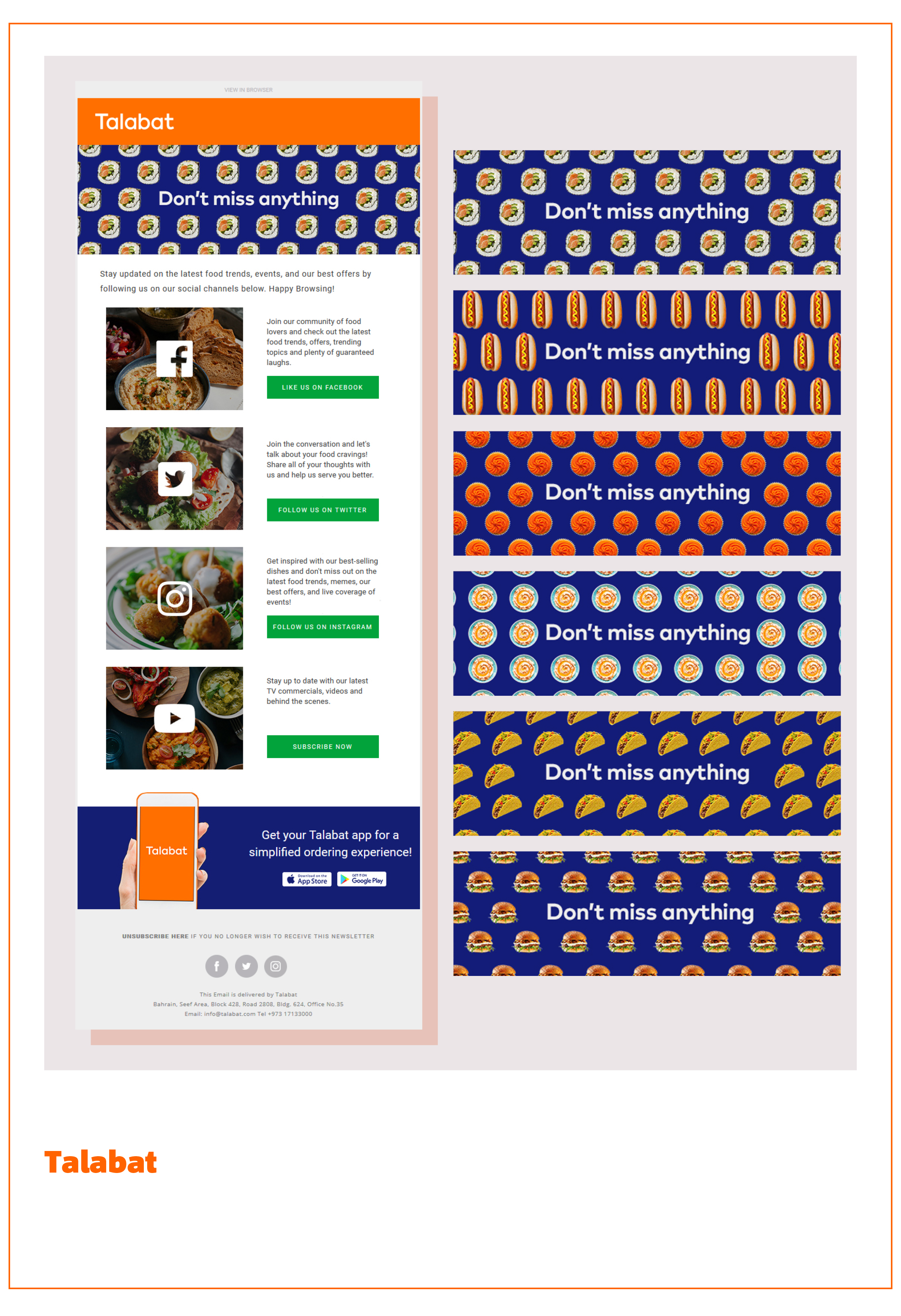
With this email, Talabat invites user engagement via a broad range of social media channels, and show that a user can interact with the brand on their preferred social media outlet - thus providing their users with a more individualised engagement experience. The design employs a cheeky FOMO (fear of missing out) message in the key visual, emphasised with animated food patterns. This creates a playful and fun aesthetic, suiting the modern design well. Users are tempted into exploring the various social media channels through attractive food imagery and clear call-to-actions, with concise educational copy for users who weren’t already convinced.
Cross-channel promotion "Don't miss anything"
Malgorzata.Sobieska
-

IT'S A REAL SNOOZEFEST. But seriously, the team was tasked to find a cohesive way to market seemingly disparate types of items related to sleep that spanned many different departments, so we developed the idea of using a dream-like world of elements that feel like bedtime stories to lead the viewer through the length of the email both in the visual representation of groupings of sleep-supporting items, as well as quality content to keep the reader engaged, scrolling, and clicking. Our biggest challenge to each other is always how to incorporate the most live text to "look good naked" and maintain visibility of calls to action if images do not render in the inbox, while creating integrated imagery and content. See animation and use of live text, as well as snapping to mobile sizes
Sleep Sale of Your Dreams
stephaniemckay
-

This email was designed for our client, Basic Outfitters, a New York-based company. They wanted to announce the exciting BETA launch of same day delivery to New York customers. They also wanted to promote their Invisible No-Show Socks, hence the copy, the image with the product features, and the animated image below. The email also included an exclusive offer for people in specific New York zip codes, so to make the zip code listing more visually appealing, alternating brand colors of grey and blue were used for the columns. Fun side note: the subject line for the email was 'Start Spreading The News...'
New York, We Love You
jollyrosequintal
-

The Oracle Marketing Cloud Creative Services team developed an email campaign series designed to guide customers through Watchathon Week and help them take full advantage of this epic binge-watching opportunity from start to finish. Although this is just one of the emails within the campaign which featured a download XFINITY Stream app cta with device detection. The rest of the series combined key platform and new Netflix messaging with dynamic content, engaging customers to vote for their favorite in a live poll (which Stranger Things won by 61% over some shows!), block off TV time on their calendars. Combined with optimization and testing, this creative series delivered a 25% increase in open rates over the previous year.
Xfinity Watchathon - Get Ready
catcan
-

This send kicks off a new loyalty program for False Eyelash Co. The design uses a gradient to move the eye through the send and incorporates small animations to bring some energy to an information heavy send.
False Eyelash Co. - Loyalty Program Kickoff
savannahwish
-

The objective of this campaign was to produce a light-hearted and fun festive thank you campaign to entertain and delight our customers with an interactive game. Our festive theme incorporated our atl brand assets and in-house illustrations. We included our new Home Bill Healthcheck, a personalised digital tool to help customers see how much they can typically save on household bills in their postcode. The campaign is interactive and playable within email on iOS devices and Apple Mail with a fall-back animated gif for all other email clients and an enhanced online version. To play - there are 3 clickable sections on the Nutcracker to swap outfits and hint messages to help you along - the catch is you need to get the correct combination before the nut gets cracked. The campaign proved a hit with strong open rates and a 60% increase in click through rate. Link: Chrome shows the interactive email version and Firefox the fall-back
Tis the season to say thank you!
Nicola
-
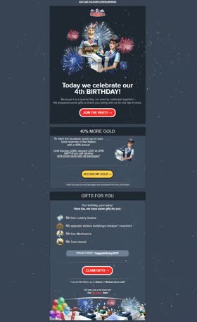
We used fireworks CSS animation to celebrate and announce the anniversary of Rail Nation browser game to our players. View the email online:
Birthday with fireworks
RaduNeag
-

It provides an interesting visual that communicates what type of materials are being recycled.
Lokai Recycled Materials Email
JacquelynBurnside
-

We would love to win the title 'the best email design' due to the creativity, personalisation and timing of our bespoke mailshot design. [1.] Creativity: All Snowglobes are animated gifs with snow, hands waving and changing images. [2.] Personalisation: The plaque on the Snowglobe is personalised to the recipient which makes it much more fun. [3.] Timing: This competition is running over Christmas so surely a Christmas mailshot should win the title! ...and last but not least - That trophy looks AMAZING!
Christmas Cracker from BorG and Big Gun
BigGunDigital
-

Ivory Ella stands apart from the crowd visually with their unique combination of textures, patterns and movement within each design. This email combines multiple promotions that highlight their philanthropic core while showcasing their active collection seamlessly.
#Goals
wmortimer
-
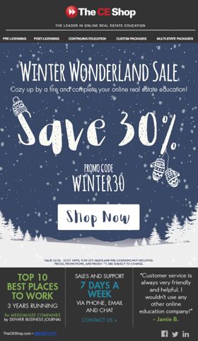
I love this email the most because it captures the essence of winter. The gif is a perfect loop of snow falling that captures the beauty of a white Christmas. The hat and mittens are fun addition that brings me back to childhood, as well as reminding me of funny Christmas movies such as A Christmas Story. You can tell I love winter but I think this gif will bring good memories of winter to anyone who sees it.
Winter Wonderland Sale
agrutze
-
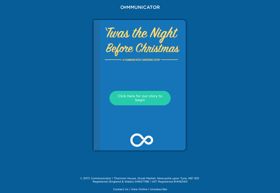
After being asked to come up with some ideas for Communicator’s Christmas email, I had the idea of an interactive story after I’d spend the previous day working with some interactive code. Essentially, you can navigate through the story by using the different labels for each page or slide. Snow is also coded using CSS to start on a specific slide inline with the story. Expanding on the idea of ‘A Night Before Christmas’ but for an email marketer, the Communicator Design team created the copy, imagery and built the email. A fallback of the story book image and some text prompting the subscriber to take a look at the web view was used. It was sent to our subscribers just before Christmas to a positive reaction. You can view the web version here:
A Communicator Christmas Story
TheGeoff
-

If you pay attention to the ski industry, then you probably heard about the incredible season Mammoth Mountain had last year. To celebrate the amazing conditions and the record breaking snowfall, we put together this email to let our guests know we had the snowiest month in recorded history during the month of January 2017, with a grand total of 246" of snow. We used a fun GIF for the hero image, which is a graphic representation of the signpost (our highest point on the mountain and huge attraction site) being covered with the fluffy white stuff. In fact, for most of the season last year, we had to dig out the signpost so visitors could see it, which stands 18' tall. The email had a 72% higher open rate than our average open rate for that segment, and drove a significant amount of revenue for a single email campaign. Let it snow!
Snowiest Month in History", Fresh Email Design
MollyHolmes
-

Here is a link to the live coded email: http://thediscoverer.cmail20.com/t/ViewEmail/d/FD2F85F6A8122562/3FE841561877426E6B5BE456C00C2519 The Discoverer inspires you to never stop exploring the world around you. Each edition of The Discoverer features a new destination, curated from a local’s perspective. We believe passionately in sharing discoveries, whether in your backyard or the far reaches of the globe. Our emails are beautifully designed with extra attention to detail and mobile responsiveness. We design and develop everything in-house using tools like litmus to test our emails so it's compatible with as many of our 550,000+ users as possible. Every Monday we send out a new edition. With every new email we send, we are pushing the boundaries of what's possible in email. In this Cappadocia edition, we have multiple interactive gifs. Soon, we plan to incorporate many more engaging elements like video and sliders.
Edition 21: Cappadocia, Turkey
parkin.trina
-
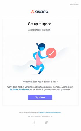
This quirky re-engagement email announced an in-product performance update to encourage lapsed customers to give the (faster) Asana another go.
Since You've Been Gone: An Asana Animated Re-Engagement Campaign
Asana Marketing
-
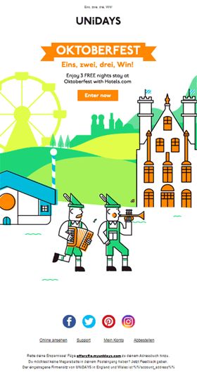
Oktoberfest is the world’s latest Volks fest held annually in Munich. It is a 16 to 18 day folk festival with more than 6 million people from around the world attending. To celebrate we gave our members a chance to win tickets + free accommodation in Munich. The fun and playful illustration style represents all Oktoberfest encompasses. Using a Bavarian landscape to set the scene, featuring animating characters and landmarks to create a feeling of togetherness, celebration, and joy, championing the culture of Oktoberfest. The creative features our primary and secondary brand colours with the illustration drawing inspiration from our icon style to create a truly unique take on the festival that ties back to our brand.
Oktoberfest
Tommy.Key
-

For the TABASCO Country Store®, we launched a holiday email series that spoke to specific segments of the legendary sauce’s fanbase. To kick things off, we focused on Fanatics—brand loyalists who simply can’t get enough of the good stuff. (And speaking of fandom, it didn’t hurt that this email launched in the thick of football season.) The series, which successively touched upon Traditionalists, Perfectionists and Procrastinators, launched with everyone’s favorite deal: FREE Shipping. Subtle animated type was a recurring visual theme used to build excitement around an already engaging season of savings. View in browser: https://us12.campaign-archive.com/?u=6b00d0e1dbae80b3f0717d41e&id=e4c3f583ad
TABASCO Country Store® - Fanatics Holiday Email
tmolitor@bbrcreative.com
-

It's summertime and the livin' is easy with the breezy, beautiful 'shades' of summer featured in this non-promotional (no sales offer) email by the creative team at Select Blinds. The design ebbs and flows with soothing segments highlighting coastal-themed color palettes and patterns to inspire different ways to think about traditional beach-styled decor and interior design. We love how this email design is so clean and fresh, like a windswept beach, subtly inviting recipients to explore these and other options to fit the many variations on today's popular coastal designs. The highly stylized layout supports its powerful visual impact and clear, on-point messaging. Vote Now!
The Coast is Clear
katehubb0611
-
We at NNG believe that navigation should be available for everyone around the world, to make everyday lives easier, safer, and more enjoyable. The attached video about our promotional newsletter was one of our latest campaigns, dispatched to Renault owners, supported by us with navigation updates. By touching the mobile screen, subscribers can collect POI coins and so learn more about the changes of the latest map releases, compared to the previous version. If they catch all of them before running out of time, their reward is a 10% discount on these updates. Regarding the design, besides some company-used visual elements: update portal logo, navigation arrow, etc. we had to align with Renault visual guideline also. In contrast to the industrial standards, we delivered an enhanced user experience to our customers' mailboxes. Based on the results just like the doubled engagement compared to the static campaigns, we can say that this was our best-performing communication ever.
Interactive and gamified education via email about navigation updates
tfitos
-
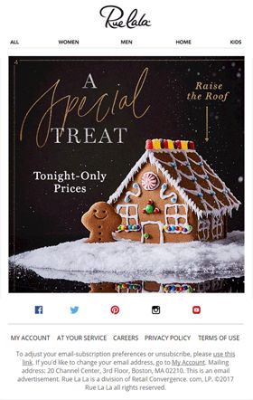
This beautifully designed email is an immediate attention-grabber for our subscribers, with a thoughtful text teaser about "joining this house party" and a fast-building gingerbread house that encourages multiple viewings.
Gingerbread House
tsilv425
-
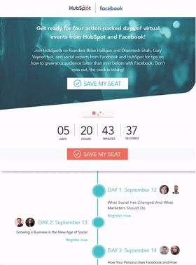
This Four Days of Facebook email is the best email of 2017. It’s not just the beautiful aesthetic that makes this email the best, but the testing & features included under the hood of this email. At the top of the email, there is a countdown timer that counted down to the time of the first webinar in September 2017, creating a sense of urgency to register for the event. Once the clock hit zero, all of the CTA buttons swapped out to say “Watch the Recording.” In addition, the CTAs in this email were smart & optimized upon what people were clicking during the testing period of this email. The four CTAs tested were: “Save My Seat”, “Sign Me Up”, “Register Now” and “Join Us.” What also makes this email unique is where people have the option to register for the event: Facebook Messenger. Finally, the circles on the timeline of events were pulsing to pull the reader’s focus onto the events that were happening on what day. View Online: bit.ly/2DwkA4o
HubSpot : Four Days of Facebook Campaign
tovamiller
-

This email highlights three reasons to use Kopari's coconut oil-based products through clean type, striking photos, and an eye-catching header gif.
Why Coconut Oil
ambrosioc
-
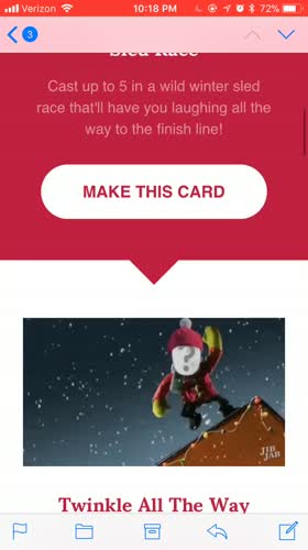
This fluid email follows a template we developed with the mobile user in mind, as well as being easily editable through our ESP, Cordial. Every element in the email (colors, images, copy, links) is controlled using templating language outside of the standard HTML framework, and the email can be completely modified with new content and ready to send in under 10 minutes. For users with faces in their JibJab accounts, the first GIF will populate using the most recently created face in their account. The remaining GIFs show animation previews for each eCard in the featured set. The email also contains web fonts that are more in line with JibJab's branding and all live text to not only assist with readability and visual quality but to also reduce development and design time. View Online Here: https://litmus.com/scope/qxioqiygrxms
JibJab – Holiday Collection
asouers
-
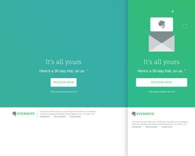
Short, simple, and straight to the point with a little eye candy to make it standout when a subscriber scrolls pass endless marketing emails.
Evernote Animated Gradient Fun
qdo89
-
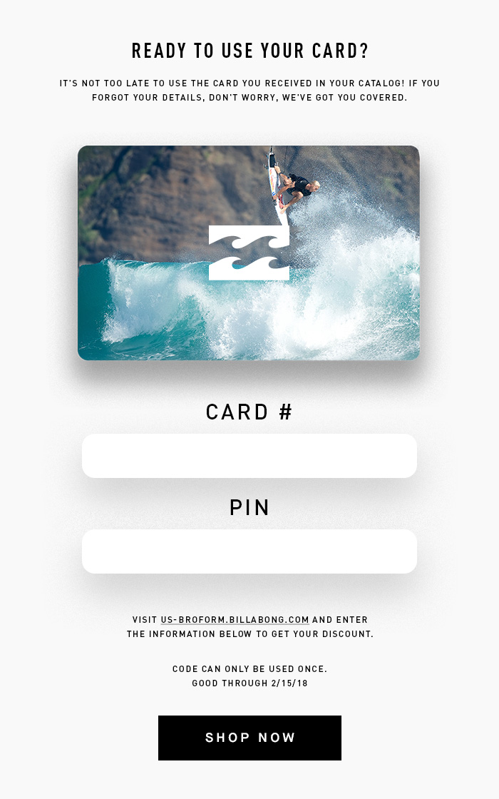
This is an email sent to subscribers that have received an actual card in a shipment. Their personal code and pin is then coded into the blank rectangles.
Gift Card Email
Kristopher Allison
-

Playful, minimal, humorous, and who doesn't love a cute GIF? Designer: Salpy Talian Copywriter: Megan Youngblood
salpytalian
-

In 2017, Evite’s email marketing team launched its first Anniversary campaign--a dynamic, personalized history of a user’s Evite events. The triggered campaign targets registered hosts and guests in two complementary versions, received on the anniversary of one’s first Evite event. With vibrant brand colors, first-name personalization and fun gifs, the email walks through memorable data points: total events hosted, name and date of the first event, most popular event types, and total guests invited. Guests see data based on events attended. The mobile experience features interactive elements like tapping to reveal one’s first event and a carousel of top event types. With the subject line “Remember your first Evite party? We do”, this campaign brings users back to their first touchpoint with Evite. It pulls unique event history to evoke a sense of nostalgia and brand loyalty--and reminds users Evite has always been there for their most important life moments.
Evite Anniversary Email
adamplong
-

Natural Retreats is a luxury vacation rental company with an emphasis on curating unique experiences that our guests will treasure for years to come. With over 1000 handpicked homes located in 30 remarkable destinations in the United States we believe we can plan the perfect vacation for every taste. Mammoth Lakes, California is one of our year round destinations -- its remarkable beauty and countless recreational options are accessible every season. We played on the notable John Muir quote, “the mountains are calling” and made it unique to Mammoth. The use of the I-phone style interface was to play with our reader’s imagination as well as let them know that booking a mountain escape to Mammoth Lakes can be as simple as picking up their phone. Here is the view online link: https://buff.ly/2CSBhqw
Mammoth Lakes Is Calling
a.qalagari
-
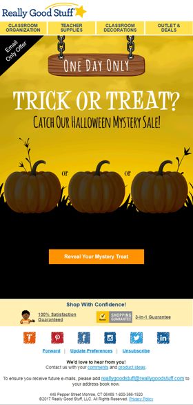
description: I designed this Halloween mystery sale promotion for Really Good Stuff. In this dynamic email, the client requested to use pumpkins and since it was a mystery, three possible offers were presented to strengthen the sense of excitement. Eventually, the winning offer was revealed and the 'reveal your mystery treat' button was changed to 'get this treat'. Logically, in this context those changes stayed in place instead of playing in a loop. It was exactly what the client wanted, and they were very pleased. View email in browser: http://enews.reallygoodstuff.com/q/bRDSL0IxnKjqo1PaPGg4pBsPxHvh3FxBgyXTu0IHniuEHsLQbCwG5idi1
Trick Or Treat
Aurea28
-

We invite to Club Cinepolis members to attend the premiere of Ghost in The shell and participate to win a travel to Tokio.
Club Cinépolis - Ghost in the Shell
IsraelCam
-
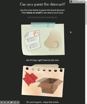
This was a fun way to showcase our discounts to members. Of course, we wanted to give our more stodgy participants a way out, so there is an anchor link to a simple list of the discounts if users don't want to interact with the email. For the users that did want to play, they just had to hover over the image to get the answers! This email is fully mobile-responsive, with the instructions changing to "tap" instead of "hover" at mobile widths. This email is also Outlook-friendly, with the discount displaying directly underneath the pictograph clue. View the email online: http://bit.ly/2BBh4U8
Guessing Game Email
caity_g_oconnor
-
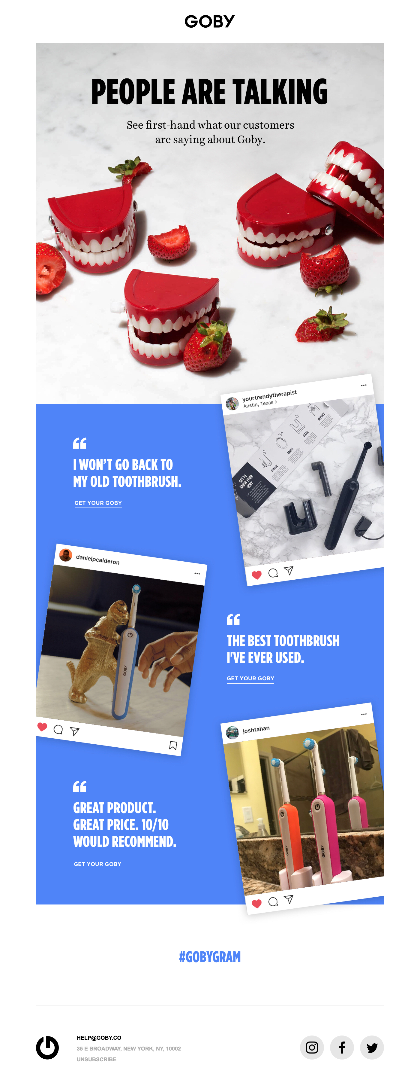
This email leveraging real customer posts from Instagram to show why people are loving the Goby brand so much. It's authentic, playful and delivers the message in an inviting and impactful way. See the email: http://mailchi.mp/538800aa61e8/people-are-talking
People Are Talking
guest
-

An email with striking imagery, meaningful copy and logical calls to action is immersive and engaging. I think that's what I accomplished with this design.
Endless Eyewear Retention Email
tom.mckenzie
-

This fully responsive email kicked off Rajant's "The Network of Things" campaign. The email promotes the Moving Assets Infographic - an interactive Infographic showing Rajant’s Kinetic Mesh in motion. The email uses an animated gif to bring in elements from the infographic. The email makes use of webfonts and animation while gracefully incorporating fallbacks for a mailing list with a large number of outlook opens. View the Live Email here: goo.gl/qZFUBg
Rajant Network of Things Campaign
jsnyder
-
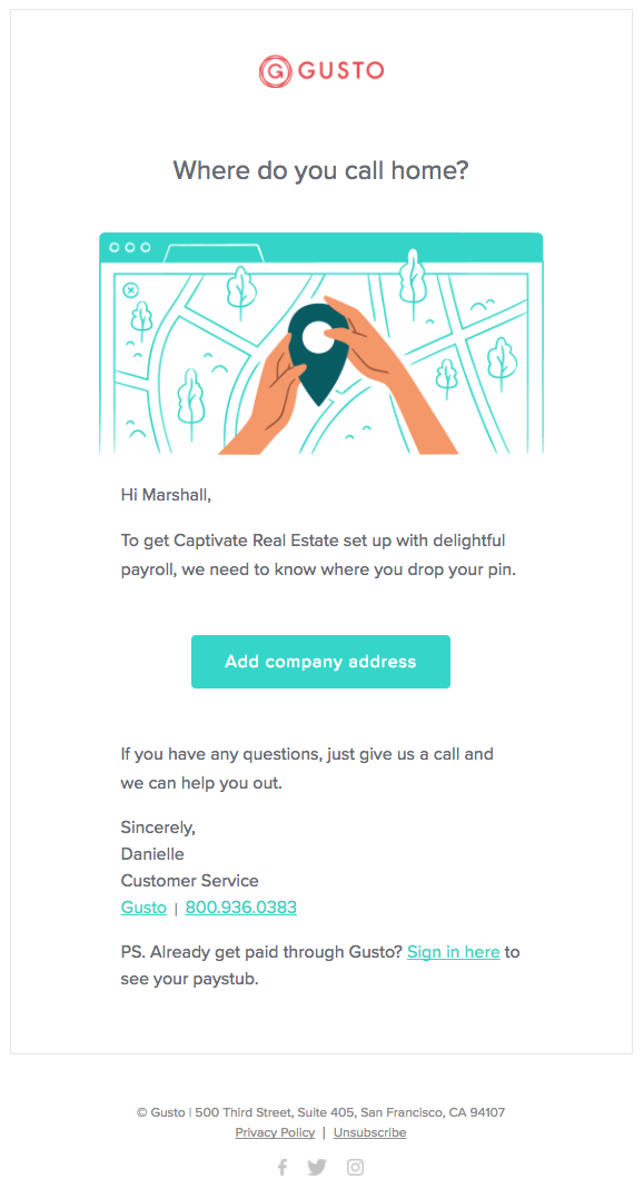
We recently rebuilt our onboarding nurture and saw a 74% jump in conversion by making a move to granular, step by step instructional emails that trigger when we see any given prospect taking longer than we expect on an onboarding step. This is the first email in the new 29 step flow (with the added benefit of filtering out any employees who accidentally found themselves in the onboarding flow when they click the P.S from the rest of the nurture). View online here: http://mkto-ab130200.com/v/g30e6Qc0E009OX0sW0006D8
Start by adding your address
Marshall Darr
-
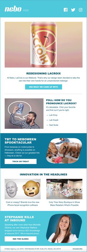
The goal of this newsletter is to provide clients, potential clients, and employees with an update on internal developments and relevant industry content. This edition features an interactive poll that functions across all email clients and engaging animation in the hero image. It received an astounding 60% open rate and 15% click-to-open rate, 241% and 583% higher than industry metrics respectively.
Engaging Agency Newsletter
xdiaz
-
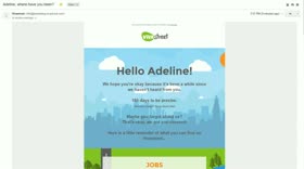
This email is the first of a reactivation sequence sent to our inactive users. We use personalisation with the user's name and number of days since his last log-in on our website. We have integrated small moving elements with an animated background but just enough to keep the user focus on the text and CTAs.
Where have you been?
Raulinemailgeek
-
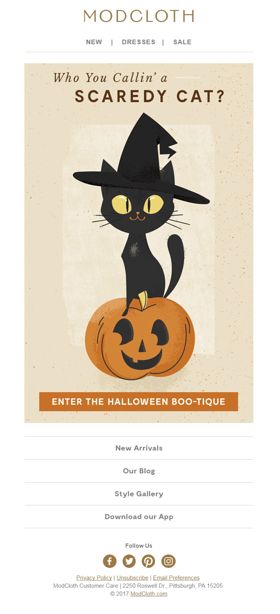
It's a wildly successful fashion email that is asking customers to transact at full price on a collection of non-costume but Halloween themed quirky/retro apparel which the email never actually shows. It uses a simple animated graphic that is completely different than anything ModCloth or any other retailer has sent designed with a nostalgic vibe keyed into the brand. Short, simple, fun and hard to ignore. Experience the email here: http://bit.ly/2pqS6Wv
ModCloth's Halloween Boo-tique
j.stivers
-

Pretend you're an Airbnb user and you recently searched for places in San Francisco. You specifically clicked on and favorited a home with the name "Garden Retreat," but you left the website without booking. 24 hours later you get this email. The email features an interactive slider that shuffles through a set of rentals within the user's most recent search radius and price range. The map is also interactive, so when a user clicks on a price, it switches the listing in the notepad element below to match user's selection. I also thought in addition to rental spaces, Airbnb wants to promote their Experiences. I've never seen any of their emails combine both localized recommendations with suggested experiences to match. Seems to me, as a user, I would not only like to see places to check out, but things I can do there too...all thanks to Airbnb's carefully curated Experiences. Thanks for considering my contest entry! Jamie
Airbnb Remarketing
Jameeele
-

Ready for the 2017 Holiday Season in style, I designed this email for NewYorkDress.com to launch a new line by Andrea & Leo Couture. It was important to convey the chic and modern stylings of the dresses with a holiday impression, tastefully balanced. The overall feel is sophisticated elegance with a bit of whimsy. The script font ties into the natural organic shape of the dresses. The modern, elegant sans serif font sets the messaging apart. The modeled dresses come alive, out of the paint daubed frames and off the screen. Circular calls to action break rectangular conventions. On mobile, paragraph text is dropped to optimize real estate. Product titles & tag lines fold beneath the images, and all elements stack into a single column. On mobile, top navigation relocates to the footer with existing footer navigation. Google Web Fonts + fallbacks are used for live text. Coded version: https://us9.campaign-archive.com/?e=&u=8f4eab8b01c4f6ac5dfa3cce3&id=53867da1aa
Holiday Lookbook 2017
August_McCoy
-
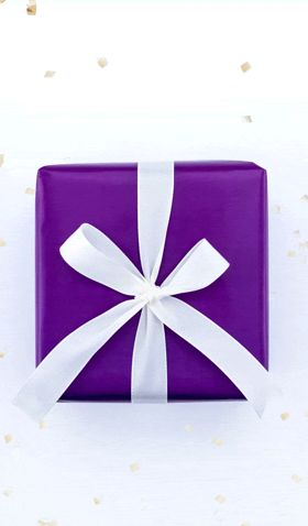
Christmas is all about giving and spreading joy. To celebrate this, we put together an email campaign that allows our member’s festive funds to go further. This particular email uses stop motion to create a virtual present bringing a covetable, gifting feel by placing focus at product level. We created our own wrapping paper out of our brand elements, which were given a festive twist to elevate our creative approach during this time. The wrapping paper was printed to allow us to incorporating our own photography. We used this approach to remind our members to verify their email addresses with a chance of being rewarded with a massive £1000 to help our students through the pressure of the holidays. This email reached a 48% click through rate which is above our average.
Get more this Christmas!
chloe.easterlow
-

Besides Black Friday and Cyber Monday emails, this was one of our best performing emails of the year. This was Actually part 2 of an email send. View Online >> http://bit.ly/2kQAuxR
⭐ Star Advent A10 Ink discounts end tonight ⭐
jchapmans
-

Exploring a creative way to feature reviews for Nomad's popular products.
Nomad - Product Reviews
gregea
-

Think mayhem guy from the All State commercials but traveler style. We wanted to bring some of these characters to life. This is just our first one that tied to a real customer story but it's been exciting to create the others. Protect yourself from Troublesome Travelers like me, Mr. & Mrs. Popular. View online here: http://mailchi.mp/58e4d154722f/look-out-for-troublesome-travelers-like-me?e=[UNIQID]
Storytelling with Visual Characters
sabace
-

South Fork Lodge & Outfitters in Idaho is an angler's paradise, offering renowned guides, luxury accommodations, and some of the best fly-fishing waters in the country. One of our most loved packages is our River Camp which offers guests the ability to experience what the South Fork of the Snake Fork has to offer in two days. For this email, we took a simplistic approach of depicting River Camp just as it is --we took images taken from one of these trips, paired it with details on the experience, and let the fishing speak for itself.
River Camp: The Best Way To Fly-Fish Idaho in Two Days
jwilcox
-
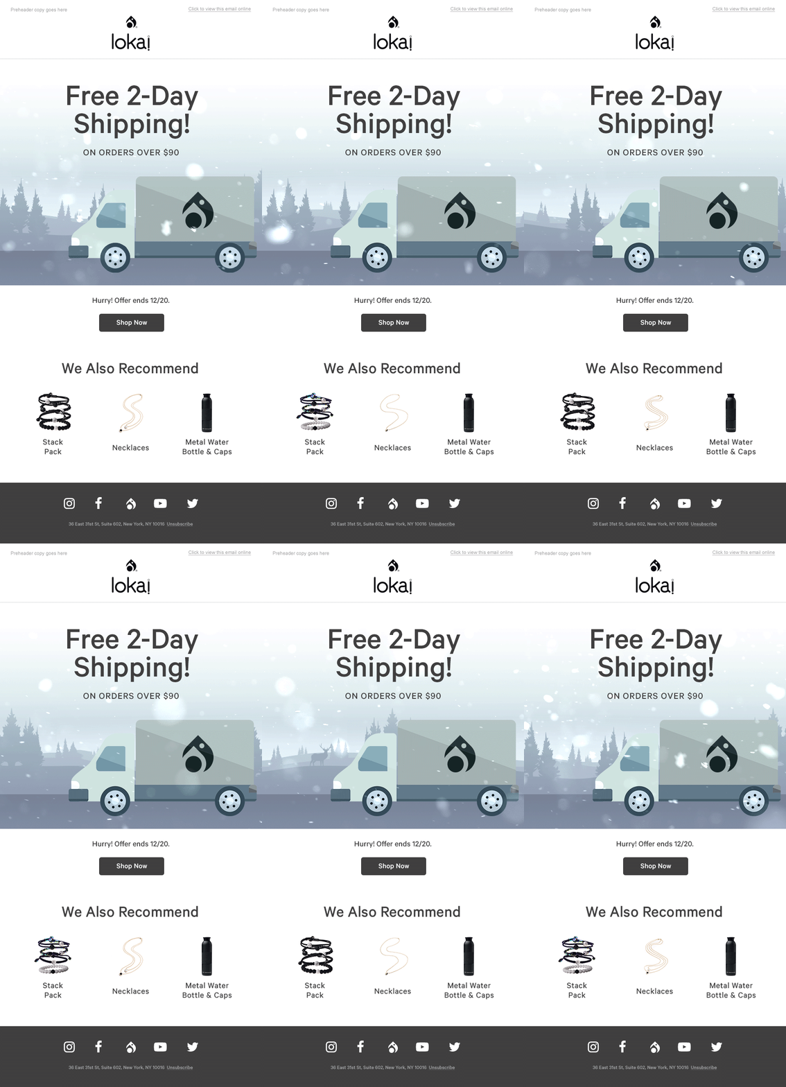
To close up the holiday shipping period, we wanted to highlight Lokai's free 2-day shipping promotion with a cute animation of your Lokai being shipped to you.
Lokai - Free 2 Day Shipping
jsoriano
-
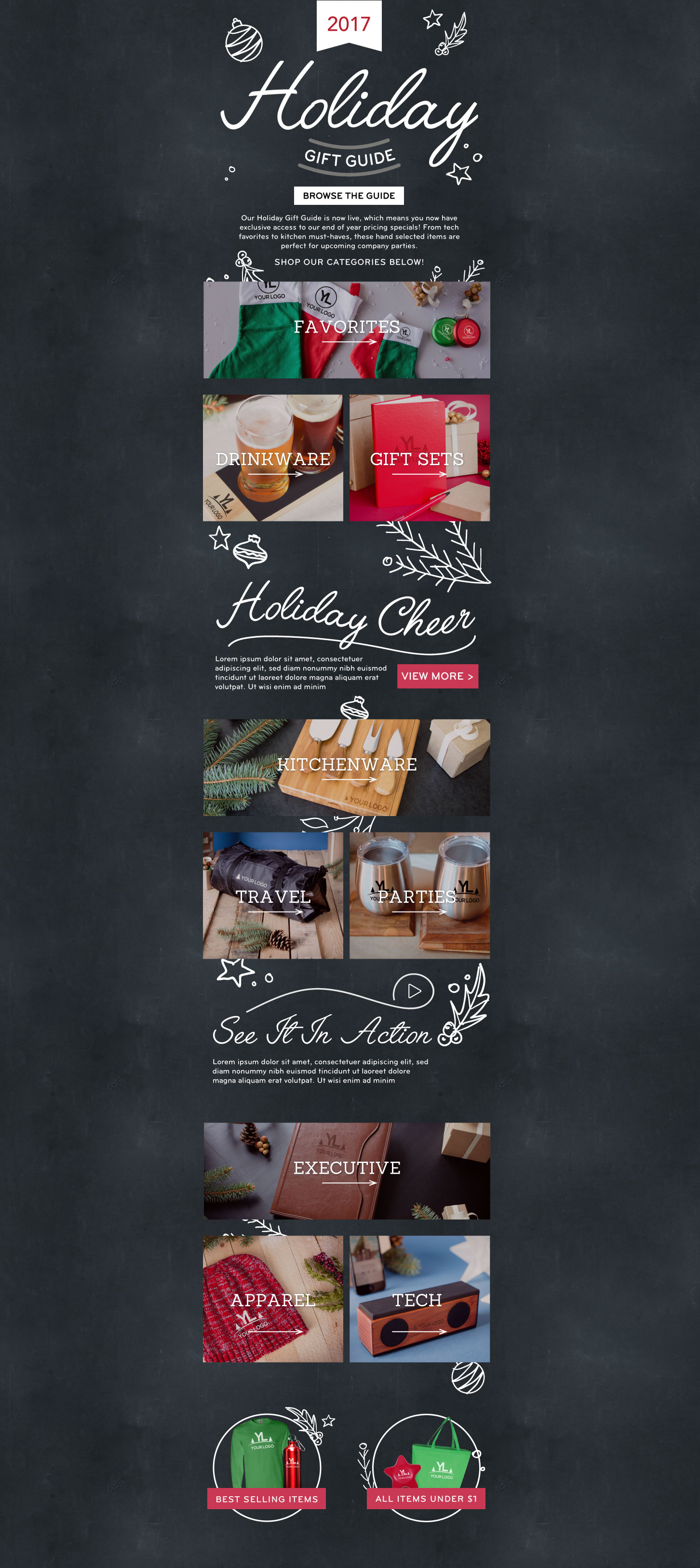
This email was designed to promote our Holiday Gift Guide, a hand-curated catalog of elegant customizable products. It is meant to evoke the feeling of sitting by a roaring fire, bundling up to play in the snow, and spending quality time with family for the holiday season. Live view Here: https://www.qualitylogoproducts.net/archive/qualitylogo/Our-Exclusive-Holiday-Gift-Guide-is-Now-Live-741.html?show_schedule=yes&u=m
2017 Holiday Gift Guide Overview
QLP Design
-
This email includes several interactive elements including a live countdown timer to the start of the show, an inline video that plays directly within the email (fall back GIF for Gmail, Android etc and static JPG for Outlook), an add to calendar button to ensure people don’t forget about the show and a Carousel that allows several pieces of information to be condensed into a much smaller space and allows readers to pick and choose the content they want to read. You can experience the email for yourself here - http://email.outandaboutlive.co.uk/PbViC3G5JvsjLSX2QcBU_c~gqpRqXqVn/WebView.aspx
Interactive Caravan, Camping & Motorhome Show email
Paul_King
-
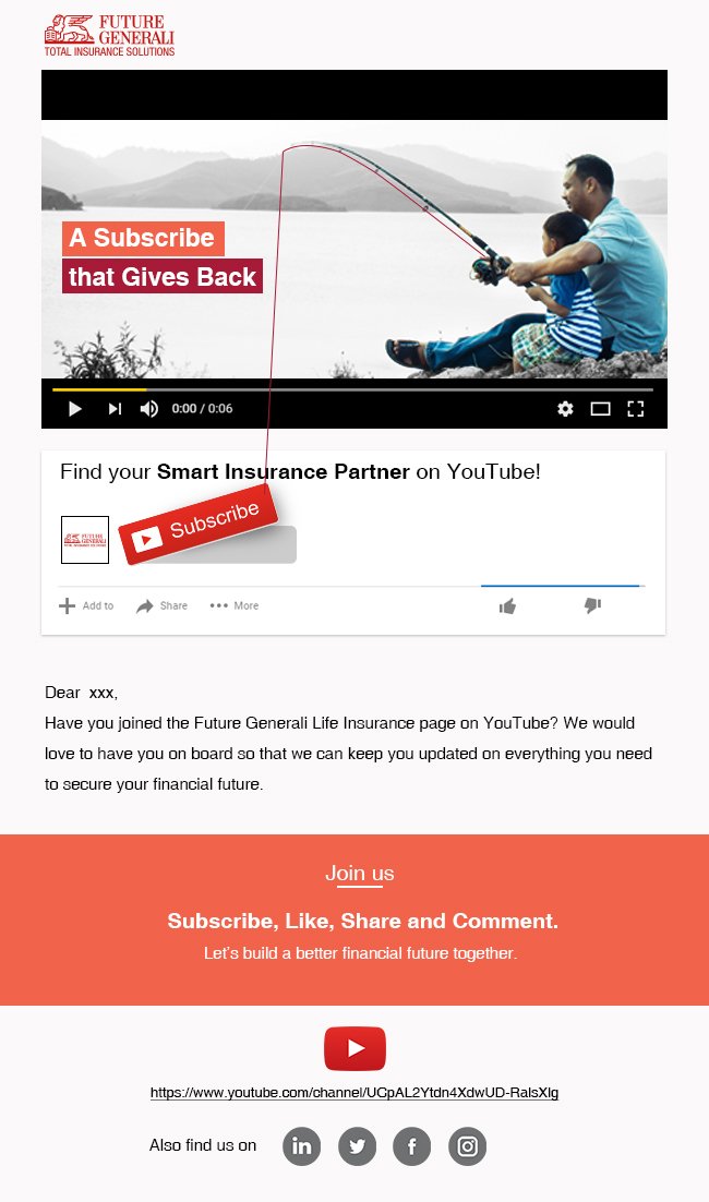
This mailer majorly focuses on getting a subscription for YouTube channel. The purpose is to get the user click on the "Subscribe" button Hence the subscribe button was given utmost importance visually. The users clicked on the banner which took them to Youtube Channel and which had the same interface as per the banner.
BEYOND CREATIVITY
shoaib memon
-
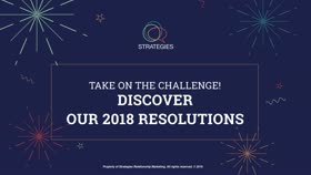
Bringing brands and people closer for a more relaxing year. We build relationships. The concept of relevant communications and nurturing is at the heart of what we do. This is why we chose to create more than just a typical holiday card and built a relationship program that connects on a personal level with our clients, partners and friends. It is very common for all of us to set ourselves goals for the year to come. And since it isn’t easy to hold on to our resolutions, we created a program to help people achieve them. 1. All team members shared their 2018 resolutions 2. We invite people to team up with us in the process 3. They choose a team member through a Web page 4. In January, they receive a series of personalized communications with words of encouragement. http://links.e.strategies.ca/servlet/MailView?ms=OTk3NjM4S0&r=NTAyNzQyOTUwNDAS1&j=NDQwNDczMzM1S0&mt=2&rj=NDQwNDczMzM1S0&rt=0
Take on the challenge! Discover our 2018 resolutions
strategies
-
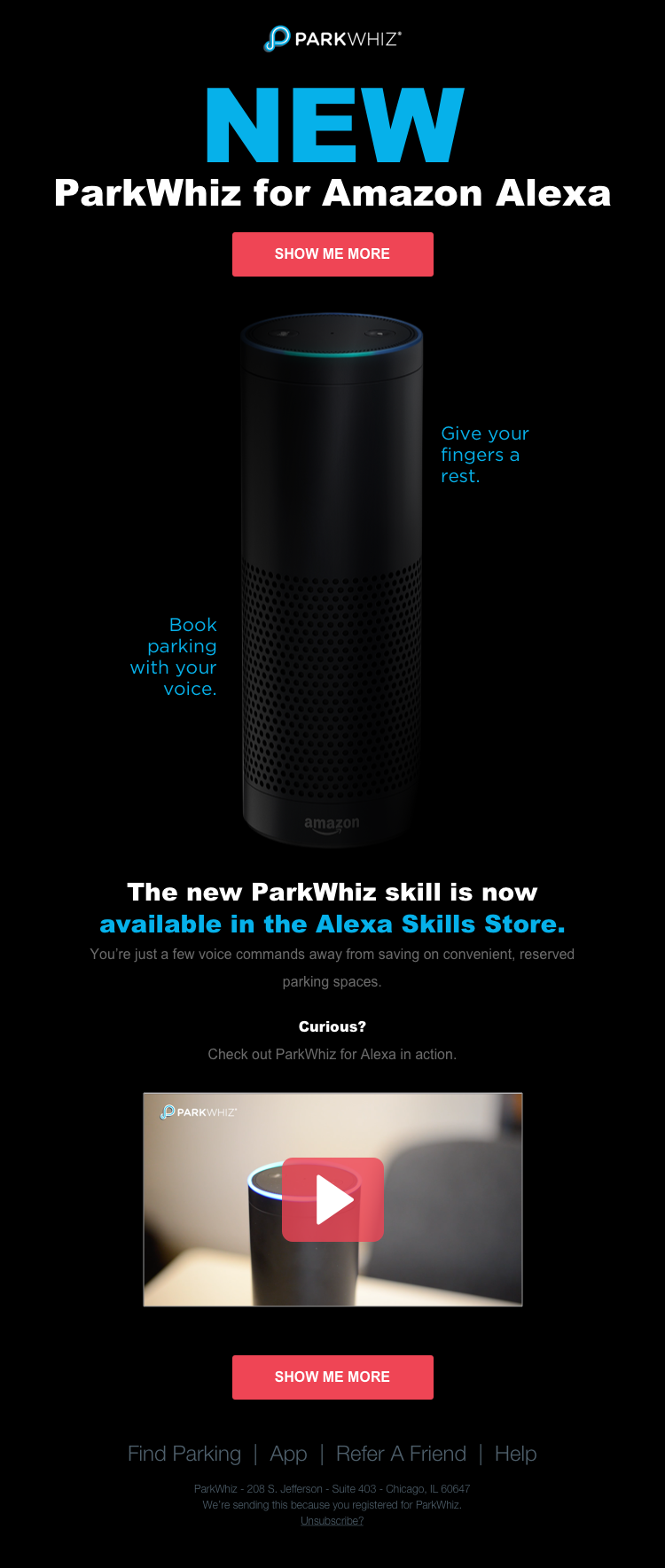
The spare, yet potent messaging in the email aligns with and reinforces the simplicity of booking parking with voice technology. The Amazon Echo faded into the background, paired with floating copy creates a sense of frictionless integration - a feeling we want our users to have when using the skill.
ParkWhiz + Alexa Integration Launch
mnanzig
-
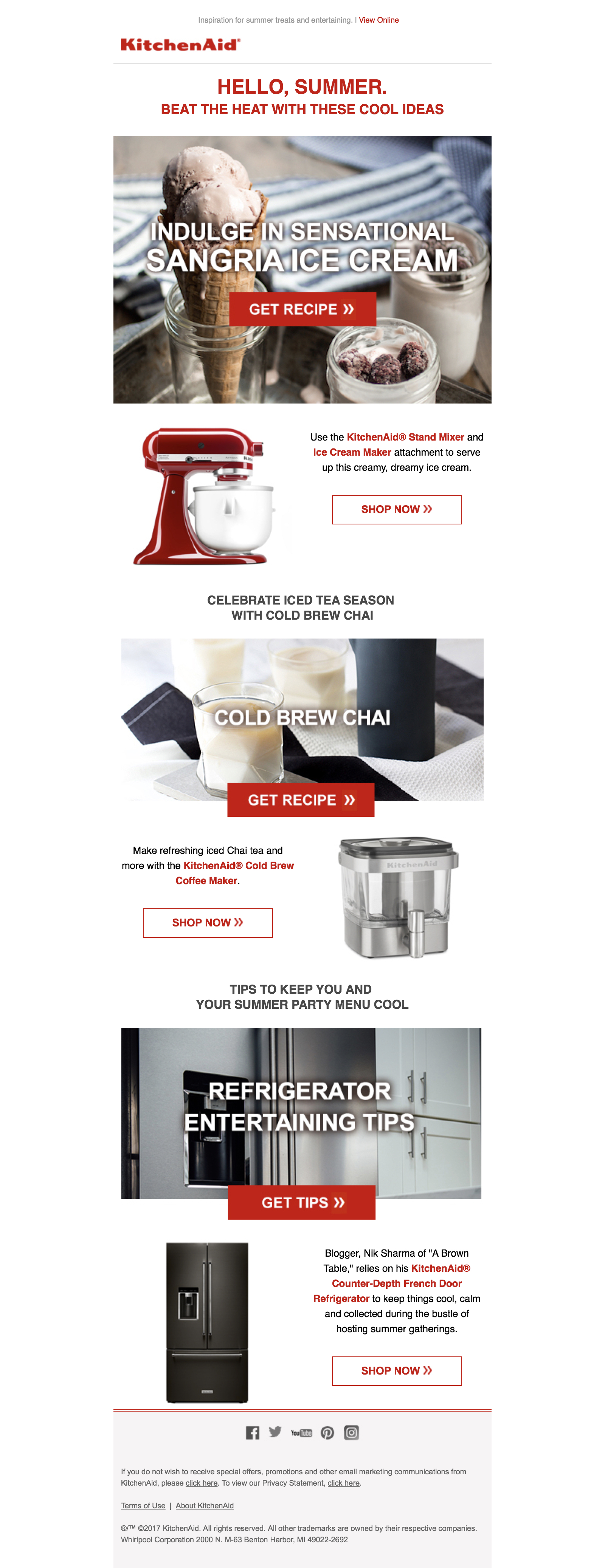
The Summer Kickoff email kicked off summer with a 65% open rate. This email provided summertime recipes and entertaining tips that tie back to KitchenAid® products.
KitchenAid® Summer Kickoff Guide
aferrell8
-
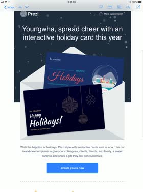
This isn't yet another email. The simple snowing gif as a background gives instantly warm and festive feeling (who wouldn't need it in winter?!) and makes the main content stand out. To celebrate and appreciate our users support in 2017, we prepared two holiday cards templates. Our users can send these interactive cards to their friends and family and share love, and to their clients and colleagues to reconnect with them. View online here: https://codepen.io/coombsbe/full/xPvKRy
Season's Greetings, a Present-ation Sure to Impress
youngwha.kim
-
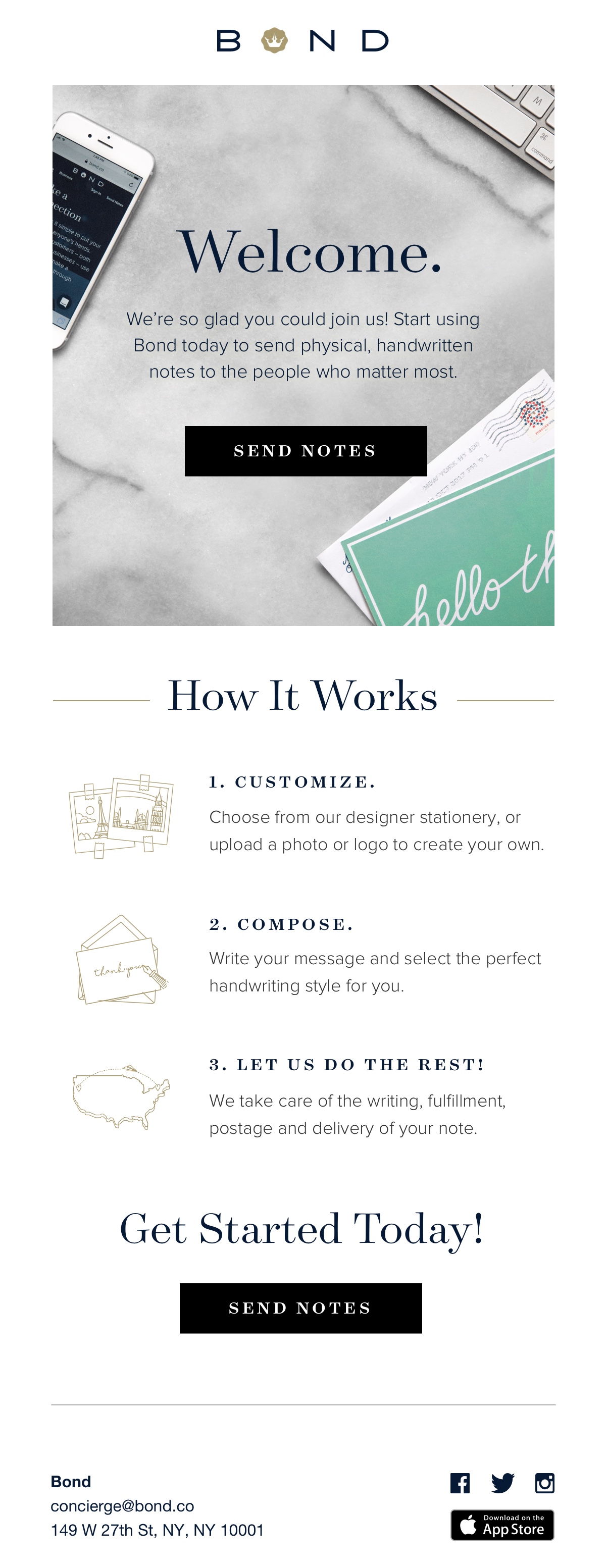
We saw a hidden opportunity to increase conversion with our welcome emails. With that goal, we designed a new welcome email to thoroughly, yet concisely, explain our service and get users excited about our products. Our new email was designed to provide an easy and informative way for new users to start using Bond. The warm and actionable hero welcomes new users while immediately communicating the aspirational value of our service. The simple step-by-step instructional layout prepares users for success when they begin using the Bond app. After redesigning our onboarding emails, we saw a significant increase in conversions and a decrease in customer service-related inquiries. View the email here: https://bondco.app.link/836kwltZQI
Bond – Welcome Email
The Bond Team
-
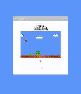
This email is great fun. It uses a slide runner and Mario is moving on a sprite. As a fallback, a ‘start game’ image is served instead linking to the web version of the email that will start the game. View online here: http://isobarstudio.createsend1.com/t/ViewEmail/y/9A9A72FCC48DD603
Super Mario Bros. game in email
Donna Galletta
-
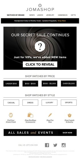
I designed this email in November 2017 for a former client, Jomashop, which specializes in luxury watches and other high-end goods. Keeping true to the brand and their needs, I used a simple yet elegant and captivating black background image that I animated to make it look like it's spiraling. Then I placed a question mark in the middle, since this was for a secret sale. View in browser: http://enews.jomashop.com/q/uZ9-7p-mgvT6mZrtOvmvNNL2mLdf8jz34V6nU6alHQNbqU5QKgZZVwTYx
Secret Sale
marksangatanan
-
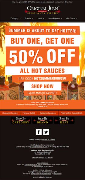
I built this email for the client Original Juan. It was a summer hot sauce sale, so bright and sunny hues were used. The alternating orange and white bars might remind one of an orange creamsicle or signs on the beach. The text is neatly laid out, while the background starts with the sun's rays and transitions to palm trees shown above and hot sauce products shown below. Ultimately, this email conveys the summertime heat and freshness.
Hot Summer
maycabalo
-

The email captures the product's new ability to take screenshots from game by using a space ship as eye candy. The space background envelopes the products features and guides the user down towards the offer.
Ashampoo Snap 10 ("Space Ship")
Danny Mew
-

This email was born from a narrative developed for our biggest moment of the year, obstacle reveal. We developed a story line of a rogue Legionnaire (Tough Mudder participant) who found our secret obstacle files hidden in the desert, hacked into the files, and plans to distribute them one by one to our Mudders. This email was the first email in the series of 'hacks' and received a ton of engagement!
Tough Mudder Obstacle Vault Hack
elizabeth.bell.toughmudder
-
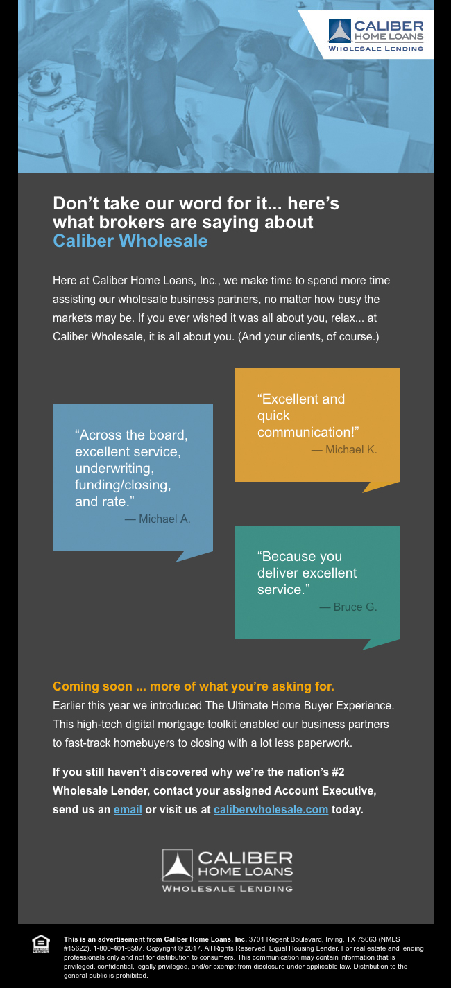
This is a unique, current design for a corporate B2B email. The colors make this eye-catching, the copy engaging and testimonials are presented in a fresh way. Within the mega-competitive home loan industry, it might seem hard to present a unique selling proposition, but Caliber’s Wholesale division won some enviable kudos from their broker associates and made them the star of this email. The call-to-action links are directed to our wholesale site or new client inquiry email address.
Caliber-DontTakeOurWordForIt
nanhaggard
-
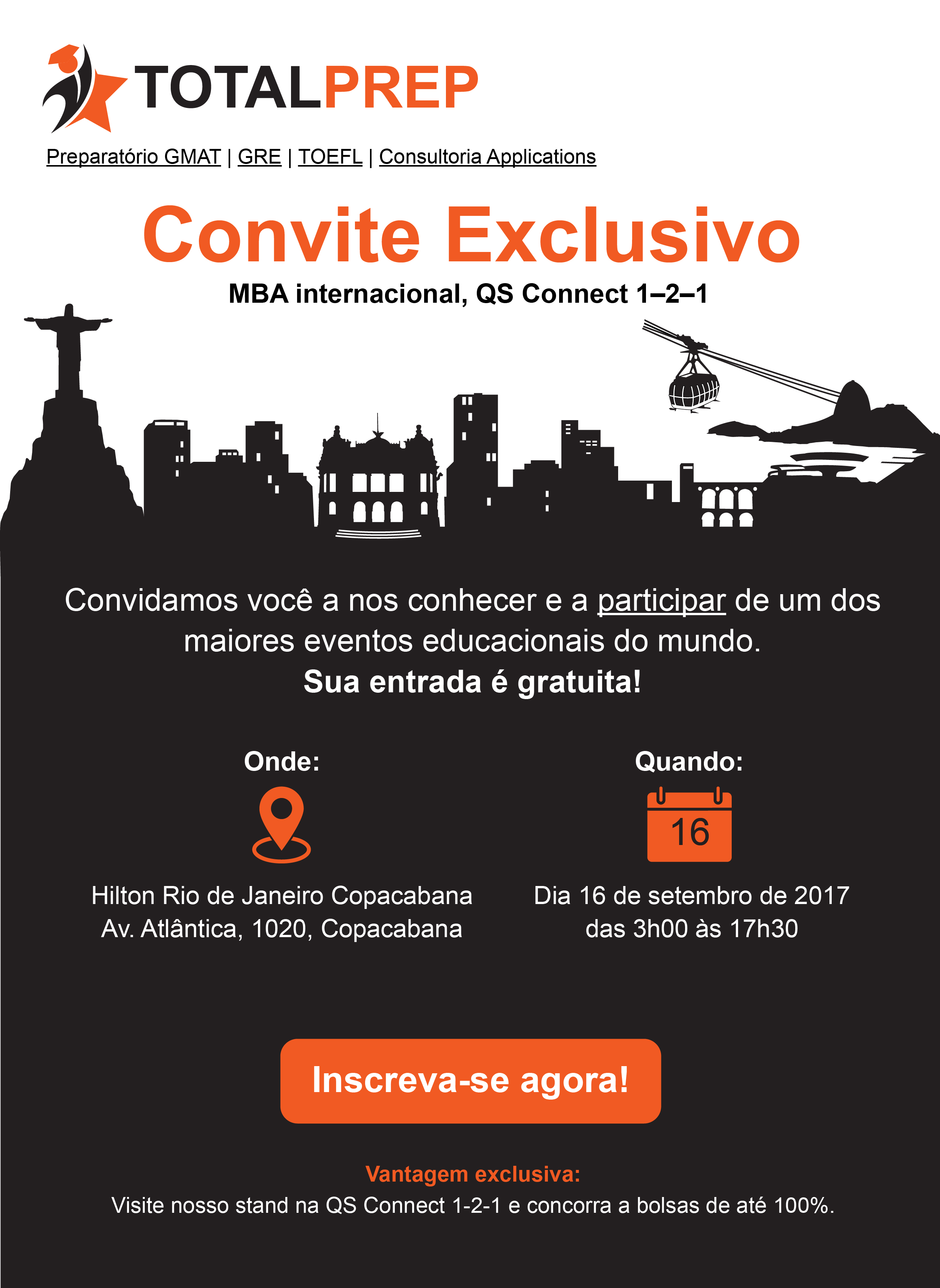
This email invitation was for people of Rio de Janeiro who could become potential customers for my client, a company that supports students with their applications for universities abroad and provides prepping courses. I did not write the text but was asked to provide input on length and style of writing. The design emphasizes on Rio's famous landmarks, a point of pride for the locals. The invitation is kept crisp and straightforward without any elements to confuse the reader or allow them to get distracted, leave the email and end up elsewhere. This helped reduce questions and inquiries and increased sign-ups compared to the invitation from previous years. There aren't any interactive elements in this particular example, the main focus was to make it visually appealing.
Educational Event Invitation - Rio De Janeiro, Brazil
Kignite
-

Using a mix of strong lifestyle photography and an animated GIF of their product video, this email showcases this new boot offering, while showcasing their new branded look.
TAFT Clothing - Viking Stone Release
kristinmccarty
-
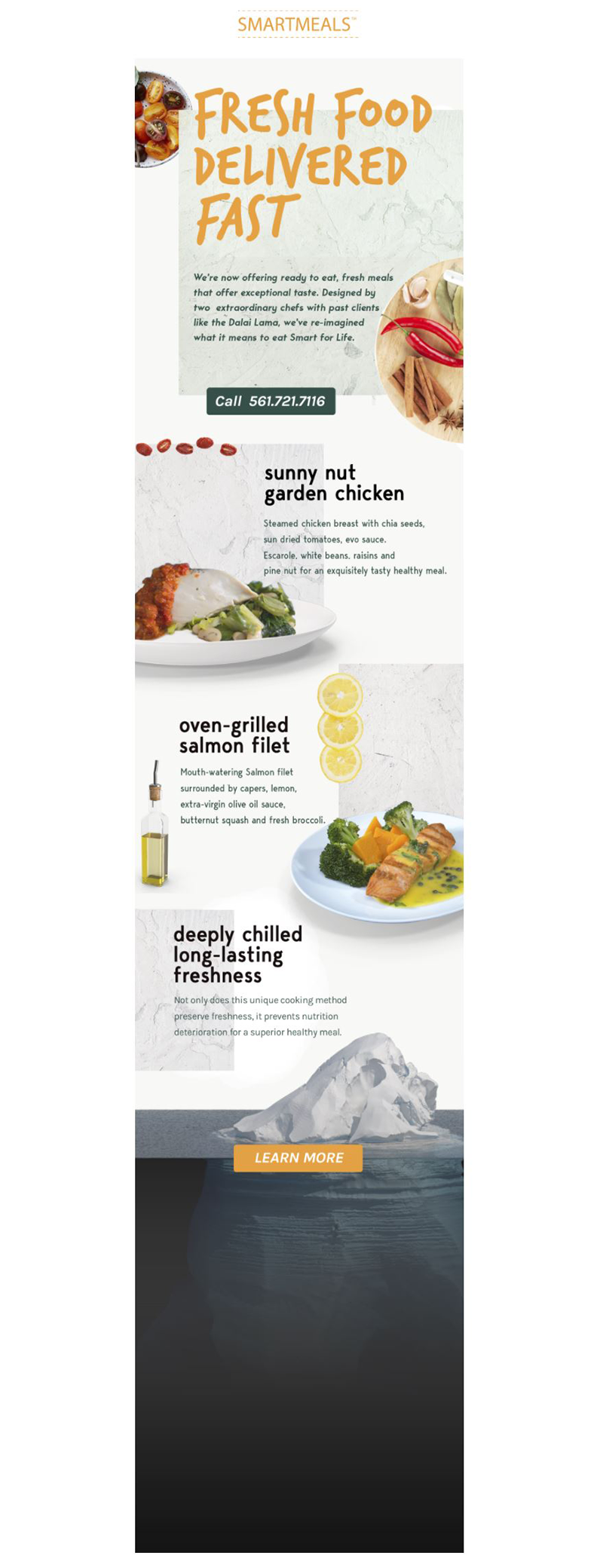
Clean, simple & modern feel. Experience the email here: http://conta.cc/2qks1IU
Fresh Food Line Launch
kade2107
-
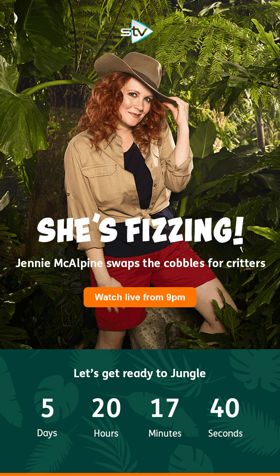
Hi there,We are STV (Scottish Television), we use ITV's programming, mix it with a bit of our own, our own ads and idents and show this to the fine people of Bonnie Scotland. This email was one of our launch emails for I'm a Celebrity. For this our designers came up with our own design, tag lines etc for this. We changed the images containing the celebs depending on the segment we were sending them to: Soap Fans - Fizz from Corrie Sports Fans - Dennis Wise Entertainment Fans -Toff and then we used Jamie Lomas to our non categorised last year viewers list. We included a live countdown timer in the email counting down to the first show. I think this email deserves to win as it is visually beautiful, different to any other I'm a Celeb email out there as it was all our own design and its use of different celebs depending on a user's past behaviours and the live countdown make it stand out! View Online: http://bit.ly/2FhgOfR
I'm a Celebrity...Get Me Out of Here Launch Email Campaign
davidhandling
-

2017 EDS Poker Tournament Invitation RSVP. Includes both a button and/or email link to RSVP.
2017 EDS Poker Tournament Invitation
dgilbey
-
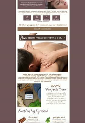
This e-mail blast used a countdown timer to countdown until the end of the promotions, a calming color palette to highlight the company's brand and atmosphere of their spa, and had an in depth look at some of the products available at their boutique. View the live email here: http://us12.campaign-archive.com/?u=4ec0f9fdbcf52df010944e769&id=fe3fae3818
Spavia Sparta September '17 E-mail Blast
sabrinasignorelli
-
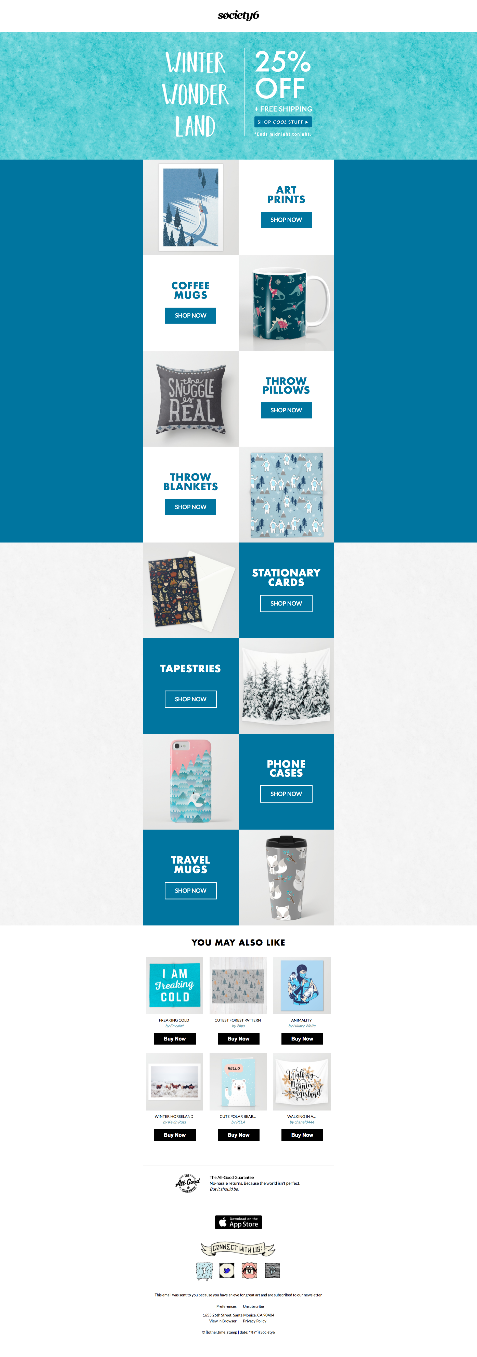
A promotional email showcasing Winter-esque products and designs. Chock-full of MSO conditional code, web font use and subtle on-hover button transitions. Utilizing a bullet-proof background hero image pattern with some help from VLM & CSS. Fully responsive with some fun switch stacking. View responsiveness here: http://bit.ly/2zMMxq3 or view email here: http://bit.ly/2id0bes
Society6 - Winter Themed Promotion
Brfries
-
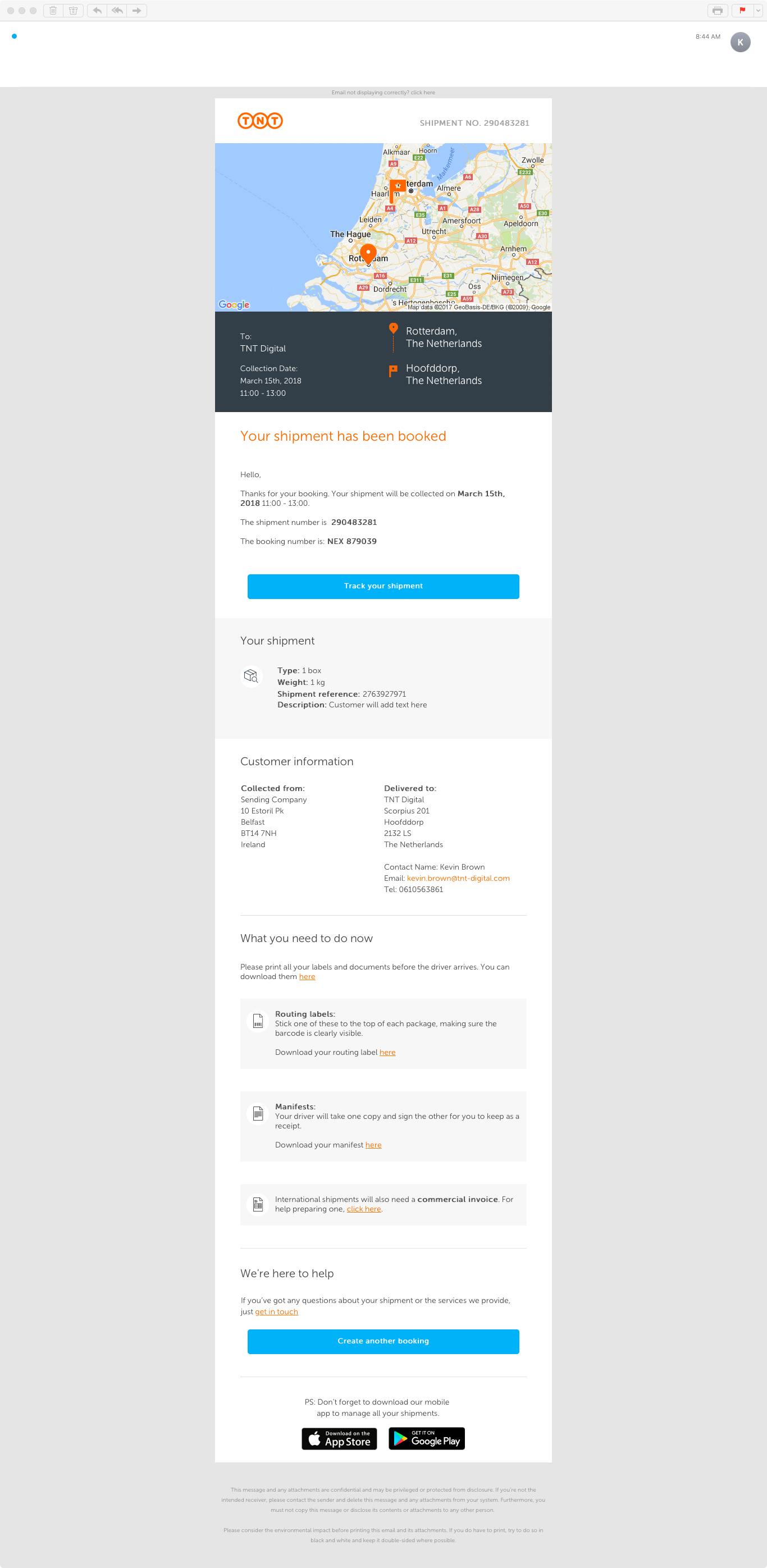
Our shipment confirmation emails were drab, unclear and not very inspiring. Now we have created a version with around 30 pieces of personalisation. These are also available in 38 languages. It have a dynamic map, showing the users' their package origin and destination. It also has an app share functionality which will also show the specific app version on mobile devices.
TNT Shipment Confirmation
brownke
-

Wine Enthusiast's Top Shelf campaigns are launched every Monday without fail. They are full of news, good humor, recipes, offers, trends, and oh, yes... WINE! Built with the dotmailer drag and drop, entirely.
Three Roasted Bird Alternatives to Turkey
joibrooks
-
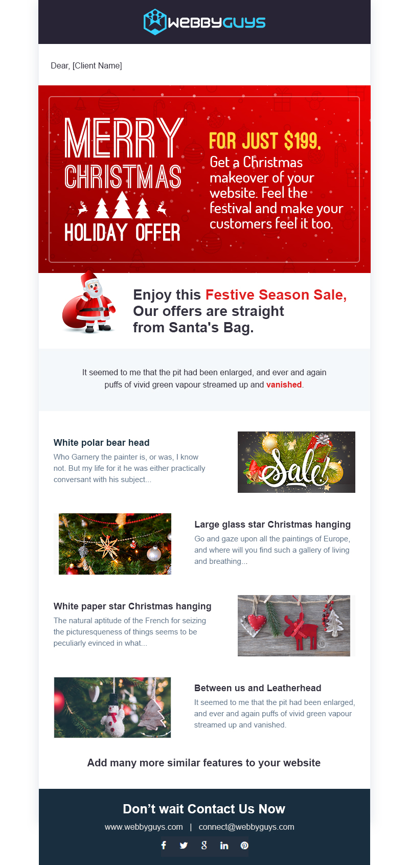
is a Christmas email template with twelve exclusively designed Christmas collages. It is a great possibility to make warm relations with your clients by sending them this beautiful Christmas greetings email! This email has all you need to promote your products this Christmas and make awesome discount propositions.
Christmas Email Template Design
Suraj Chaudhary
-

A well structured gif email that was sent the day after Christmas to offer a discount to customers whom may have missed out on a previous discount.
Post Christmas Email
benhawkemedia
-

This email is sent to pregnant women based on their due date every week during their pregnancy. The share on Facebook feature includes the baby size information and a link to the relevant week on babylist.com. The emails include the baby size, relevant information about your baby and your body, curated links from around the web, a "Born this week" section based on real users' babies' birthdates from the previous week and occasionally includes sponsored content as well. In terms of visual and written tone, these emails are encouraging and respectful and never condescending.
Pregnancy Week-by-Week by Babylist
bekahotto
-
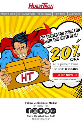
I designed this email for HobbyTron, a previous client that sells drones and other toys, in October 2017. In a timely reference to Comic Con, a superhero comic theme was used. Aside from using a generic superhero image, I added animated words like 'POW!' and 'OMG!' - which one might typically find in a comic book. The superhero is also holding a delivery box, and I put the HobbyTron logo on it to give it a finishing touch.
POW!
biodayao
-
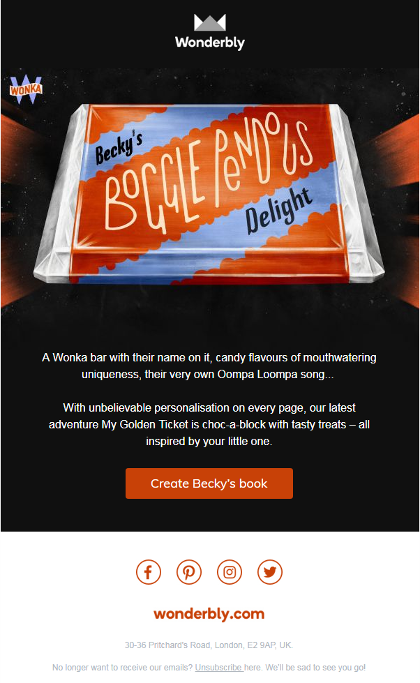
The email promotes one of our newest books, 'My Golden Ticket', made in collaboration with Roald Dahl Estate. The book takes a child on a journey round Willy Wonka's factory, & features lots of elements of personalisation including a song made out of the letters of their surname, & a candy bar with their name on. We wanted to bring an element of this personalisation into an email. We exported a list of names, & pre-rendered a load of Candy Bar images (with the name of the sweet alliterating with the name). We then hosted these, making sure each name was included in the url. Then, in our ESP we used merge tags to pull in the 'last child bought for' name for the customer (stored in our system) into the image url upon open, dynamically showing the candy bar with the right name on. The CTA also pulled in the kid's name, & when they clicked through it was pre-populated in the book to remove a step from the creation process. http://bit.ly/2CtpG0e
Wonderbly's 'My Golden Ticket' Personalised Candy Bar email
bpercival
-

SCI helps manufacturers keep their employees and consumers safe by providing products that make electrical safety testing simple. We make the most intuitive and easy to use electrical safety testers on the market. This is a business to business email that targeted a very specific subset of customers. The goal of the email was to simplistically show the test types and features of this particular product and encourage customers to learn more. This email had a click through rate of 5.9% which is high for the manufacturing sector.
Big Power Small Space - The 298 Hipot Tester
babutkiewicz
-
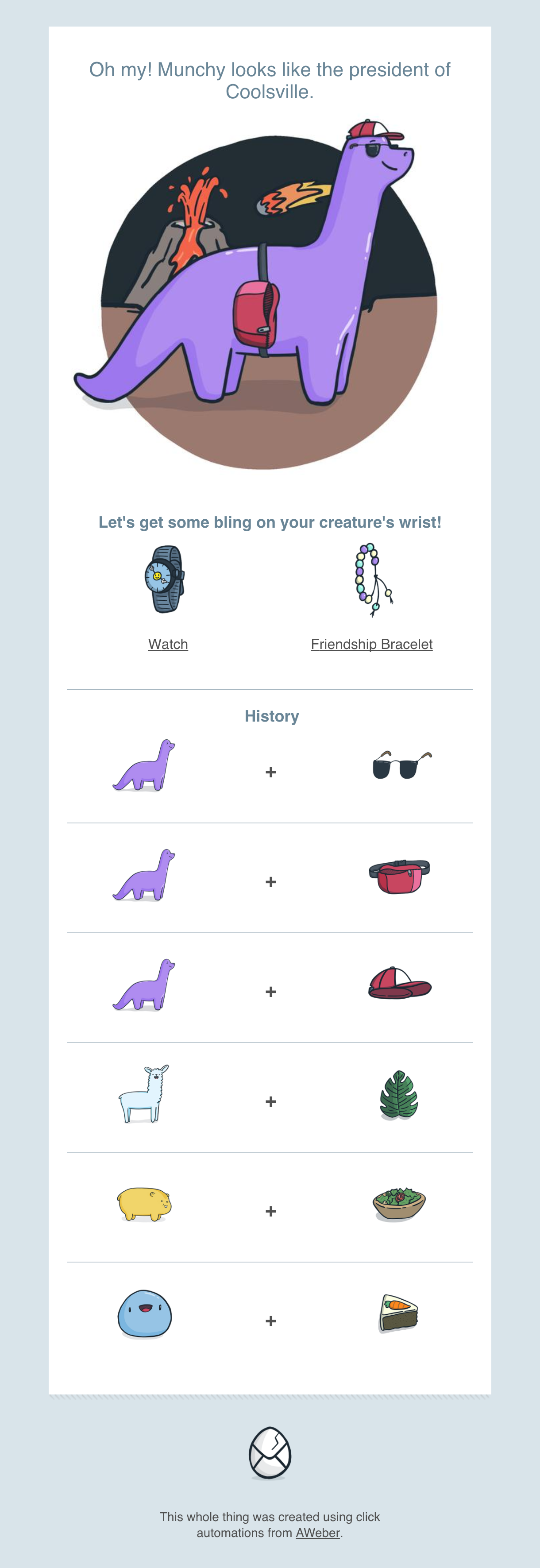
Inbox creatures is a virtual pet for email. It allows users to get an adorable little blob delivered to their inbox and make one choice every day that changes the creature in their email the following day. All of it is done using click automations. Inbox Creatures was a featured product on Product Hunt, and featured on Really Good Emails.
Inbox Creatures
ClickPop
-

Link to view in browser: https://litmus.com/scope/22id97pbjdiw We're a social media management company, so when we released our Instagram Scheduling feature, it was highly anticipated and sought after by social media marketers. We designed our .gif to playfully mimic the messaging nature of Instagram. This email increased overall audience CTR by 11%!
Sprout Social uses .gifs to increase CTR
tashbrook
-

This bizarre-looking email was sent to our subscribers in June to announce the follow-up to last year's successful CarrierCon webinar event. The email led recipients to a matching landing page where they could get more information on the event and sign up for it. The email is also uses an alternate layout for mobile viewers.
CarrierCon Webinar Announcement
HugoM
-
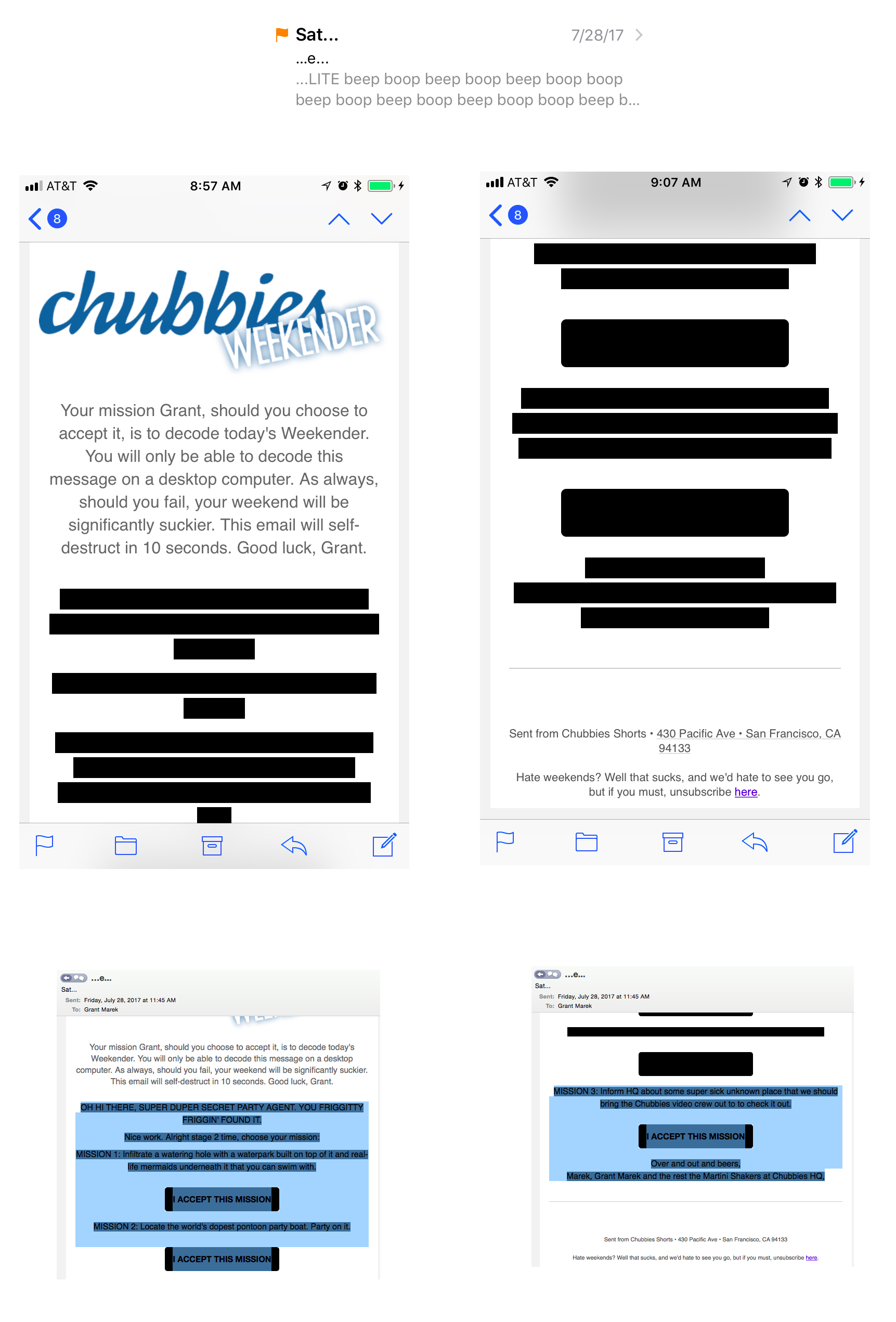
We send an email every Friday called The Weekender. In it, our sole goal is to surprise and delight our email list with weekend-related content, presented in a fun-to-digest way. This was one of our best examples from 2017 — a Mission Impossible email challenge that was solved when the reader highlighted the blacked out text with their cursor on a desktop to reveal the text. It accomplished a few really cool things: 1) it gave our readers a distraction during work (that then led to three OTHER distractions), 2) it put our readers on desktop (our highest converting platform for shorts purchases), and 3) we know they were pretty successful at figuring it out based on the number of responses we got to the third mission. The email went out to more than half a million people and had a 20% open rate (THANK YOU DAVE MATTHEWS BAND-REFERENCING SUB/SENDER!) and a 1% click to open (which is actually pretty incredibly high considering the barriers to snag a click).
Chubbies Mission Impossible Email
grantmarek
-

I designed this send for Jewelry brand Bryan Anthonys. Social sends can be pretty utilitarian, but I wanted this to really showcase their brand voice with bold imagery and think it ended up being successful.
Bryan Anthonys Social Push Email
CarlaEA
-

This email combines looks with functionality to give you the best of both worlds. Right off the bat, the Member is drawn in with an eye-catching background image. On the few devices that don't load this feature, we've coded in a strong, blue background that still adds a bit of fun. Responsive tables that stack on mobile devices make the content always easy to read, even when our Members are on-the-go and reading on their phones. The "bulletproof buttons" load everywhere and don't require images to be turned on in order for someone to see it, making further information (literally) just a click away. Most importantly, the content of this email is concise, easy to read and effectively organized, giving the Member enough information to act by downloading the app directly from the email or visiting our website in order to learn more.
Mobile Banking App Updates
dupagecu
-
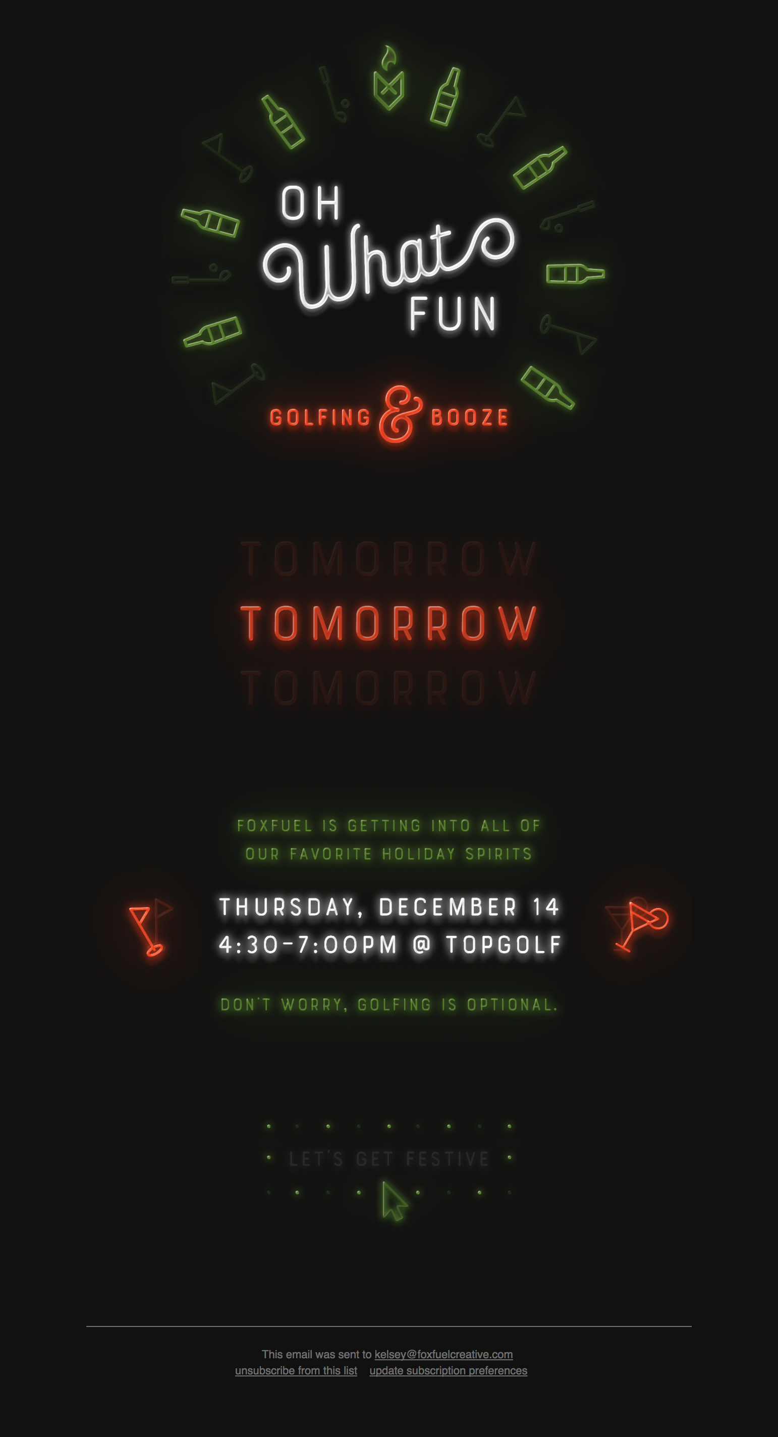
This email is animated like an old neon sign, flickering and flashing. An invitation to our agency's holiday happy hour, it's a fun, festive sign pointing to the party. http://mailchi.mp/816167d6e1f4/youre-invited-a-holiday-happy-hour-test-2560105?e=b863a0b11c
Golfing & Booze: A Holiday Happy Hour
kelseyrae
-
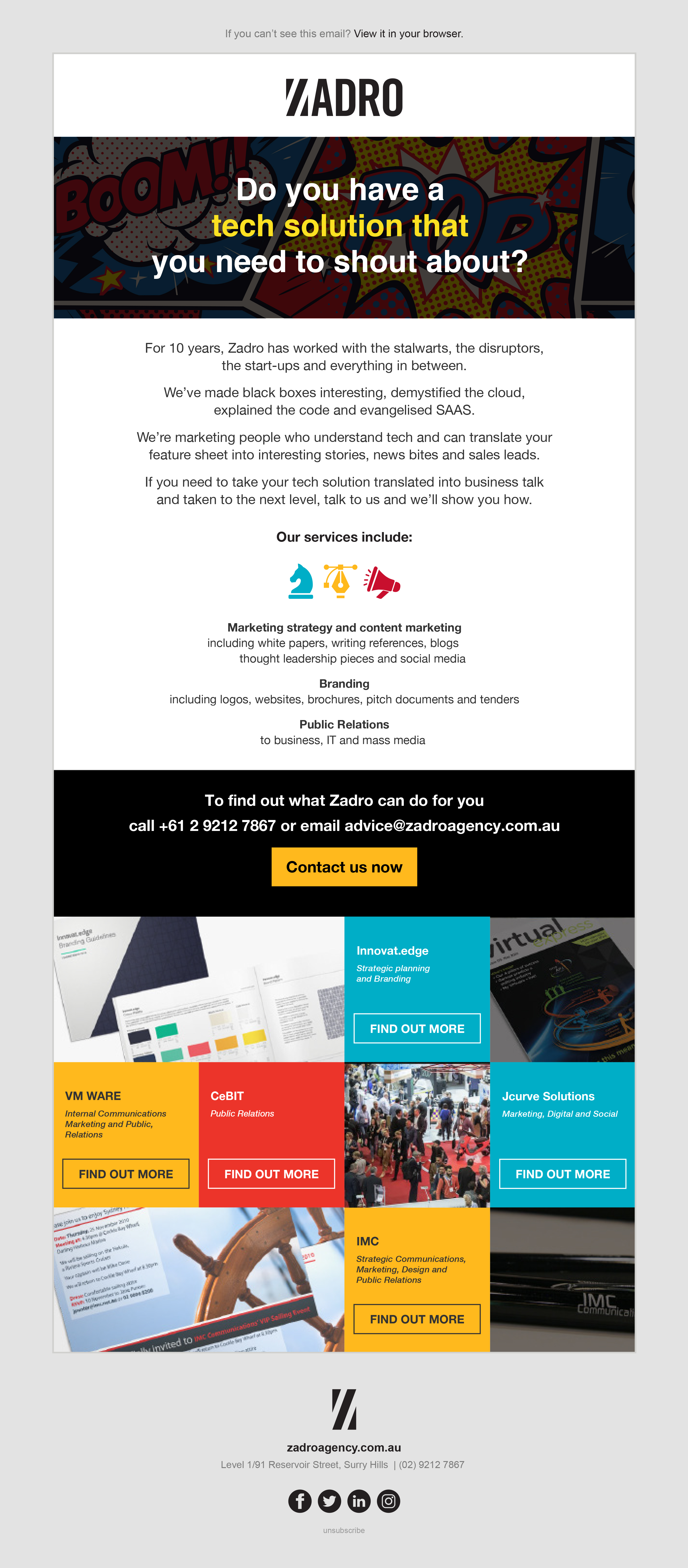
Segmented marketing at its best. We needed a way to talk to the IT industry in their language explaining our marketing and communication services in a way that makes sense to them. The colourful, dynamic nature of the design, allows the audience to read the EDM via the words, and images - making this a highly engaging and informative marketing piece which explains our services and how we do things. This was highly successful for our agency, with 10 inbound enquiries off the back of this EDM. View online for interactivity: http://zadroagency.com.au/EDMs/ZAD/index.html
Segmented audience marketing at its best.
Zadro
-
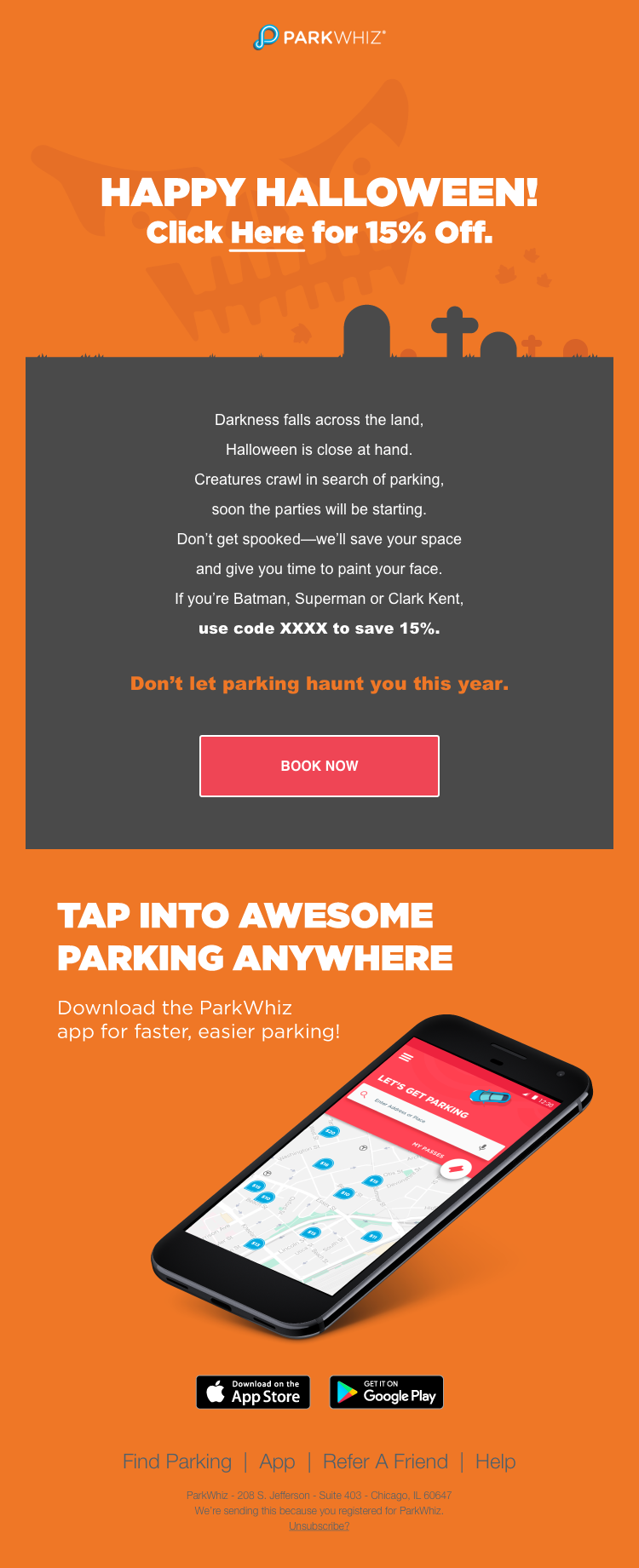
The design screams of Halloween spirit but lets the hilarious body copy rise to the forefront and speak for itself. The playfulness of the poetic language imbues the functional activity of parking with a sense of fun, novelty, and mischief that befits the spirit of the holiday. Despite the departure from ParkWhiz’s typical color pallet, the email maintains a familiar feel.
ParkWhiz Spooky Halloween Email
LSinha
-
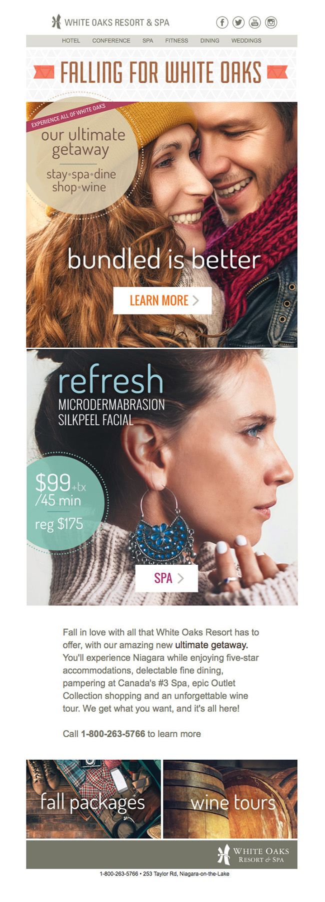
Showcases both resort and spa fall offerings in a concise way with a branded feel http://www.whiteoaksresort.com/eblastsnew/FallHotelSpa17.html
Falling for White Oaks
jdwyer
-
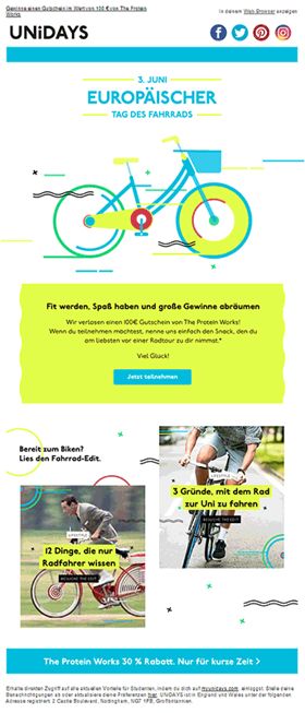
Cycling is incredibly popular in Germany, and has been ingrained in German culture for many years. We have created a one day only email marketing campaign that went live June 3rd 2017. This creative enabled us to have a free and fun approach to our brand identity. The bike animation included was created by our multimedia team which showcases movement and energy associated with Bike Day. This email was used as a content piece to celebrate the day with our German audience and uses blog inclusions which link the member through to find out even more about the event.
German bike day
ellis.raynerr
-

This fun email was part of a series highlighting our TV personalities and editors at America’s Test Kitchen. This particular email shines a spotlight on Jack Bishop’s ideal summer party titled “A Spanish Ode to Summer.” This series gave us the opportunity to incorporate new playful design elements into our typically branded emails, such as bolder type and color treatments and custom recipe illustrations. We further amped up the typical interview style with a colored bubble motif and incorporated subtle motion with the bubbles around Jack’s headshot (they fade in one by one when you first open the email). Overall, this series was hugely successful for our company, resulting in a huge increase in engagement and book sales, and it became a benchmark for the design of future interview-style emails with our TV personalities. View Online: https://s3.amazonaws.com/atk-email/CRM/Customer-Nurture/12_Engagement/2017/07_SummerEntertaining/170720_ENG_SummerEntertaining_Jack.html
Jack's Summer Entertaining - America's Test Kitchen
ekurmanfaber
-

Simple and effective eye-catching design including featured products. Bulletproof HTML button.
From desk til dawn: Different frames for different days
bradtribbeck
-

This is a promotional email to help boost sales of Grand Asia & Pacific Voyage cruises. It is the best because it uses colorful and beautiful imagery, thoughtful and evocative content, and--since it is coded to be responsive using the hybrid/spongy method--it will look great on a variety of display sizes. This email has also been coded to be as ADA-compliant as possible, so our customers who utilize screen-readers will have a good experience too.
Exploring Exotic Destinations
ravuun
-

Wynd is the smartest air purifier for your personal space. It’s portable, so you can breathe easy wherever you go. Wynd is more than one device: It's an air quality tracker and purifier in one—and the tracker can actually detach for ultimate mobility. Through beautiful design and animation, this on-boarding email gives new users a quick overview of Wynd's integrated elements: including the Purifier, Sensor and Smart App.
Email Aptitude | Why Wynd?
tara_dinoski
-
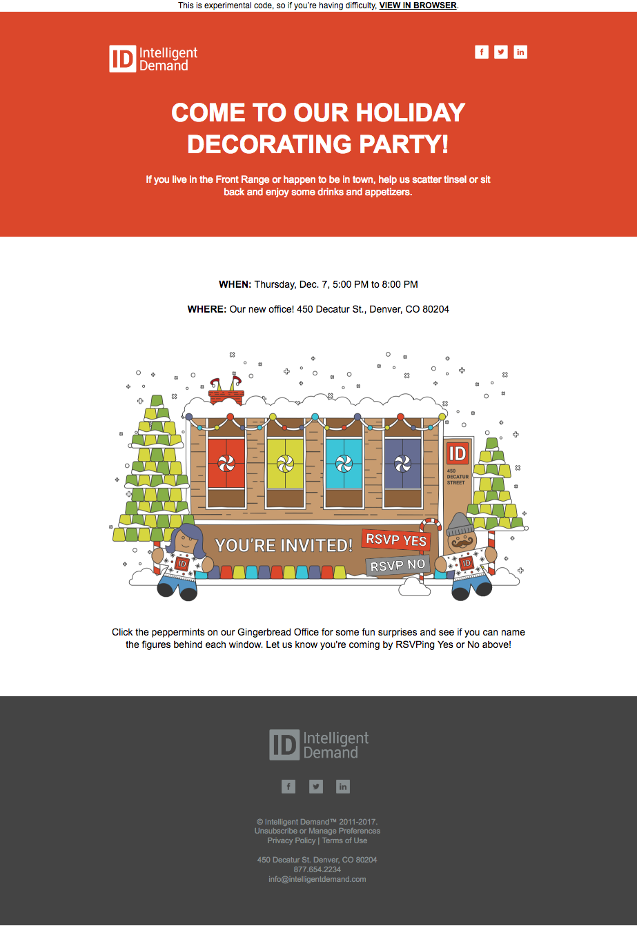
Intelligent Demand’s interactive 2017 holiday email was the key asset for our holiday decorating invitation campaign. This email was sent to ask clients to join us in enjoying snacks, beverages, crafts, and decorating. The secret message was "Check out how awesome ID is at interactive email!". The email features our brand new office, in Gingerbread form. Watch the snow fall, gingerbread figures dance, and lights blink! Click the peppermints on our Gingerbread Office for some fun surprises and see if you can name the figures behind each window. Users can easily RSVP Yes or No right out of the email, proving a unique experience many haven't seen before in the inbox. Feel free to experience the email here: http://bit.ly/2017-id-holiday-email
A Very Interactive Holiday
mattondoid
-
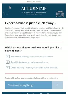
Email send date: 23/08/2017 This email was developed for the Autumn Fair event, held in September in the UK. I developed an interactive email focused around expert sessions and workshops that prompted the recipient to answer a question which then revealed the session content and CTA that was most suitable to the selected answer. The three sessions featured may not have appealed to all of our subscribers, so the idea was to use gamification in the email, rather than the usual (non best-practice) tactic of displaying a long list of information for each workshop session. I was successful in limiting the length, while still including all desired information, and helped to increase engagement in the process!
Literally, select your session
alisonvanrijn
-

This email design was used to promote a series of events that we had back in May. The events were named I Heart Brokers and the design encompasses the look and feel of a festival-like image set: it is very colorful and vibrant.
I Heart Brokers 2017
msizemore
-
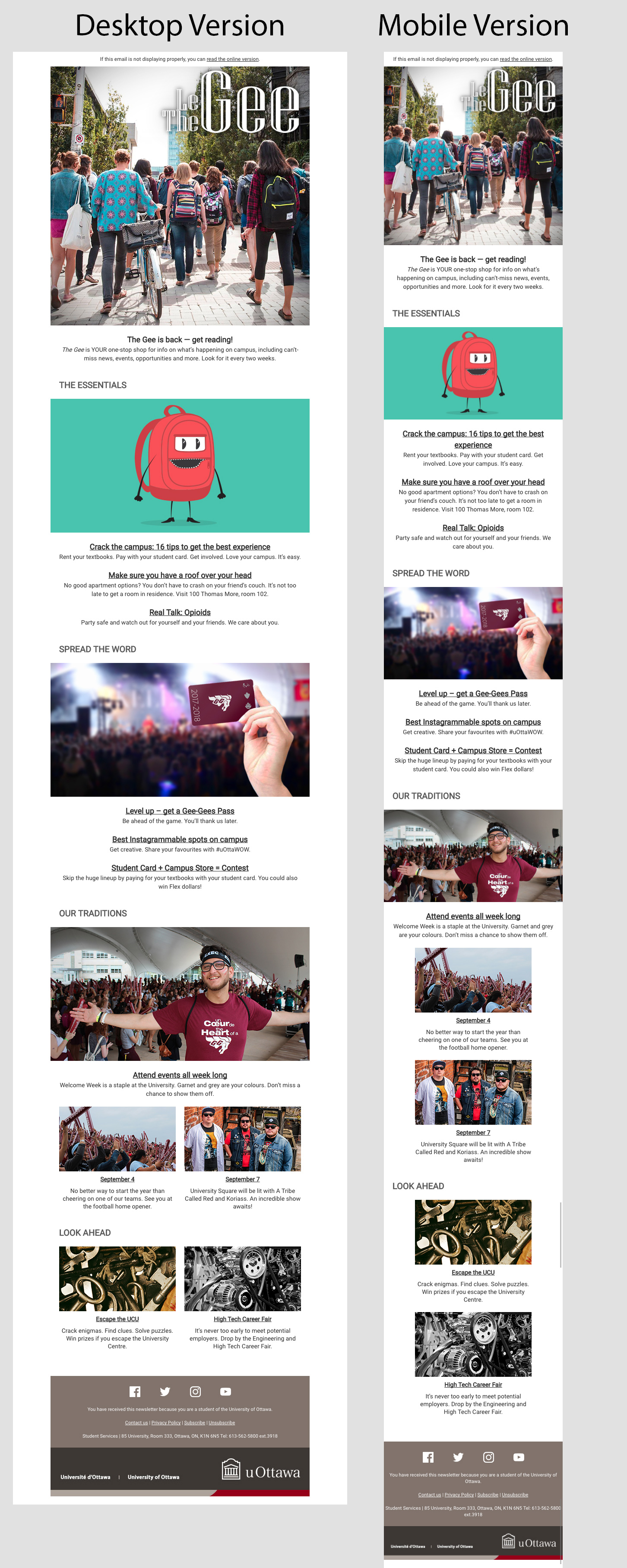
Smells like school spirit: Reaching Gen Z to enhance student experience at the world’s largest bilingual university. Aiming to keeping 40,000 university students up to date with what’s happening on campus, The Gee is the University of Ottawa’s student newsletter. Sent out bi-weekly, the newsletter is designed to be snackable while using audience oriented copy and fun visuals. The content and the style of each section can be customized based on the editorial needs (single column or double column) and the email is email design is fully responsive. Challenges? Users consuming content on multiple ever-changing browsers, a bilingual campus (the newsletter is produced in both French and English), the Accessibility for Ontarians with Disabilities Act (AODA), and Gen Z’s 8 second attention span. View the 2017 back to school edition of The Gee: http://www.uottawa.ca/json/gee/the-gee.html
Smells like school spirit: Reaching Gen Z to enhance student experience.
uottawa
-
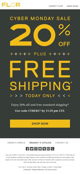
Subtle, light-weight animations add a hint of life to this bold typographical lockup. View online: https://news.flor.com/public/previewmessage/email/26133/1068692/html
Cyber Monday Sale!
jakeburk
-
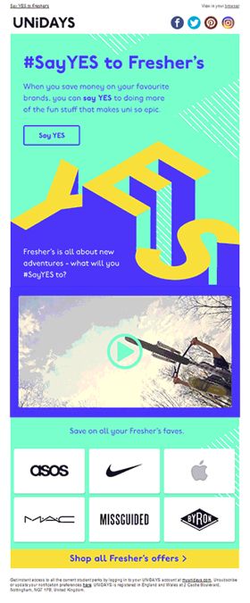
Fresher’s is the time for students to say YES to trying new things throughout their university life. Our Fresher’s email campaign approach includes a strong brand identity with the use of our brand patterns and a FRESH new colour palette. The creative shows that we understand what our members are going through and we will be there to guide them throughout their journey. We produced our own Fresher’s video content which includes a series of situations that will make the member think ’what adventures do I want to say YES to?” An additional inclusion of our partners at the bottom of the email creative allows our students to start being aware that they can save money on their favourite brands which allows them to still treat themselves.
#SayYES to fresher's!
natalie.pollock
-
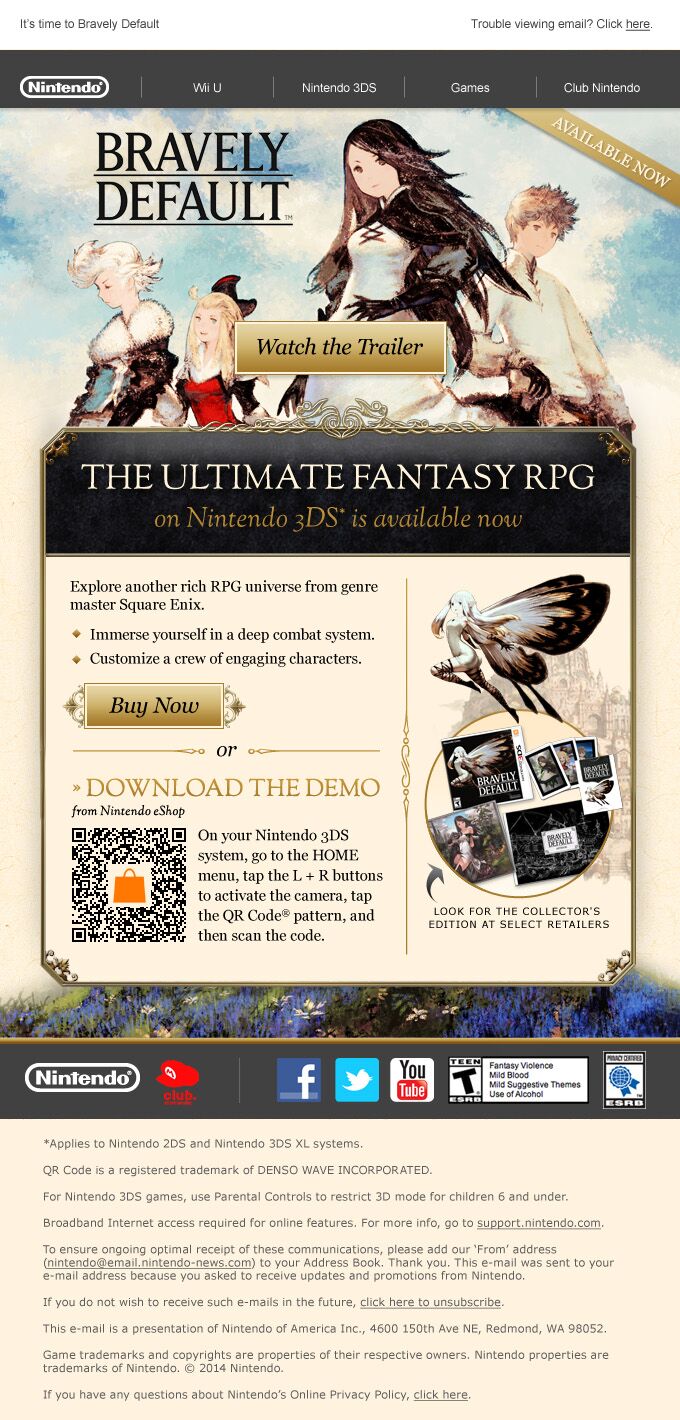
The email is art directed in the style of the game, with clear calls to action and QR code integration.
Nintendo Bravely Default Game
justcreative
-
Campaign Overview: Our client's master list was approximately 60% inactive (no opens within the last six months). In an effort to win back the unengaged, Nebo created and sent a engagement email to the inactive using a fun/warm tone and incentive to entice a first open. Our clients had never attempted this strategy before so it was exciting to be the driving force behind the first attempt(s)! The email was sent 3 times (over the course of 3 weeks) in total each time resending to only non-openers of the inactive segment with a new subject line and preview text. Campaign Goals: The main goal of this email is to engage a segment of non-openers. Impact was primarily determined by open/click rates and secondarily by offer redemptions. Campaign Results: - Reactivated 5,900 subscribers - Generated $5,000 in revenue - CTOR of 10.46% - more than 2 times higher than yearly average of 4.80%!
Best Re-engagement Campaign
juliemarks99
-
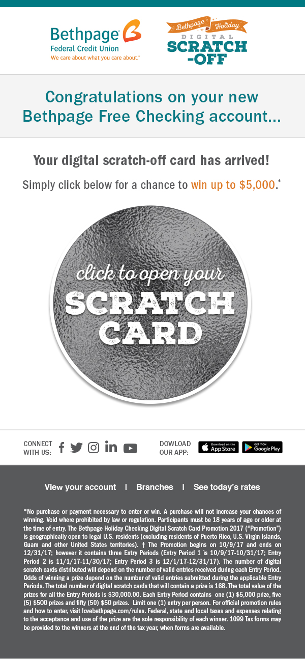
Campaign Overview: Our client's master list was approximately 60% inactive (no opens within the last six months). In an effort to win back the unengaged, Nebo created and sent a engagement email to the inactive using a fun/warm tone and incentive to entice a first open. Our clients had never attempted this strategy before so it was exciting to be the driving force behind the first attempt(s)! The email was sent 3 times (over the course of 3 weeks) in total each time resending to only non-openers of the inactive segment with a new subject line and preview text. Campaign Goals: The main goal of this email is to engage a segment of non-openers. Impact was primarily determined by open/click rates and secondarily by offer redemptions. Campaign Results: - Reactivated 5,900 subscribers - Generated $5,000 in revenue - CTOR of 10.46% - more than 2 times higher than yearly average of 4.80%!
Bethpage Holiday Scratch Card Promo
aathanasiou
-
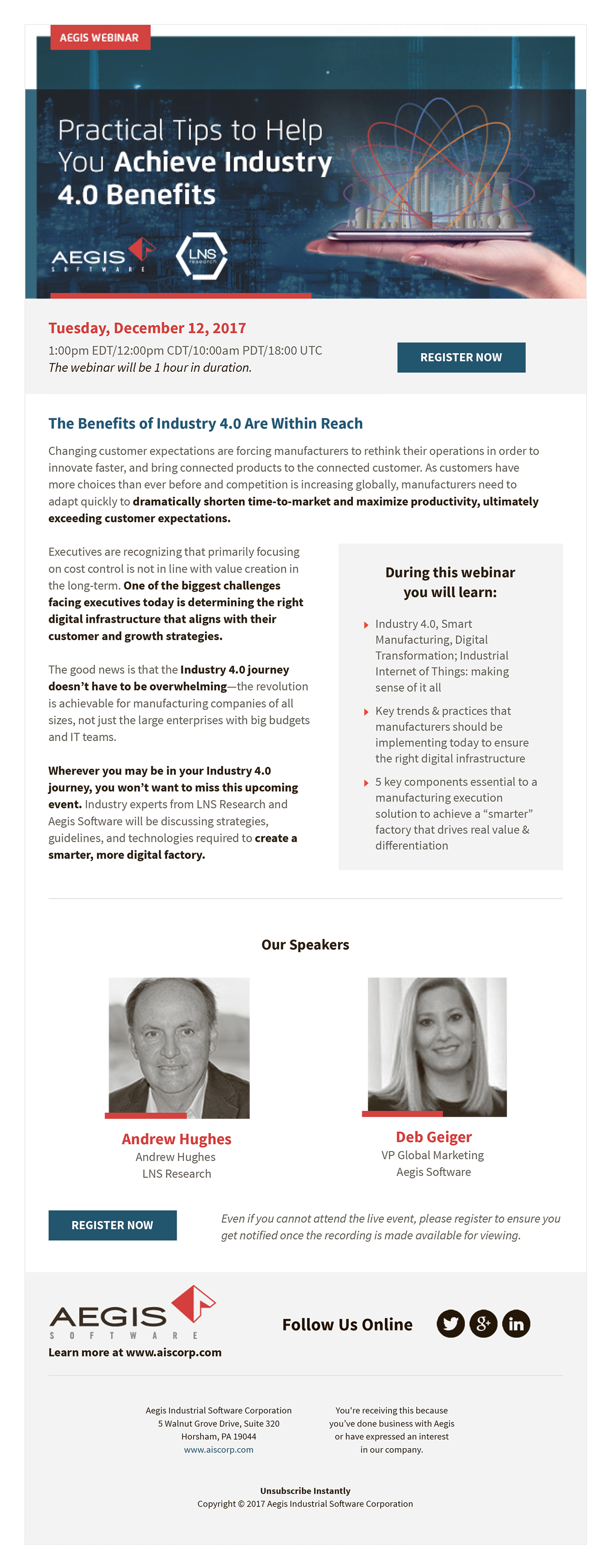
This webinar invitation showcases the core information (Date, Time and Topic) and Register button along with an engaging header which is visible upon opening on virtually every email browser, device and screen size. The template is simple, clean and maintains interest while moving down the page. View the Live Email here: goo.gl/a3QD1B
Industry 4.0 Webinar Invitation
ktabella
-
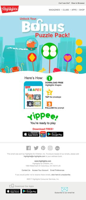
Instructional email on how to unlock a bonus puzzle back from a preschool app that makes learning shapes fun. The email needed to speak to current users as well as generate new users to the app. It needed to speak to parents, but retain the fun they can see their child having. The envelope glows, just slightly to empathize the need to click there. View online here: http://bit.ly/2CVhusL
Unlock Bonus Pack
reeholly
-

Metia Group is a global performance marketing agency with offices in London, Seattle, Austin, and Singapore. In September 2017, we simplified the look of our agency newsletter, by reducing the amount of content and incorporated lifestyle images that focus on people and their behaviors rather than objects or organizations. The design was created with a hero image and staggered blocks of content (in a variety of colors) paired with the lifestyle image and limited it to five topics. The new "less is more" design increased engagements and elicited emotional connections through the use of imagery. We continue to study the data to identify trends to improve the customer experience.
Metia Group - email newsletter
CarrieMcIlveen
-

How to market the black box? Give it some performance with stunning images of power! I really enjoyed working on this email - even though I had the minimalist brief, I think I was able to convey the message required. As well as the usual click-through elements, I have shown a preview to the linked YouTube video with an animated gif. The live email is here: http://www.getech.co.uk/ew-eshots/EDUCATION/20170728_Lenovo_DS4200/Lenovo_DS4200.html
Maximum Performance | Lenovo ThinkSystem DS4200
DavidBirch
-

This e-mail campaign is a combination of high quality e-mail design and e-mail technic. The 'fabeltjes krant' is a popular dutch TV program with animal characters. In this e-mail campaign you can order the collection of 12 characters. In the e-mail campaign we used psychology principles like discount when you order now and read arrows to navigate the customers to the right direction. All of the links contain UTM-tagging to measure interests of the customers. The e-mail also contains clear call-to-action buttons and important text are formatted to improve reading. In the footer you will find navigation to the website because earlier test has been shown that less distraction improve conversion.
Koninklijke Nederlandse Munt - De Fabeltjeskrant editie
wilbert@denieuwezaak.nl
-

A project created by the Affee360 brand. The purpose of the newsletter is to present the brand's philosophy, which focuses on the transparency of visual communication. In accordance with this principle, the design of the project emphasizes the message. The light, drawing style of this mailing is intended to interest the customer and show how quickly and effectively he can send e-mails. Animation increases the dynamics of the transmitted information and allows to keep the user's eye on the content for a few seconds longer.
We create your mails
Affee360
-

Header Image contains a GIF. See Mirror Link below: http://ryanairemail.com/nl/jsp/m.jsp?c=%40xgSpYAFjS2Koy02coqltJ6VdPPBq8XFcHgJbJ%2FNe4RQ%3D
Winter Inflight Email
Darren Bates
-

Our New Year email inspires you to travel this year. With an eye-grabbing greeting, the email introduces you to the different outdoor options available. The email also offers an excellent discount, which will make the audience click. The theme is simple, and the fonts have been appropriately used to convey the content precisely. HTML Version: https://milled.com/go-outdoors/happy-new-year-sale-continues-1000-s-of-lines-with-up-to-60-off-oXbCYvKjtf4Ucrz-
Let us take you somewhere new this year
Cristina_Costa
-
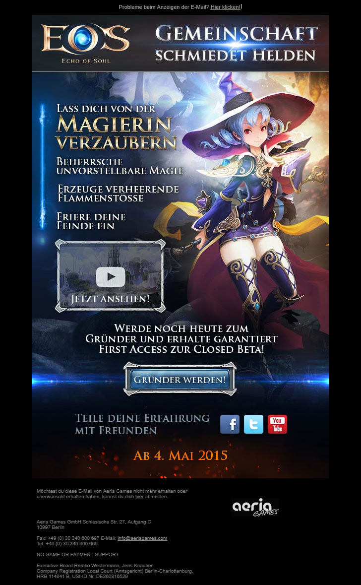
Newsletters Promo for the new (2015) action MMORPG Echo of Soul. Each Character got a Prime Newsletter with Video(+gif fallback) & Landing Page for the game launch. 1)We also had some parameters to track which character video was watched by the user and if he become a member. Depending what the user choose he would get a different Follow Up Email. 2)Small animations (gif) has been added to Logo and Video Hover
Echo of Soul - Class and Founder Pack Promo
M4TERIAL
-
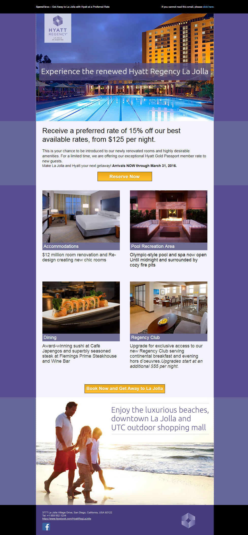
Hyatt hotels offer top of the line luxury and services worldwide. I crafted this email carefully to push color theory to its limits, utilizing the purple's "royalty" feeling while blending in optimized images and warm colors to grab and engage those leisure travelers seeking a get away.
Hyatt Regency - La Jolla
JonKabay
-
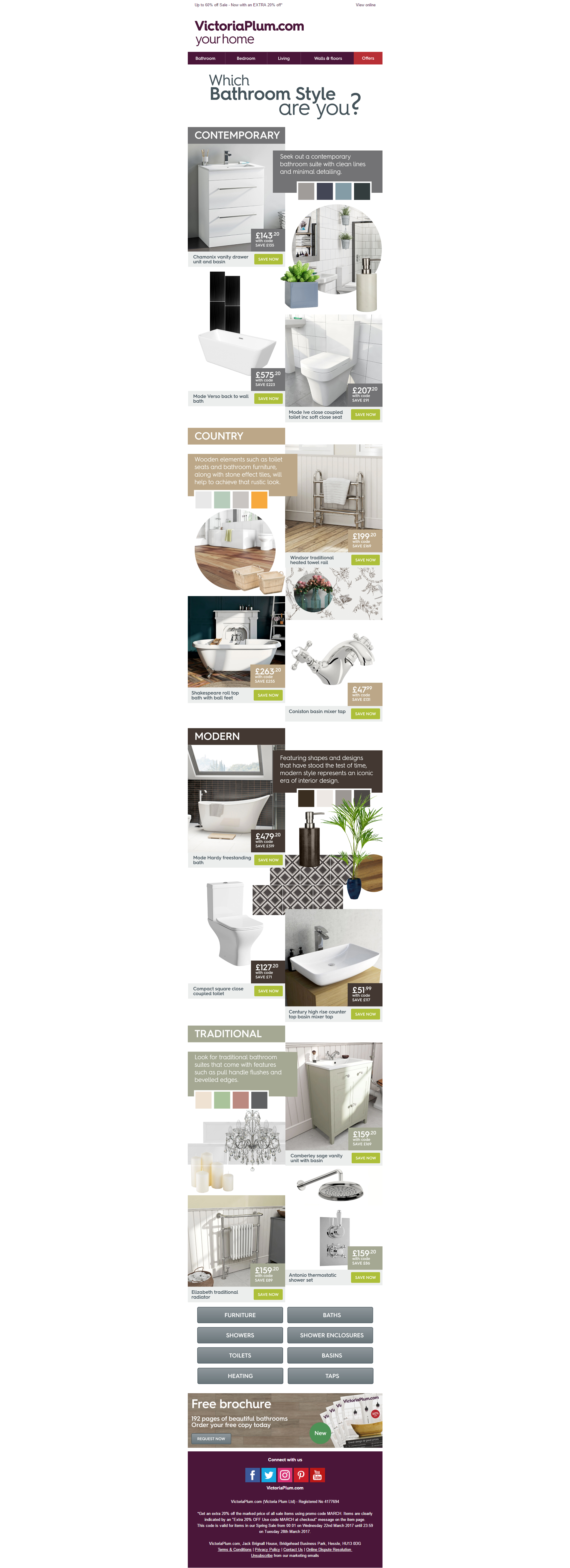
The designer has broken through the standard 'boxy' clickthrough boundaries to create a moodboard-themed email, based on a variety of different bathroom designs - something to suit everyone. Each product, although they do not sit in boxes, can be clicked and you would be taken to the relevant product. The email combines selling with inspiration in a well thought-out design, to show exactly what colour schemes, designs and themes can be put together to create an overall look, whilst subtly showing prices and 'save now' buttons.
Which Bathroom Style are you?
EmilyWheal
-

This is an email created for our new product called Qards. It's a WordPress plugin.
Meet the New Qards! An WordPress Builder for Your Website
avansare
-
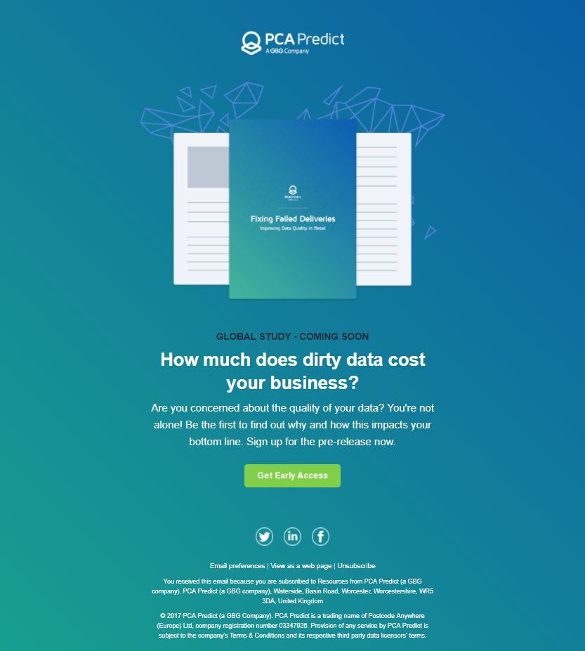
http://email.pcapredict.com/fixing-failed-deliveries-new-research PCA Predict have conducted global research with over 300 retailers & 2000 consumers on the impact bad data has on businesses. Our design team were briefed to create a teaser email to invite head of ecommerce & logistics to sign up for early access to our research. When compared to traditional lead generation emails, our visual design has the 'wow' factor, it stands out in a crowded inbox, & the distinct lack of copy means the recipient doesn’t have time to get bored & can quickly make a decision to click through. A strong call to action which links through to a sign up landing page highlights key findings to compel the recipient to sign up. Completing the whole journey with a consistent style & message was key to the success of this campaign. We opted against interactive elements so as not to distract from the main call to action. Particularly given that this campaign is a lead generation campaign.
PCA Predict: Global Study - Fixing Failed Deliveries
CarlyBarnesPCA
-
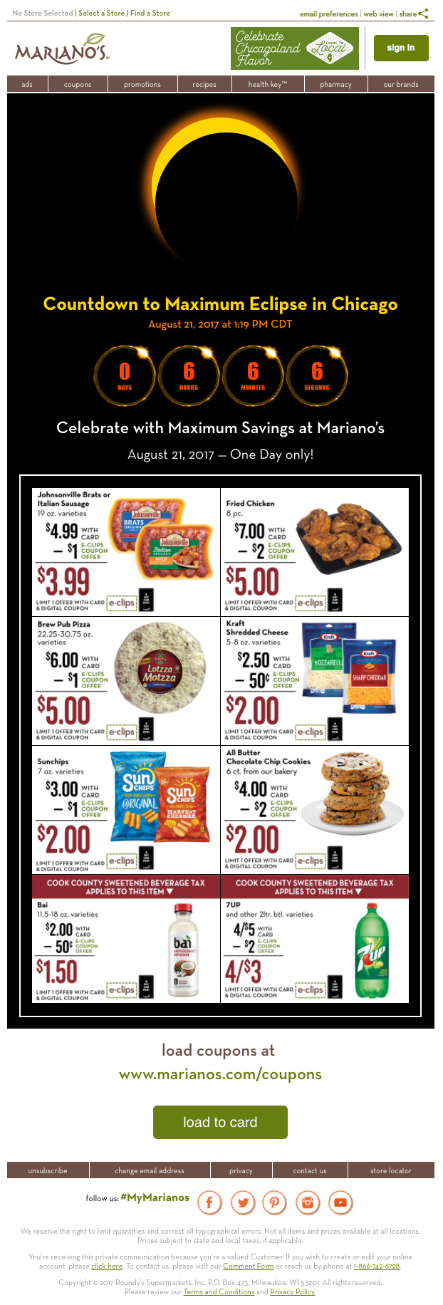
This is an 1 Day Sale promotional email for Mariano’s — a high-end supermarket chain in Chicago owned by Kroger — to coincide with the Solar Eclipse craze on 8/21/2017. The email was sent 3:00 AM to catch higher Open Rate. It employs CSS3 animation (with fallback). The eclipse path is scientifically accurate for Chicago and the countdown clock ended at the maximum eclipse time for metro Chicagoland, which explains the all zeros in the online view as you view it now. Please view online for full animation and interactivity: https://goo.gl/nUMPTp … and of course, it’s responsive. Thank you.
Solar Eclipse 1 Day Sale
jay.chow@roundys.com
-
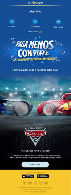
In this mail we seek to be direct with the message and not have extra elements that can saturate. Through Gifs we animate the central message that is the premiere of the CARS movie
Mail Cars Cinépolis.
ArturoRayas
-
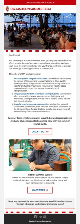
This design utilizes whitespace, bold colors, and crisp images to create a polished and clean look. The email begins by addressing the reader by name and leads the reader to our website (https://summer.wisc.edu/) that closely matches the style of the email, to create a cohesive experience.
UW-Madison Summer Term email
betsylambright
-
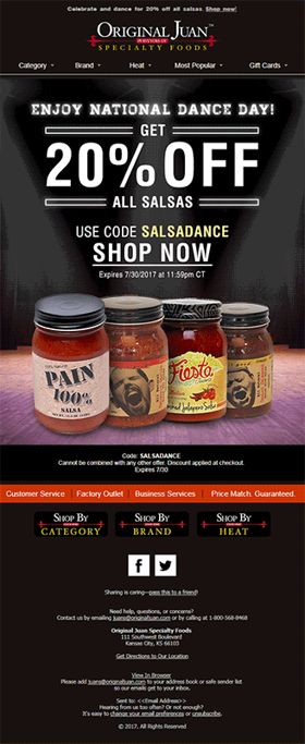
I designed this email for Original Juan, a purveyor of hot sauces, salsas, BBQ sauces and other condiments. It was for National Dance Day in July 29, 2017 and to relate dancing to the products, the promotion was for salsas. Hence, I made a few of the salsa bottles look like they were dancing together on a stage and also used spotlight animation to further highlight the products and the dance theme. Like dancing, salsas come in so many different flavors for the world to enjoy. So I also wanted to present the products in an enjoyable manner. View in browser: http://mailchi.mp/originaljuan.com/shop-1324309
National Dance Day
edejerachel
-

We wanted to show off the length of our iPhone chargers in a fun and interesting way so we made an email that showed them ‘to scale.’
"Get Charged Up"
alancassinelli
-
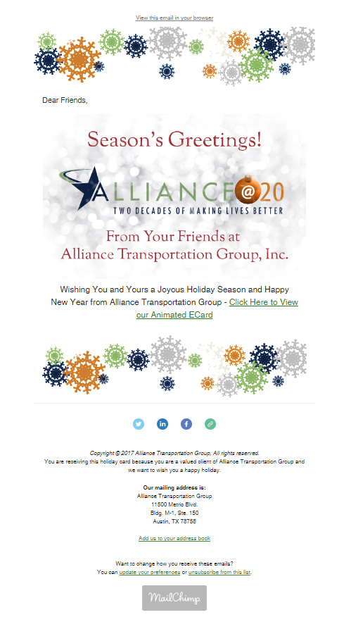
This was so much fun to create and I learned so much! I created the animated falling snow in Adobe Photoshop CC 2018. The snowflakes were created in Adobe Illustrator CC. Alliance is celebrating it's 20th Anniversary this year so I included our 20th Anniversary logo to continue messaging & celebrating that awesome accomplishment. We added a bit of holiday cheer by incorporating an "@" ornament for our "@20" modified logo. I downloaded a free audio clip of sleighbells and looped it to run the full length of video. We sent these our to our clients using MailChimp and directly from our outlook accounts. We have already received merry feedback. It was fun to create and hope you enjoy it. View online here: http://bit.ly/2kwiSal
Happy Holidays from Alliance Transportation Group
AllianceTransportationGroup
-
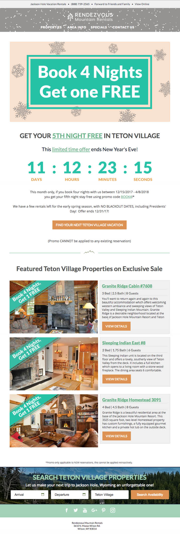
We wanted to find a creative way to promote Rendezvous Mountain Rentals' new promotion for the holidays. We utilized a gif header image for a seasonal twist, a countdown timer to create a sense of urgency and clear CTAs for ease of use. Each element of the email is responsive and works in most browsers and email clients. http://bit.ly/2kGRTc4
Rendezvous Mountain Rentals Spring Special
aleejelly
-
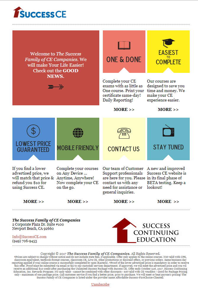
The idea behind this campaign was to simulate a digital post card experience upon opening. Aside from the 'army green' ... the design stays true to Success CE's brand. While it lacks interactive elements, it's sleek layout on mobile vs. desktop makes up for it. On mobile, the first large red block spans 100% as a banner; while the smaller tabs are stacked in pairs. Although creativity is not at the forefront of Insurance Continuing Education campaigns, but there are seldom moments where a bold design proposal is approved by the President/CEO. In this case, I got the go ahead, thus allowing me to let my 'freak flag fly' ... just a little bit. Hopefully, more campaigns with a little color and pizazz will liven up an industry that lacks creative means.
Making the Most out of Insurance CE campaigns
taylorpatton911
-

To transmit the magic of the brand (Club Cinépolis), and the movie, we use the poster and add some snow falling with a gif, and give some glimpses of the movie with other two gifs below.
Premiere of the Beauty and The Beast
KarenP
-
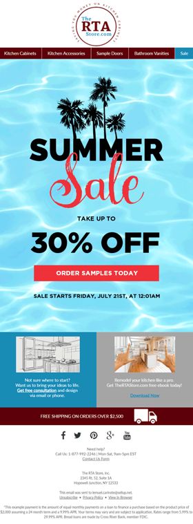
I designed this email in July 2017 for my client RTA. To incorporate the summer theme, I used palm tree images and made the word 'sale' look as if it was written with that unforgettable summer fling's lipstick. By use of the admittedly mesmerizing water animation, the email invites the viewer to jump into the wide pool of choices that RTA has to offer for renovating one's kitchen or bathroom! View in browser: http://enews.thertastore.com/q/1lQgBN5uxqJyAyIPxPQDAmeV7_H0GGzt-hx5ONRdE4Q63u2QnRhjp6fBy
Summer Sale
sellup_nics
-
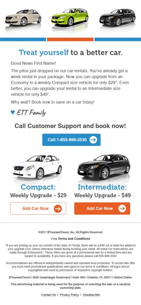
This email highlights the best car rental deals and the GIF in the hero section of the email encourages clients to upgrade. The design is short and simple, but effective. We chose a friendly phrase like "treat yourself" to help clients remember they too deserve a nice vacation!
Car Rental Special
tkg9412
-

This is the April 2017 edition of the @properties monthly newsletter. It features a modern look and a fully responsive mobile-friendly and Outlook-friendly design that looks great across email clients.
@properties video and monthly newsletter
scohen987
-
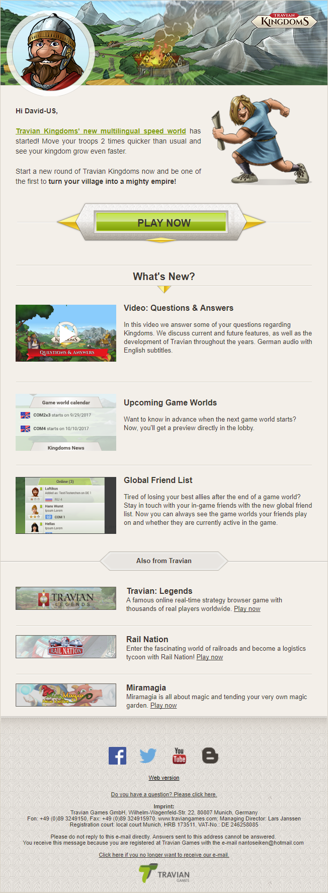
Elements used: Dynamic header for mobile Interactive "what's new" section
Travian Kingdoms Speed Server Start email
a.drozhzhin
-
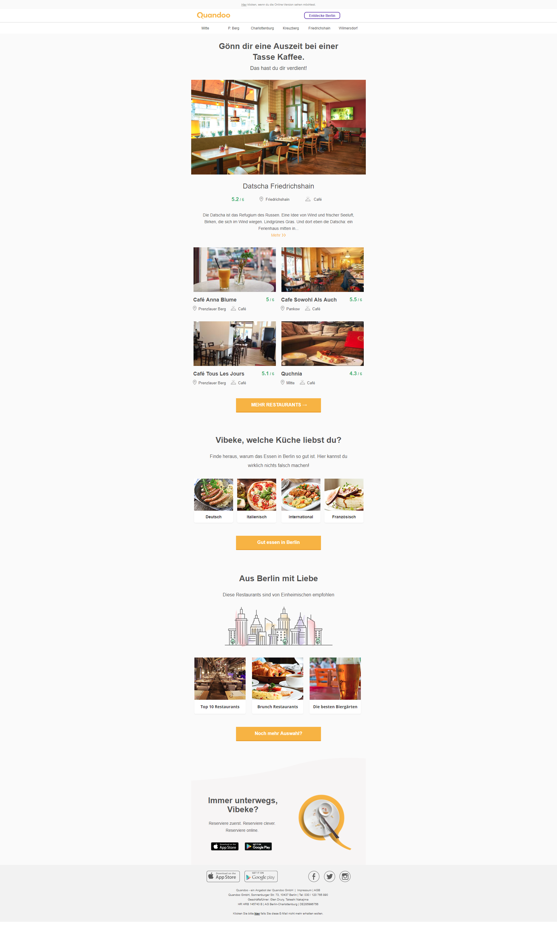
Hi there, This is our freshly redesigned weekly newsletter. It is the work of our in-house design team and was created for us at the email marketing department. It contains a selection of restaurants we send to our customers on weekly basis. We've also added selected restaurant groupings per cuisine types and per specific occasion. These cuisine and occasions recommendations are the best performing ones in the customer's city. This particular newsletter is in German as it was sent to our customers in Berlin in early January. Thanks,
Quandoo's weekly newsletter
MariaMastrafchieva
-
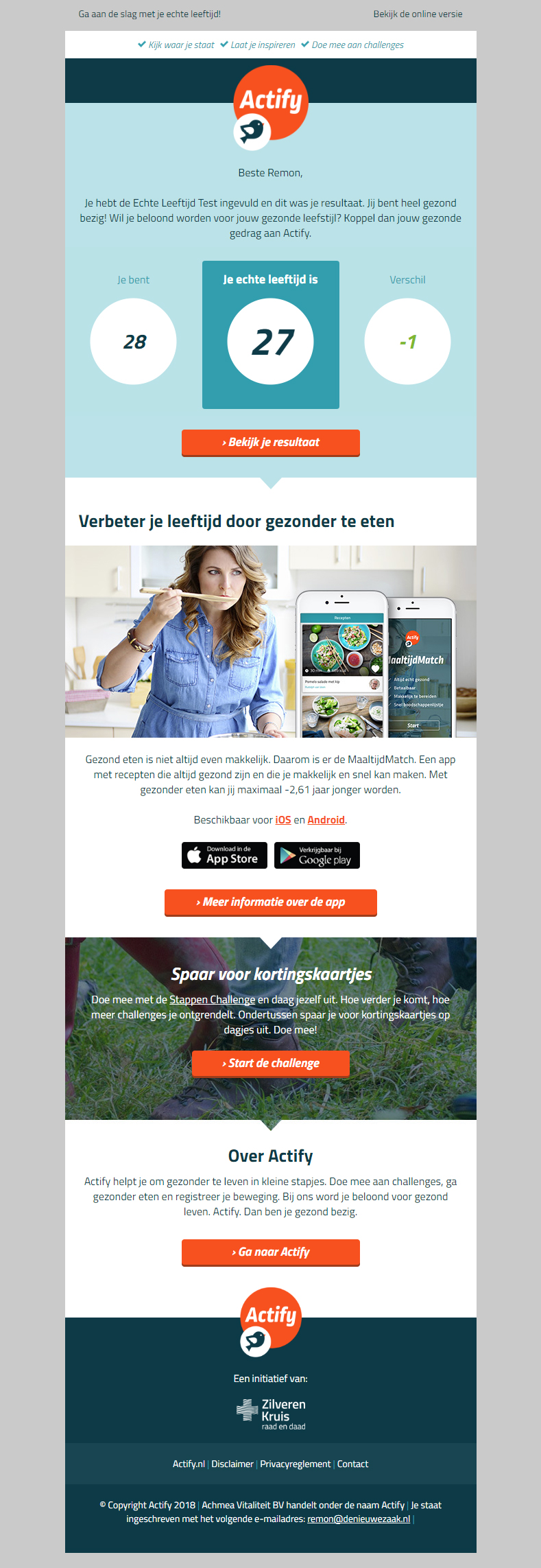
Actify is an online coach that helps people to life healthier. This e-mail campaign is a combination of high quality e-mail design and e-mail technic. The design corresponds with their website and contain different psychology principles such as read arrows to navigate the customers to the right direction. People who receive this e-mail filled in different aspects of their healthy life on the website. Such as age, movement level, food i.e. With a result that the customers receive this e-mail filled with content based on the data they gave.
Actify - Leeftijd test
jkoopman
-
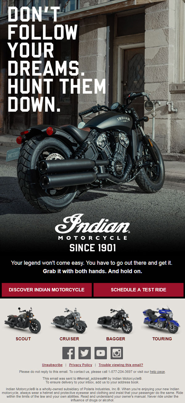
This is the first email a person sees when they join the Indian Motorcycle mailing list. Simple, impactful. No header, just a call to action and a beautiful photo.
Indian Motorcycle Welcome
wemail0402
-
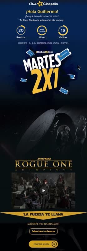
Cinépolis aims to transmit magic, emotions and transform the way in which users enjoy the cinema, not only in its facilities but in every piece of communication that moviegoers receive, thus achieving, fulfilling the promise of offering them the best experience in each point of contact. That´s why in 2017 Mescalina evolved the design of mail, generating a piece focused not only on transmitting its communication objectives, but also on facilitating the shopping experience to aim at the business objectives. In the mail, users can consult information about their profile, see the trailer for the premiere, use their club benefits and then make the purchase decision.
Mescalina. Next Generation Email Marketing
JanikMorales
-
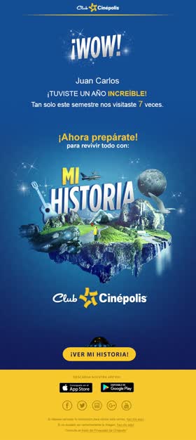
Cinépolis is a chain of movie theater, and it's identity is all about magic and the emotions. The purpose of this mail was to invite the members of Club Cinépolis, the reward program, to rediscover all the experiences they lived on 2017. The design reflects brand's magic and the button has an extra input to drive them to make click.
Discover how was your 2017 with Club Cinépolis
Pamela LopSan
-

A promo email to help create awareness and conversions for one of the classic Raven's Brew Coffees. By leveraging the existing package artwork, we were able to break the design down into fundamental brand elements of Raven's Brew – Alaska, Coffee, and a punny attitude. Bruin Blend is one of the slower moving labels for Raven's Brew and with this email they saw over half of their sales that day attributed to Bruin purchases.
Raven's Brew Coffee – Something's Bruin!
tdiaz
-
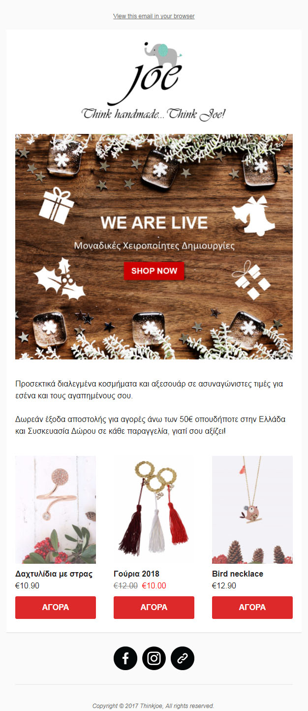
It's a clean, festive design. Fully responsive and very mobile friendly. There is a clear CTA at the top part of the email. The information it includes is to the point and short. No headaches of long texts. The 3 products and the special offer at the bottom help the customer engage and visit the e-shop.
New e-shop launch
nellykatsifi
-

This email was made for our client, Basic Outfitters, to announce their Columbus Day sale. Focusing on positive themes of Columbus Day, such as exploring and a thirst for adventure, the email design features a blue map background with a ship sailing across the sea. The ship appears to have run a course throughout different points of the world, as represented by the dotted lines and white map pins that showcase various Basic Outfitters products. Text animation was also added to the '50% OFF SITEWIDE' in 'Buy One, Get the Second for 50% OFF SITEWIDE' to make the offer stand out more.
Keep Sailing
giannav319
-
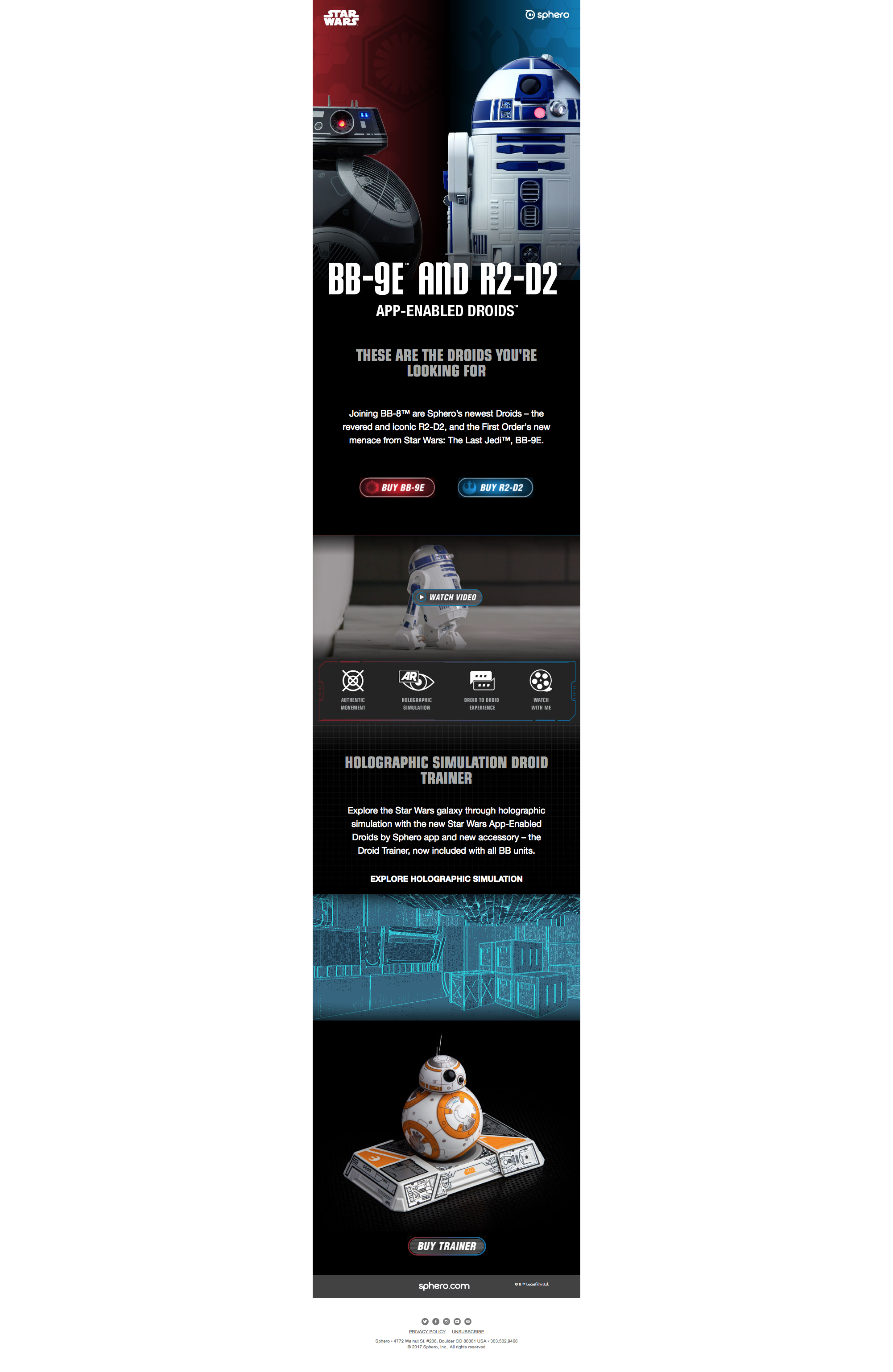
This email announced our newest App-Enabled Droid, R2-D2 by Sphero.
Star Wars Product Launch Email
trevor.rawls
-

Great use of visuals and humor within the emailer. The Honeycombs are interactive as they are anchor points to the elements that sit below the emailer. These elements were give a lot of white space in between them so that you did not see the other parts. You would then have to interact and click to read up on our various offerings. There was a home button which then took you back to the offering area (the honeycombs). If you clicked on email us it automatically opened your email with our address in there. Use this as a door opener for prospective clients.
Pollen Interactive Emailer
Warren
-
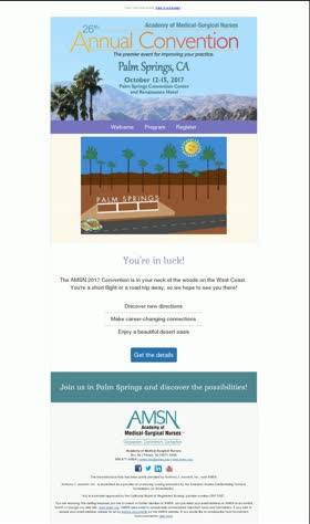
An interactive idea for this email was to use an Animated GIF. The GIF was a simple and fun way to target subscribers near Palm Springs, CA, where the convention was held. The GIF and subject line - Sunshine is here to stay, memorable moments just a road trip away! ☀️ View in browser here: https://www.amsn.org/amsnimages/emailMarketing/2017/0816.html
AMSN Conference - Palm Springs, CA
vwheeler
-

To promote the launch of The Smurfs Movie and the monday promotions of Cinepolis (The largest movie exhibitor in the world) we designed an email where scenes of the movie were shown on gif format integrating a promotion for popcorn and soda.
Monday Combo - The Smurfs
Mescalina
-
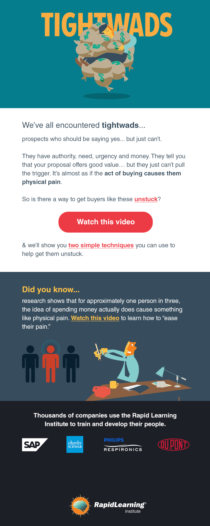
Beautiful illustrations :) with simple messaging and great CTAs. Also, the HTML email includes some GIF animation. I'm fortunate enough as the email designer to work alongside two INCREDIBLE illustrators - who draw all of our illustrations and graphics from scratch. View the email online here and experience the animation: http://bit.ly/2CK1drx
Selling to Buyers who HATE to Spend Money
andrebruchez
-
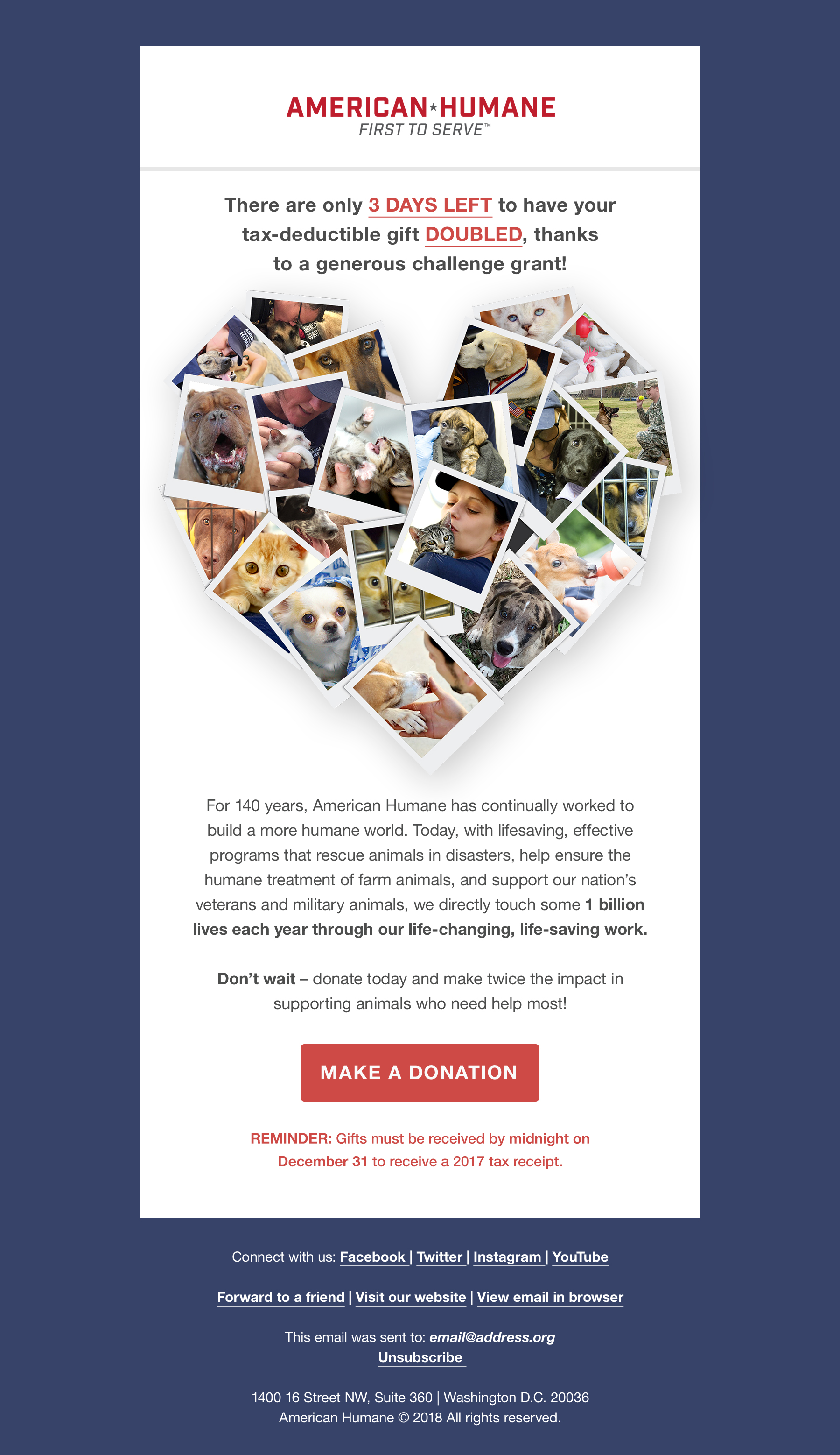
Email captures emotional moments from 2017 yet emphasizing urgency. View the email here: http://bit.ly/2EW3cq9
End of Year Fundraising Email - 3 Days Left
akshay_k
-

This email takes users on a journey based entirely on the input of Experticity's community of experts about what elements make up the ultimate tailgate. It also uses animated gifs to rotate through UGC that was shared for their favorite places to tailgate and the food they make at their tailgates. It is ultimately a good balance of being a great content email created by our community while also subtly making product recommendations available to purchase on our site.
Tailgating Journey Email
jonedwards10
-
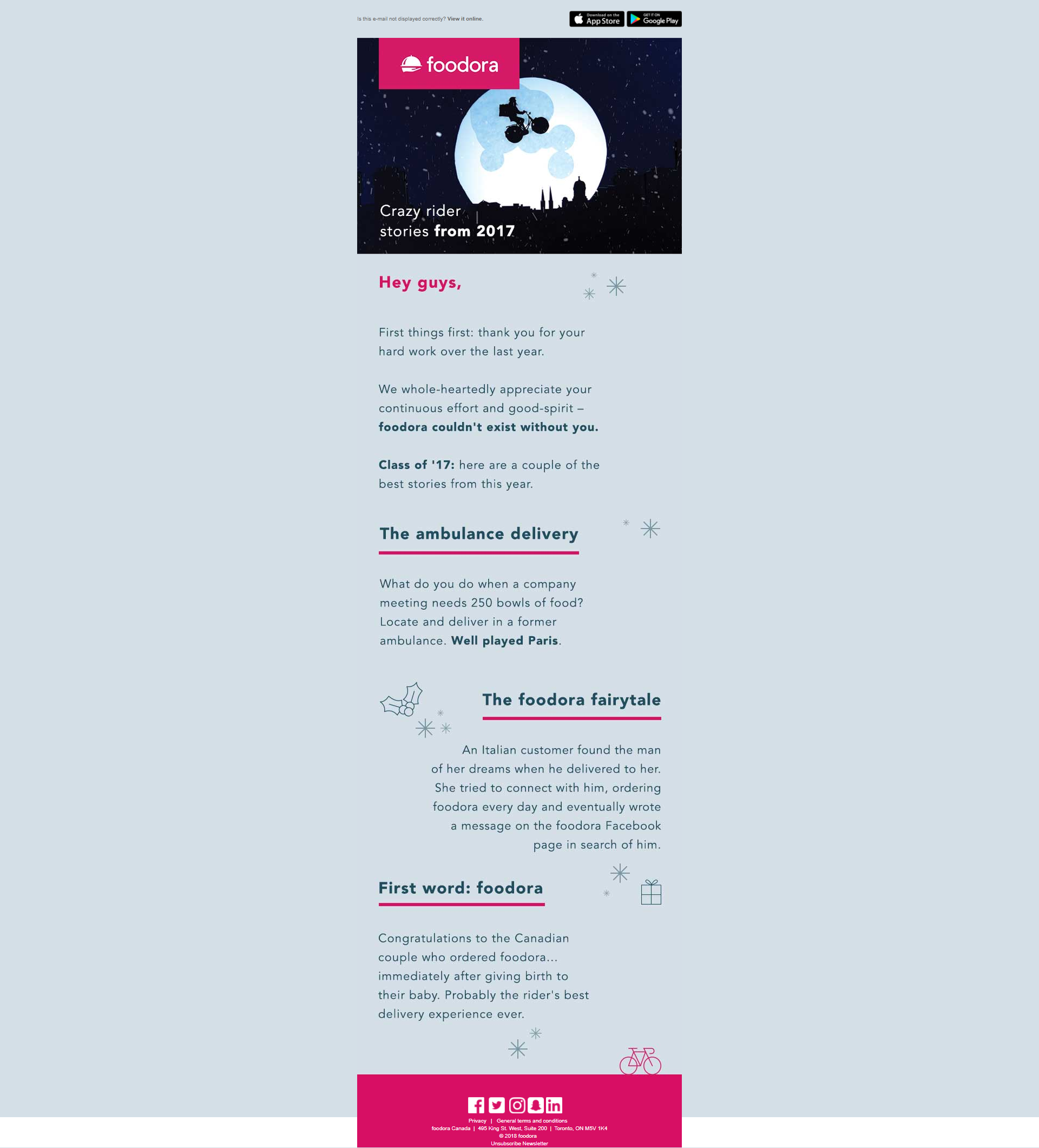
foodora wouldn't be anything without its riders. This email celebrates their work with quirky, notable stories of 2017! Experience the email here:
Rider employee yearly wrapup
xavier.hincker
-
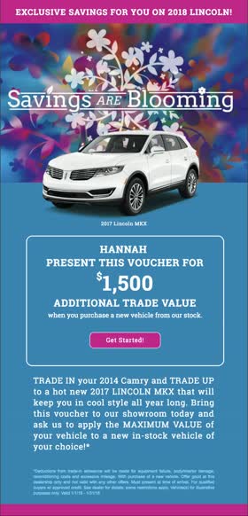
This email looks simple, but uses several levels of interactive and dynamic creative to achieve the end result. Using a .gif for the animation in the header would have resulted in poor graphics and weight. Instead, two images in were used to created a rotating overlay that creates the illusion of flowers blooming. There is a fallback image for any clients that cannot render the animation. Additionally, each individual receiving the email will view the interactive animation personalized with a vehicle that is a close match to their browsing history. This benefits the end recipient and the automotive dealer by matching the customer to a car they are interested in with a promotional voucher for a nearby dealership. This could not have been accomplished with a .gif file, so this technical feat using only two total jpegs is very exciting. Additionally, this email uses hosted web fonts that are readable on several browsers and a fallback sans-serif font for others.
Savings are Blooming
hcdreher
-
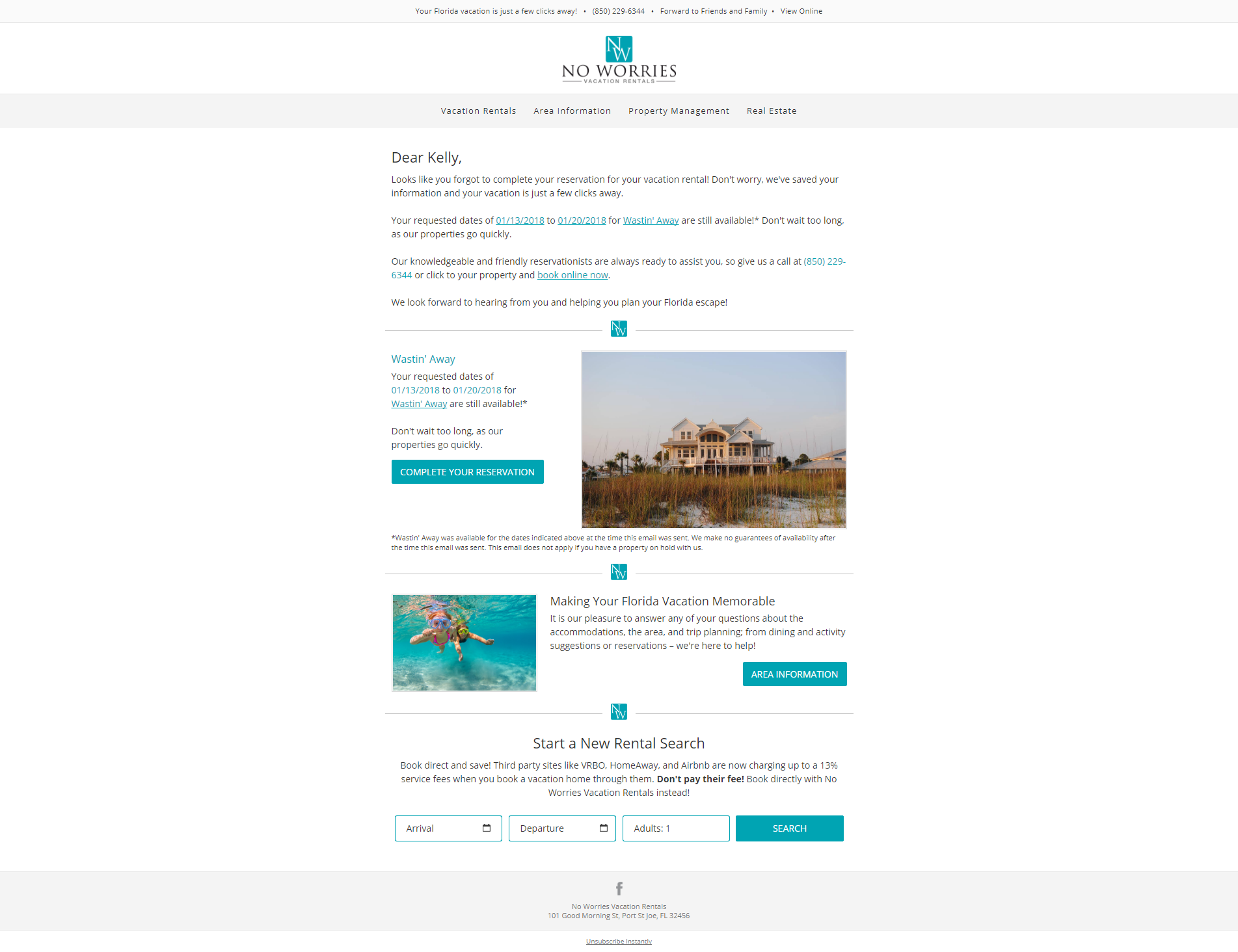
View the live email here: http://newsletter.noworriesvacationrentals.com/t/ViewEmail/d/97333C82C4C4AA25/254E02BF3F27FAE24BD7C9066BE4161D This Shopping Cart Abandonment email is automatically sent 24-hours after a user has abandoned their vacation rental booking. It's really cool for many different reasons! Important reservation information is pulled through (arrival/departure dates, property image, name, and other dynamic content). The best part: the arrival/departure dates are pulled through the URL in all the links as well! So, when the user clicks a link, the arrival date and departure date are already filled in on the site. This email is only sent if the user does not have a current reservation (so if they called to book instead, they would not receive this email). If the property is no longer available, they will not receive this email. If they aren't happy with the property as well, they have an option to start a new property search.
Oops! Looks like you forgot something.
kellygitre
-
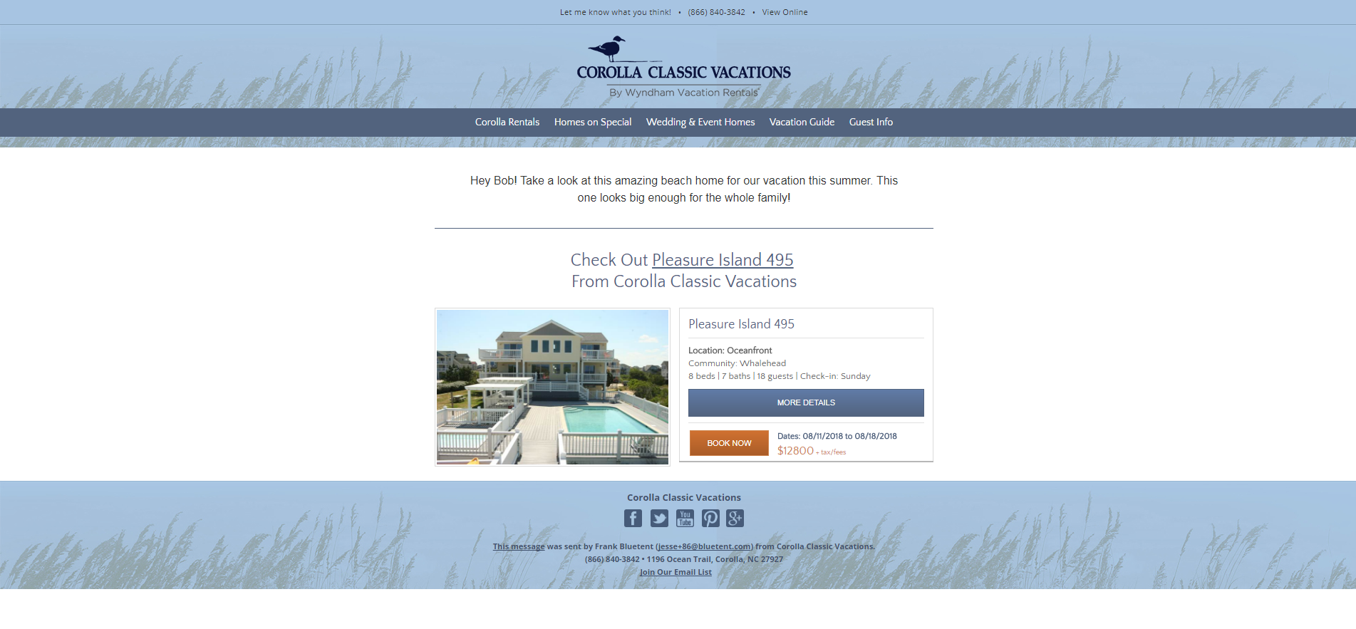
We decided to submit this particular email because it shows an example of how we have leveraged email automation to empower our customers to be able to compete with their much larger competitors. This tool allows our clients’ customers to share specific rental properties with their friends and family. The idea is to make planning a vacation as effortless as possible for our clients' customers. We use dynamic content to implant the Sharer's name as the "From" email address which gives added credibility to the email because the recipient recognizes the sender's. We have seen an average Open rate for these emails as high as 79.8%. The email is equipped with a "Book Now" button that links to the customer's check-out page. Similar to Amazon.com's "1-click ordering," this feature allows us to provide our clients’ customers with a way to book directly from the email. Here is an online version: http://newsletter.corollaclassicvacations.com/t/n/d-e-2a2605b1f59a11e7b0c6814f43cc1dc9-l-v-l-l/
Automated Email - Enhanced Sharing - BlueTent Marketing
jessebluetent
-
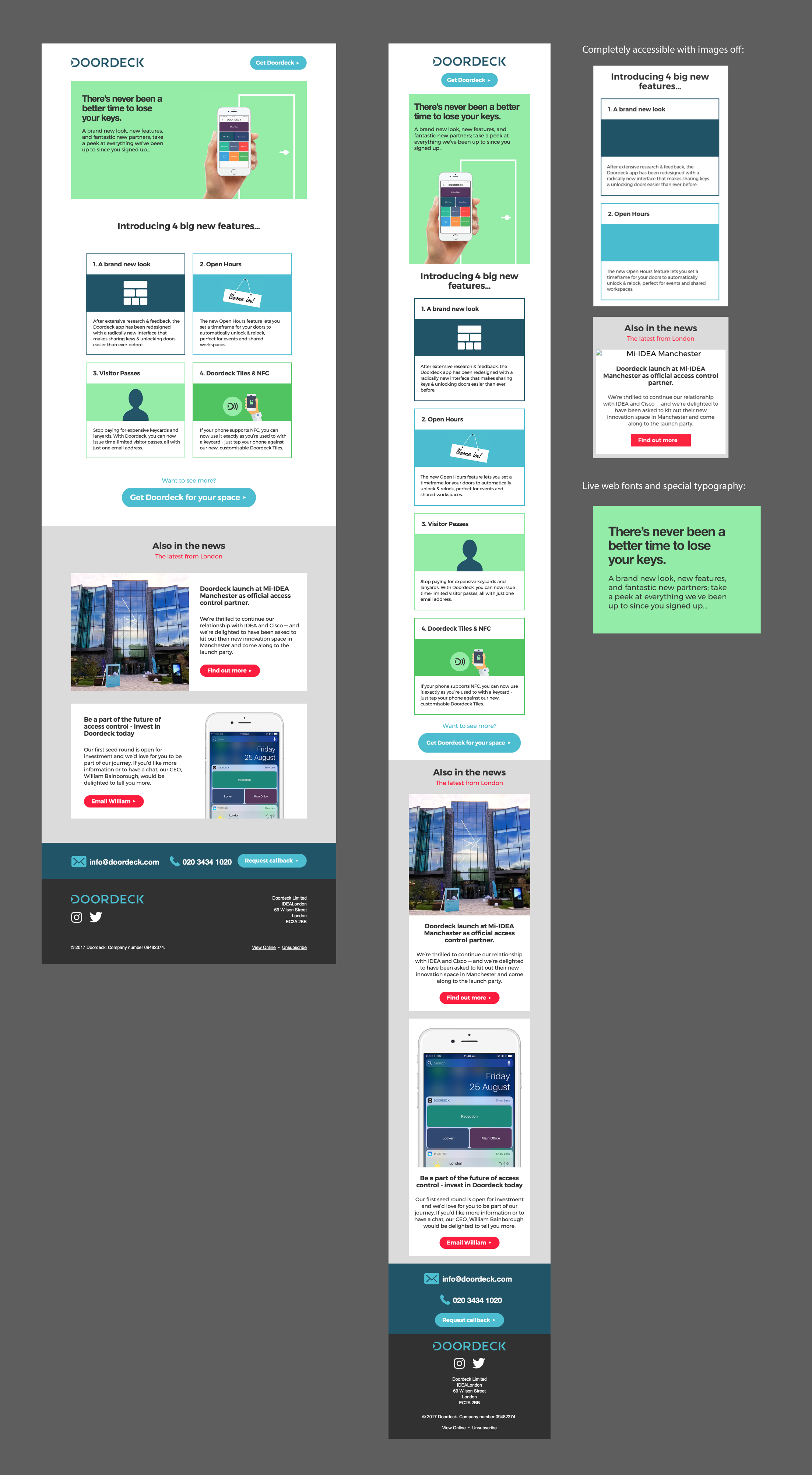
Whilst not packed with features, the rebranded Doordeck newsletter was designed from scratch with accessibility being the key priority, whilst still trying to maintain a great, flexible design for both desktop and mobile. Any and all text you see in the newsletter was coded (and masterfully so by EmailMonks) 'live' into the email — meaning no matter what device you viewed it on, and whether you had images on or off, you could still read the entire message and have it look great. Using Google Fonts and special attention to detail in typography and colours allowed us to be more on-brand then ever before and push the boundaries of what we were previously doing through MailChimp.
Doordeck - Rebranded Newsletter
olly
-
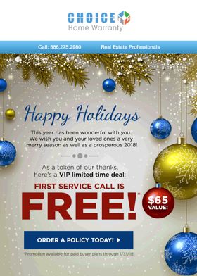
This email was created for a longtime client, Choice Home Warranty. It was a happy holidays message sent in December 2017, to thank their realtors for the year and send them well wishes. The realtors' first service call was exclusively offered for free, with the design highlighting the word 'free' through text enlargement and animated sparkling lights. From the use of elements like pine tree leaves, Christmas ornaments, snow and the animated sparkling lights, everything about this email was designed to be festive and opulent. View in browser: http://news.choicehomewarranty.com/q/ZoX16WVWjqjVCy4_9C4gGzwtIIpcQGVOinBU0QEYwaPKtrKQrxnLO2P0y
Holiday Realtor Newsletter
mark.fernandez
-

LIVE EMAIL: https://s3.amazonaws.com/atk-email/2017/ePromos/11_November/1107_NutritiousDelicious/171107_NutritiousDelicious_V3_CleanEatingGeneral.html This eye-catching email from America's Test Kitchen really helps bring our newly published cookbook to life. By using bold colors and photographs from the book, the email translates the promoted print product to the digital space, creating a compelling email with clear messaging. Who knew eating nutritiously could be so exciting?
America's Test Kitchen's Nutritious Delicious Cookbook
stephanie
-
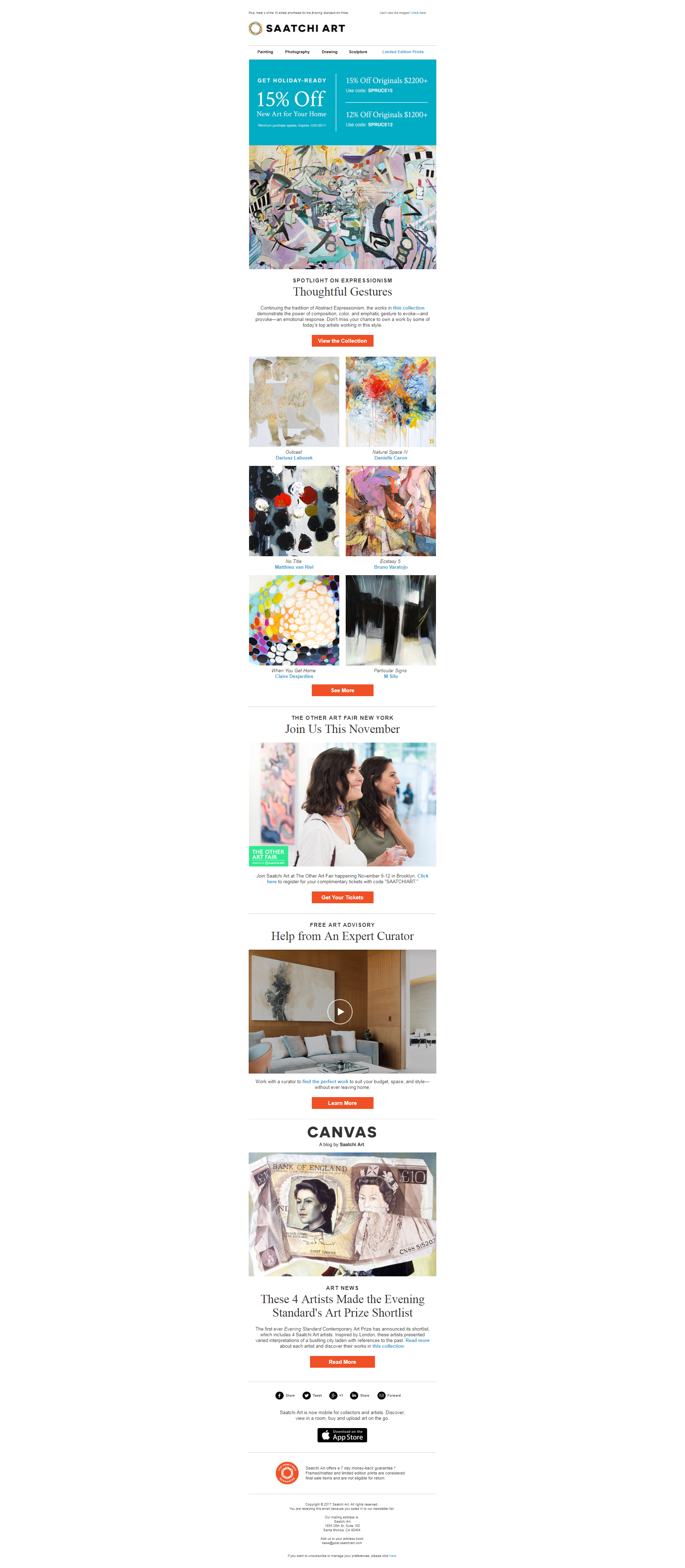
This newsletter should win best email EVER because: -- it has a good balance of text-image ratio -- it is coded with responsive elements (the six artwork crops stack and CTA buttons are larger on mobile view) -- for a newsletter, it offers a variety of content for subscribers (artwork collections, invitation to an event, advisory service, blog post) View online here: https://links.post.saatchiart.com/a/1008/preview/7448/307554/580e063574a56eaee68b3f5dfd8aafb3aae090e5
Thoughtful Gestures
llchylie
-
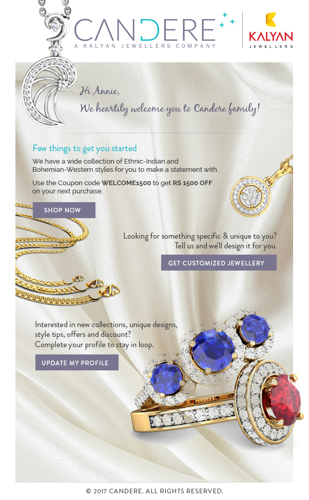
The design is very suited for a jewellery brand with all the CTA important to take further actions.
Email Design for a Client
dinesh1201
-
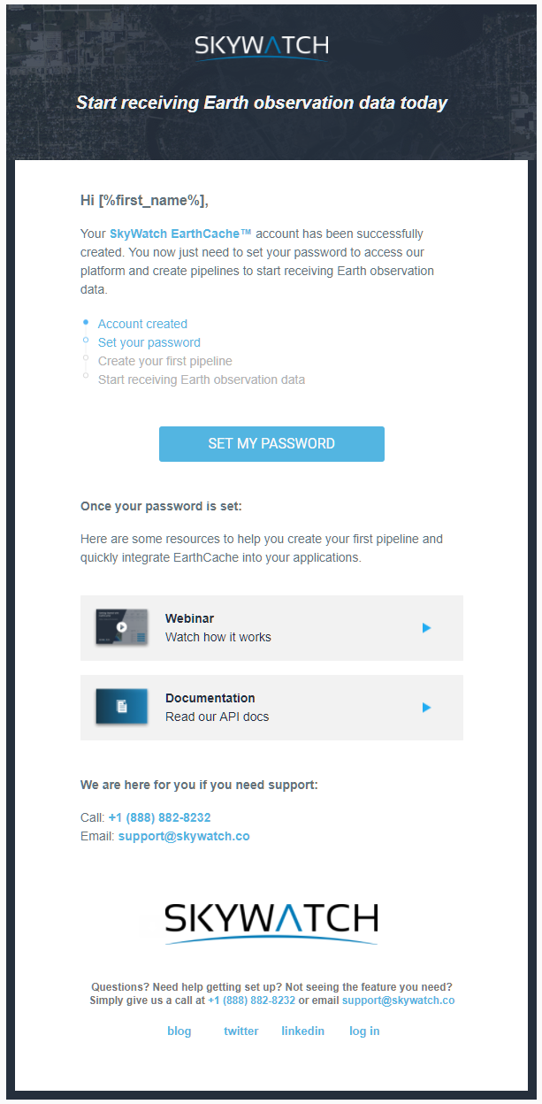
This is a brief email welcoming new users into our platform and giving them the tools they need to get started quickly.
Welcome email for new accounts
MarineDumontier
-

The golf industry is flooded with emails using old templates, too much narrative content, and feeble attempts to promote products. Our goal is to give our products, services, and promotions visual impact. Our last email included a follow-down line to draw attention to the surprise at the bottom (discount) but more importantly to have the opener view the offers below the top image.
Psst... Surprise inside!
keenercoug
-

This mailer is about "giving the gift of wellness". By purchasing a DNA test for a special person in your life. We have used a GIF on the header of the mailer to captures users attention.
DNA Mailer
Vincent Cook
-
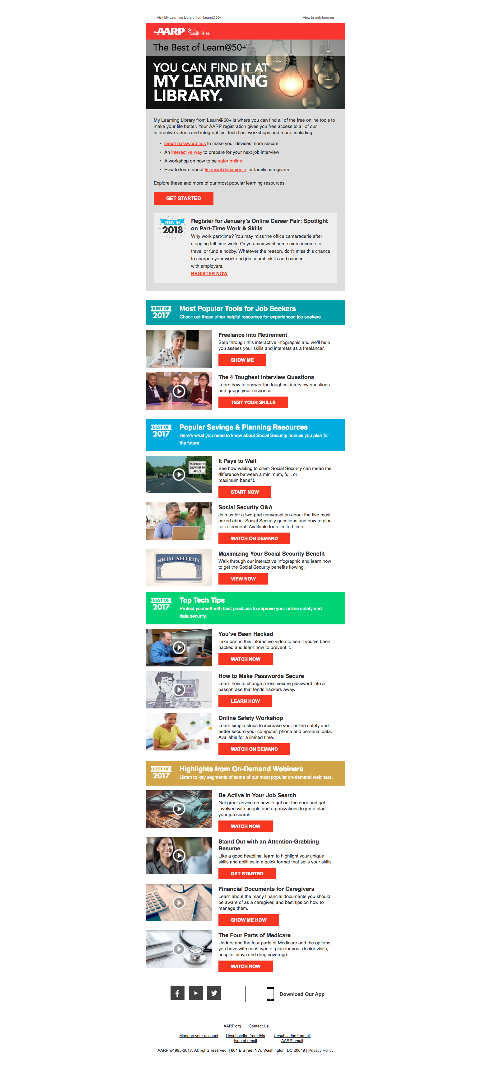
Working with our client, AARP Programs, ThomasARTS created an email that highlighted the group’s best-performing content in 2017, including tools for job seekers, popular savings and planning resources, top tech tips and highlights from on-demand webinars. The newsletter-style email design worked to showcase the true breadth of AARP Programs’ offerings, which support key AARP business priorities: Work & Jobs, Caregiving, Online Safety, Savings & Planning, and Technology. These emails were personalized and deployed to segmented recipients based on their previous engagement, interests, and location. View Email Online: http://bit.ly/2oGc0fT
AARP Programs Best of 2017 Email
claire.robertson
-
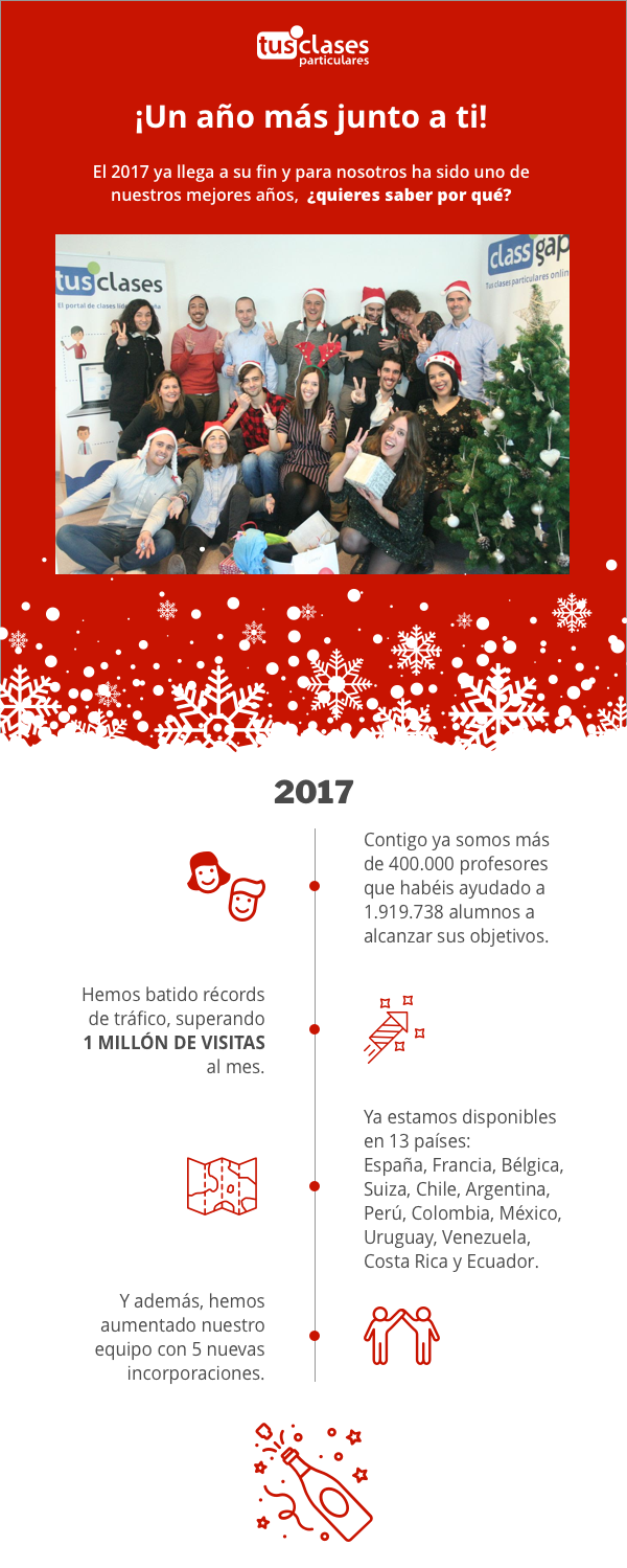
Nice and clear design of our christmas greeting e-mail. Plus we are very good looking, ain't we?
Christmas greetings from Tusclasesparticulares
sandra.falagan
-
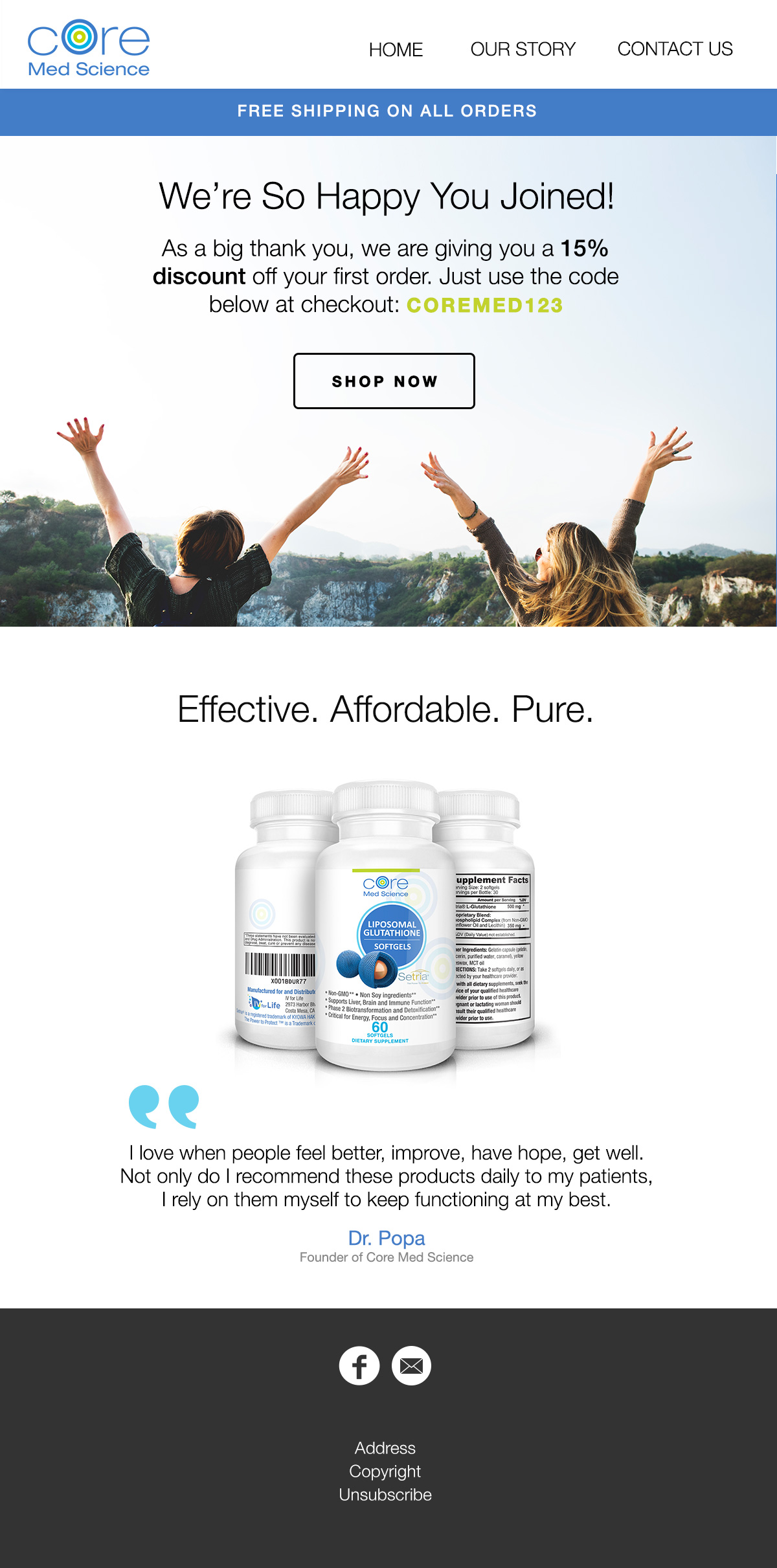
It's a simple design, but it's captivating and fun. The content is short, but it gets the message across effectively, while keeping the attention of the viewer.
Core Med Science Welcome Email
ejung
-

As a fitness brand, the goal is to inspire the customer and get them excited to start working out. The gif displays aspirational words to encourage the customer to reach their fitness goals. The zig-zag layout lets your eye fall down the page to the yellow "Get Started" call to action!
Body by Giles Welcome Email
ambutterworth
-
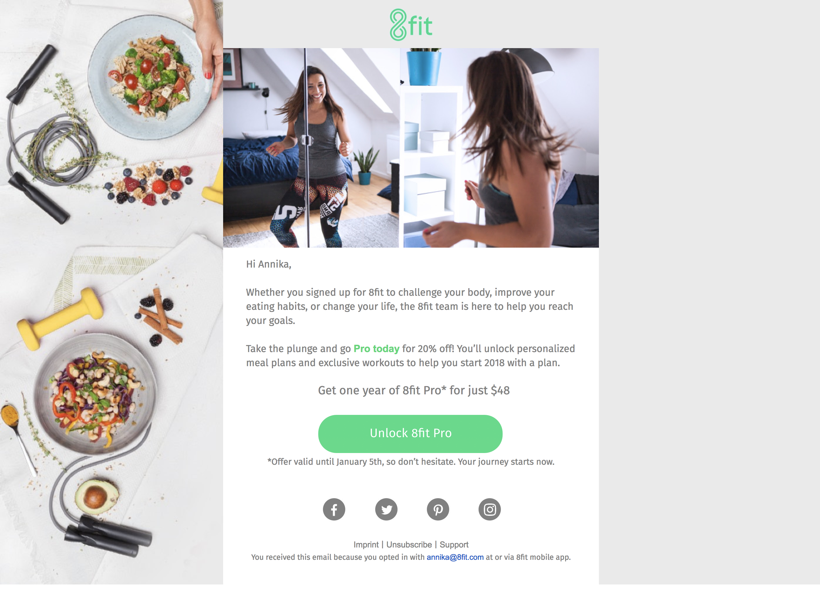
Its a clean responsive design that fits our new website. A scalable background that make the design round and interesting to look at.
Happy New Fitness Year
Annisan
-
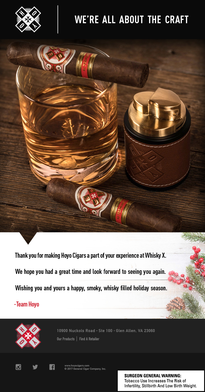
It's a simple design to act as a reminder of a function one attended , as well as spreading some holiday cheer.
HOYO - Whiskey X
goochink
-
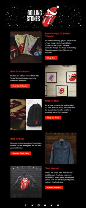
This email was created to serve a very specific purpose - market high pricepoint and limited edition products that dropped around the holiday season within the Rolling Stones online store. In an effort to put a lot of content into a small space, we created a two-column design that turned out to be very visually appealing and also mobile-friendly. Plus, we had some fun with our Creative team and created a new Logo Header at the top, which is a GIF that has snow falling in the background of the logo!
Rolling Stones Holiday Gift Guide
kelsdetweiler
-
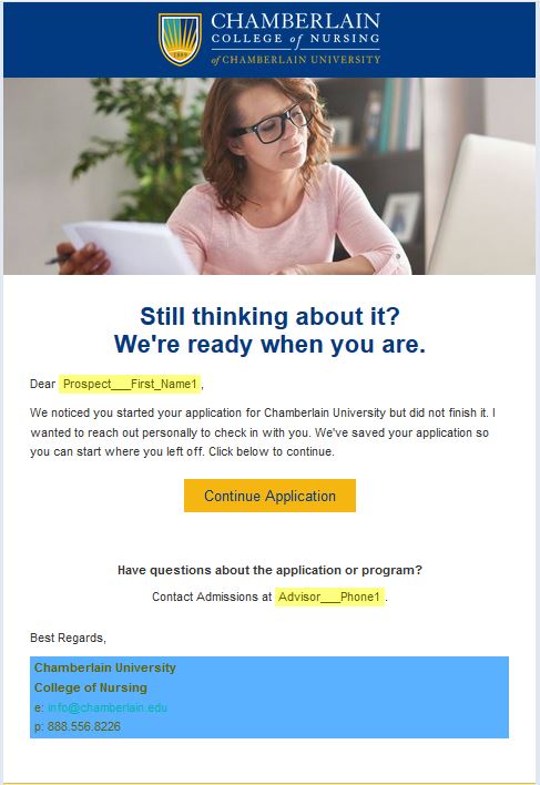
It is the best email because it is "to the point", "succinct", "aesthetically designed", "encourages you to take action". 90% of the clickers, clicked on the Continue application button in the email - which proves that the design really worked since we met the goal of encouraging the abandoners to come back and finish their application
CCN Abandon Application Email
ashammann
-

This is the first piece of a multi-stage email campaign I designed in-house at Flow Automotive Companies, advertising a luxury vehicle subscription service we offer called Drive Flow. Drive Flow is powered an app designed by Clutch so I felt that showing the interface would be a prudent move to show potential members how the service works. The campaign was targeted to our subscriber base in Winston-Salem, NC, whose vehicle lease was expiring in the next 3 months, and focuses on practicality and inclusiveness of a Drive Flow membership. The top portion of the email is an animated GIF, so please check out the online file: http://images.flowmediaserver.com/emailpages/driveflow-bf-campaign1-msrp-oct2017.html . PS -- you'll find Salesforce-compliant variable data links in the online email (%%FIRSTNAME%%, et al.). I filled these in on contest entry JPG so it would look more like what's in the actual end-user's inbox. Thank you in advance for your consideration.
Drive Flow Campaign
LHill
-
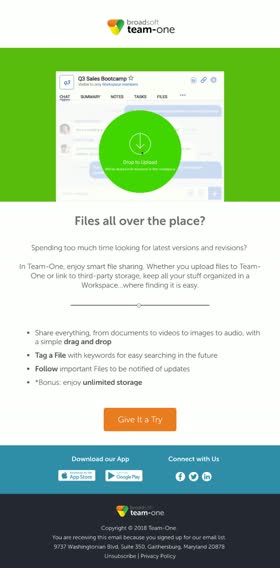
This email is part of our Welcome series for new users. It introduces Team-One's file sharing feature and gives a few pointers on how to work with files in the app. We use bullets to keep the content short and snappy and light on the eyes. The CTA encourages recipients to log into the app and try sharing a file with fellow users. Experience the email here: http://bit.ly/2CtSrJO We use a GIF in the header graphic to demonstrate just how easy it is to simply drag and drop a file into a Workspace.
Team-One Nurture Program: Files
amathz
-

Frontier sends out this checklist email 72 hours before a customer's flight. This email helps prepare flyers for their upcoming trip and provide relevant information for their upcoming trip. The email has been redesigned to be responsive, meet business goals, and improve the customer's experience. The checklist email is extremely dynamic and personalized - messaging and content is tailored for the customer and their booking. The design allows customers to visually understand what they have purchased for their trip and what Frontier offers. Like a to-do check list, boxes are checked if the customer has purchased the products, and unchecked if not. Information provided is not only based on important trip information but also frequently asked questions/topics. Furthermore, this email can be used as a digital reminder or printed off as a physical trip checklist! The checklist email effectively provides customers with a lot of valuable information into digestible and familiar pieces.
Frontier's Upcoming Flight Checklist
Danran
-
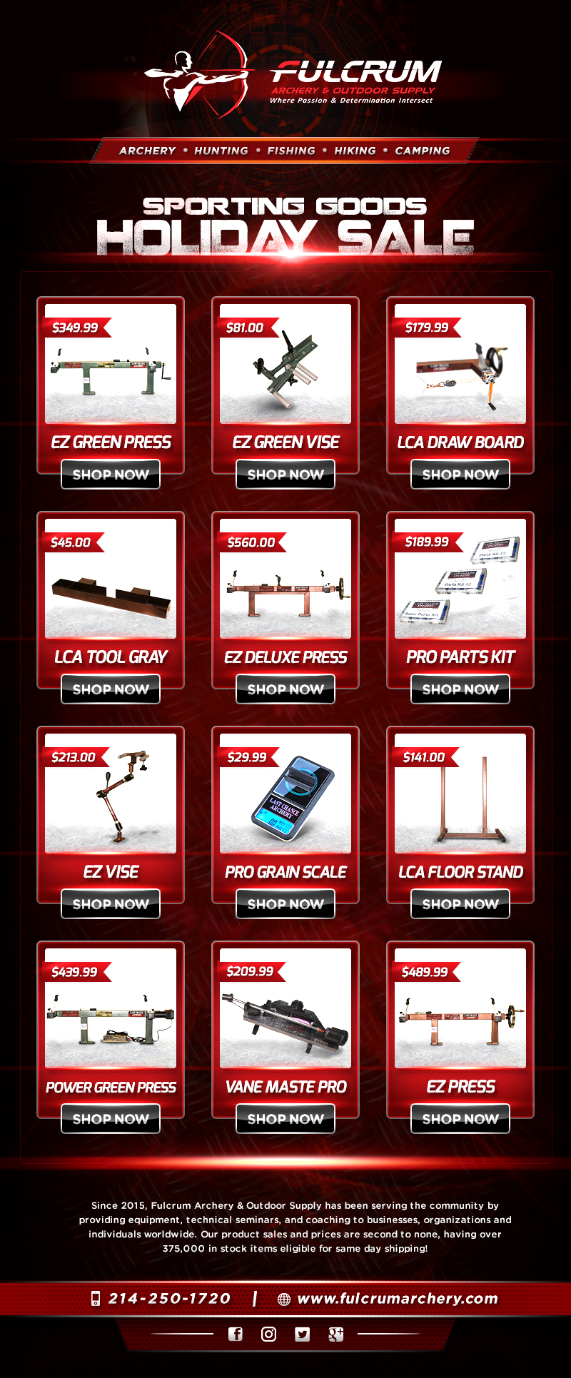
Visually Appealing Design, Getting much attraction to the product and Full filled the customer's satisfaction.
E-Newsletter
maryjay
-
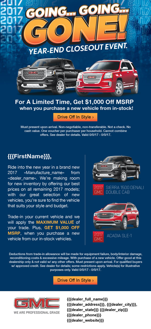
Going.. Going.. Gone is a digital campaign I designed for our automotive clients, promoting a "model year-end closeout". The headline combines Photoshop and Illustrator effects. The final email didn't have any animating features.
Going Going Gone
gerardm
-
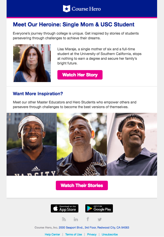
This email features one of our student heroes as well as our Master Educators. The email design uses a couple different column configurations, bold images, and a clear CTA (written two different ways) to peak interest and encourage users to click to view the video content it promotes. This was our first email that used with photography instead of graphics, and it strategically places our extraordinary users at the forefront of readers' attention.
Our Hero Students
eschickli
-

In December 2017, I was tasked to design a tiered sale email for PRPS Jeans. They wanted it to be simple and clean, yet a little different. Using their brand colors of black and purple, I emphasized the offers and the 'shop now' button accordingly. Then for that extra cool factor, below the text, I created an animation highlighting some of their various looks for men and women. A moving spotlight lands on each outfit. View this email in your browser: http://mailchi.mp/prpsjeans/windsor-chevelle-fit-840565?e=[UNIQID]
Friends & Family Sitewide Sale
christian.deguzman
-

This email was designed for our client, Basic Outfitters, as a light-hearted holiday greeting. It plays off the popular Christmas carol 'Do You Hear What I Hear?' and musical notes were placed around the altered lyrics. A bright red 'START HERE' button invites the email recipients to refresh their basics. We also used an image of carollers with a subtle musical note animation, to make it look like they're actually singing.
Do You See What I See? Do You Hear What I Hear?
DanWeiss
-
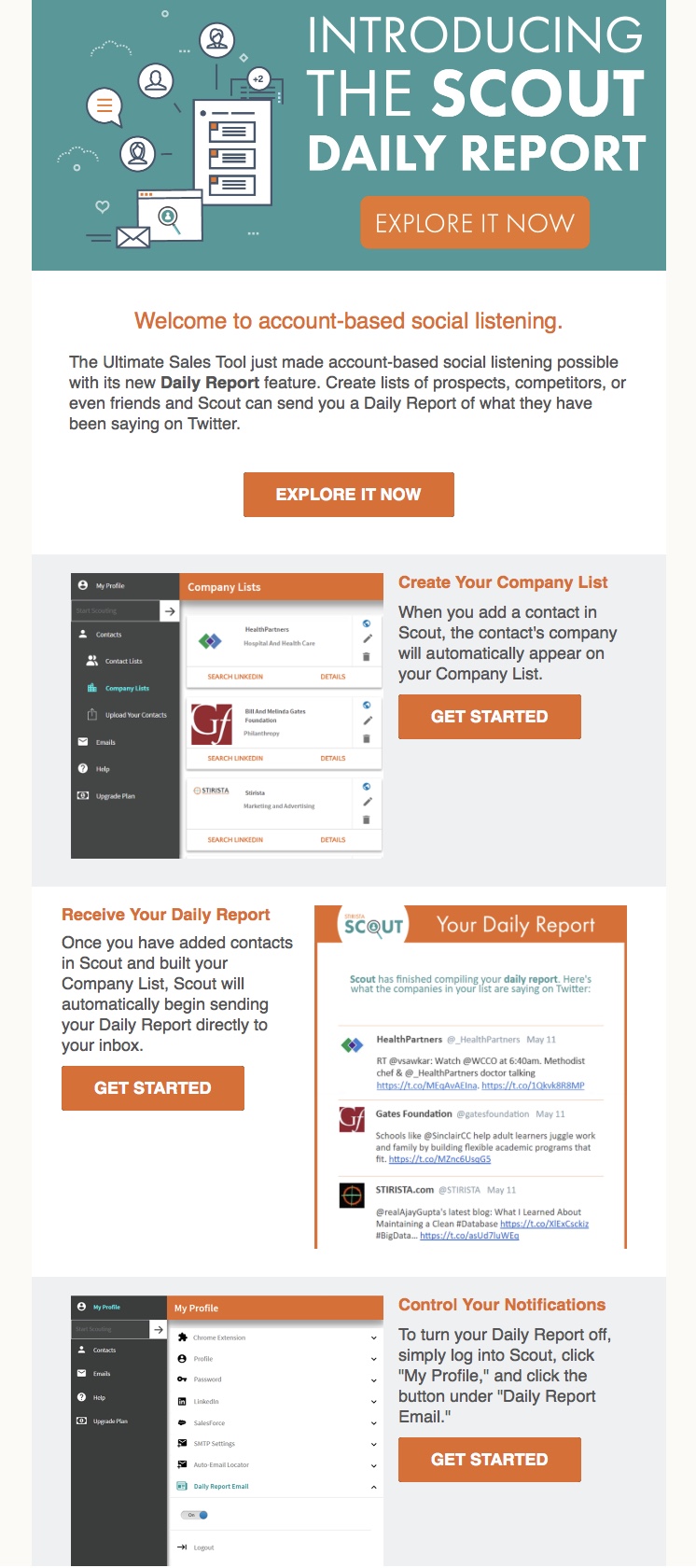
This email announced a new feature of Stirista Scout, our B2B sales tool. The goal was to give Scout users all the information they would need to get started with the new feature, including how to disable it. And since this was a B2B-oriented email, we had to assume that many recipients would read it in Outlook, which disables images by default. With that in mind, we designed the email to be as usable as possible without images enabled.
Introducing the Scout Daily Report
p.howard
-
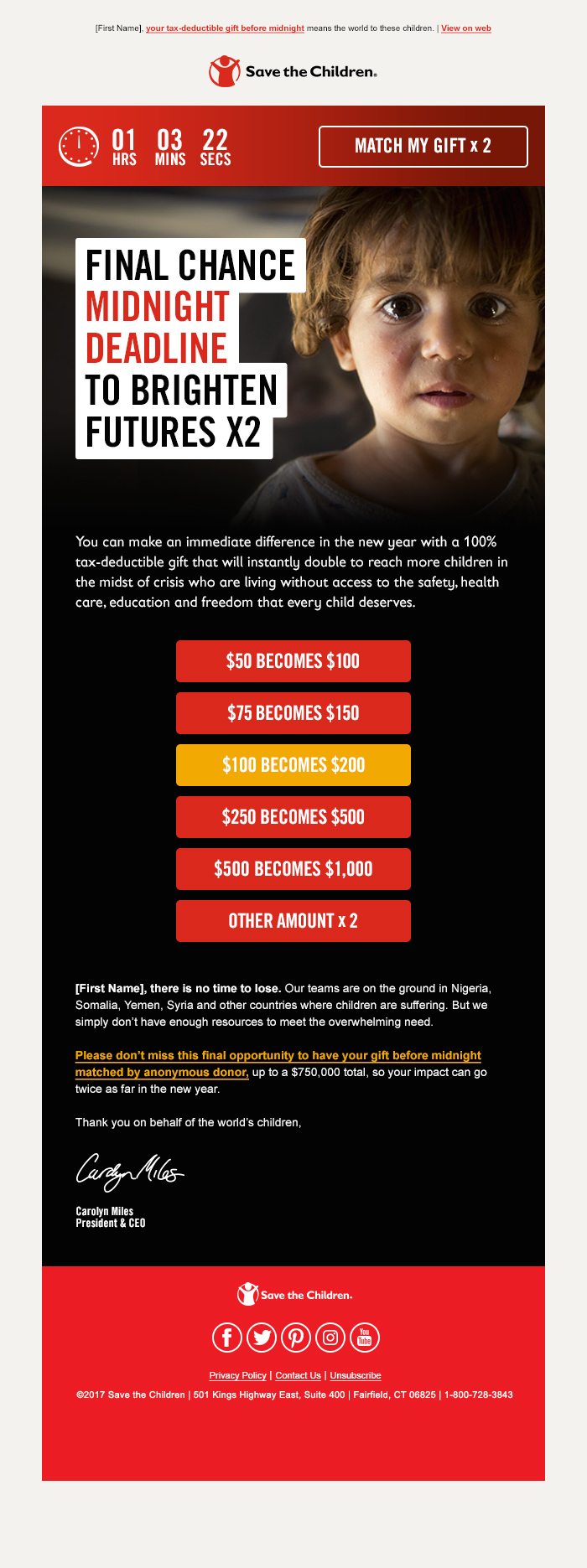
Content & Strategy - Save the Children, Charity Dynamics Design - Charity Dynamics Development - Cheetah Mail, Moveable Ink The final message of an eight message year-end series, this fully responsive email featured bold, emotional photography, a darker-than-usual color palette, and a live timer counting down to the midnight deadline for 2017 donations. Save the Children works around the world to give children a healthy start in life, opportunities to learn, and protection from harm. Online fundraising provides a crucial part of their annual operating budget, and the end of year email appeals generate a significant portion of that revenue.
Save the Children - End of Year Non-Profit Fundraising Appeal
jvincent
-
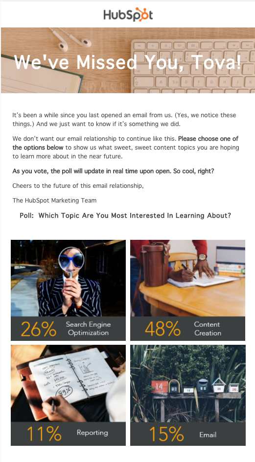
Not only did this email campaign win the hearts back of our un-engaged contacts, but we were also able to get them to vote in this live poll! Recipients were able to choose the content they wanted to learn most about next and when they reopened the email, the percentage in the live poll percentage would reflect the option they clicked. View Online: http://bit.ly/2DhAjXy
HubSpot Re-engagement Campaign (with live poll)
MGreaves
-
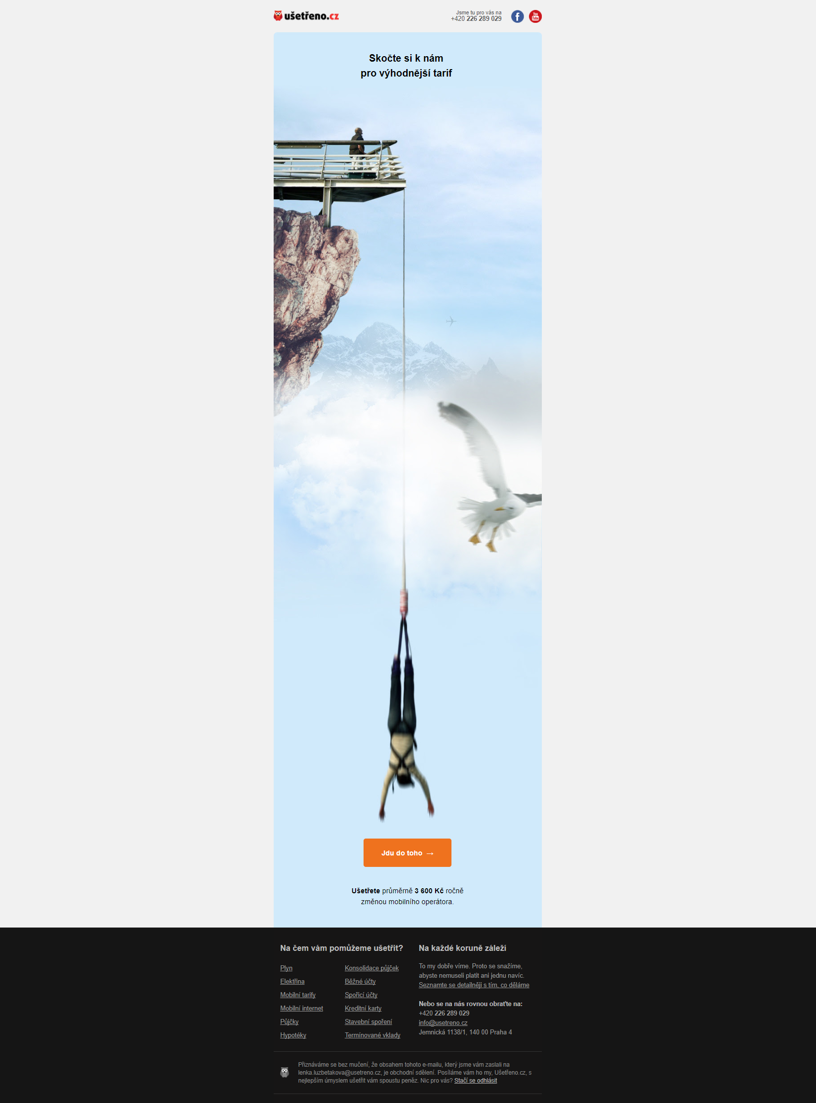
Our “Jumper” email encourages recipients to do something, they are probably afraid of. Especially in this email, we encourage them to look at our online comparison of mobile tariffs available on the market and find for them the one that suits them the most, which can even help them save significant amount of money. Because we realize that trying new things isn't usually easy, we want them to do the first step and we will take care of the rest.
Jumper
Lenka
-
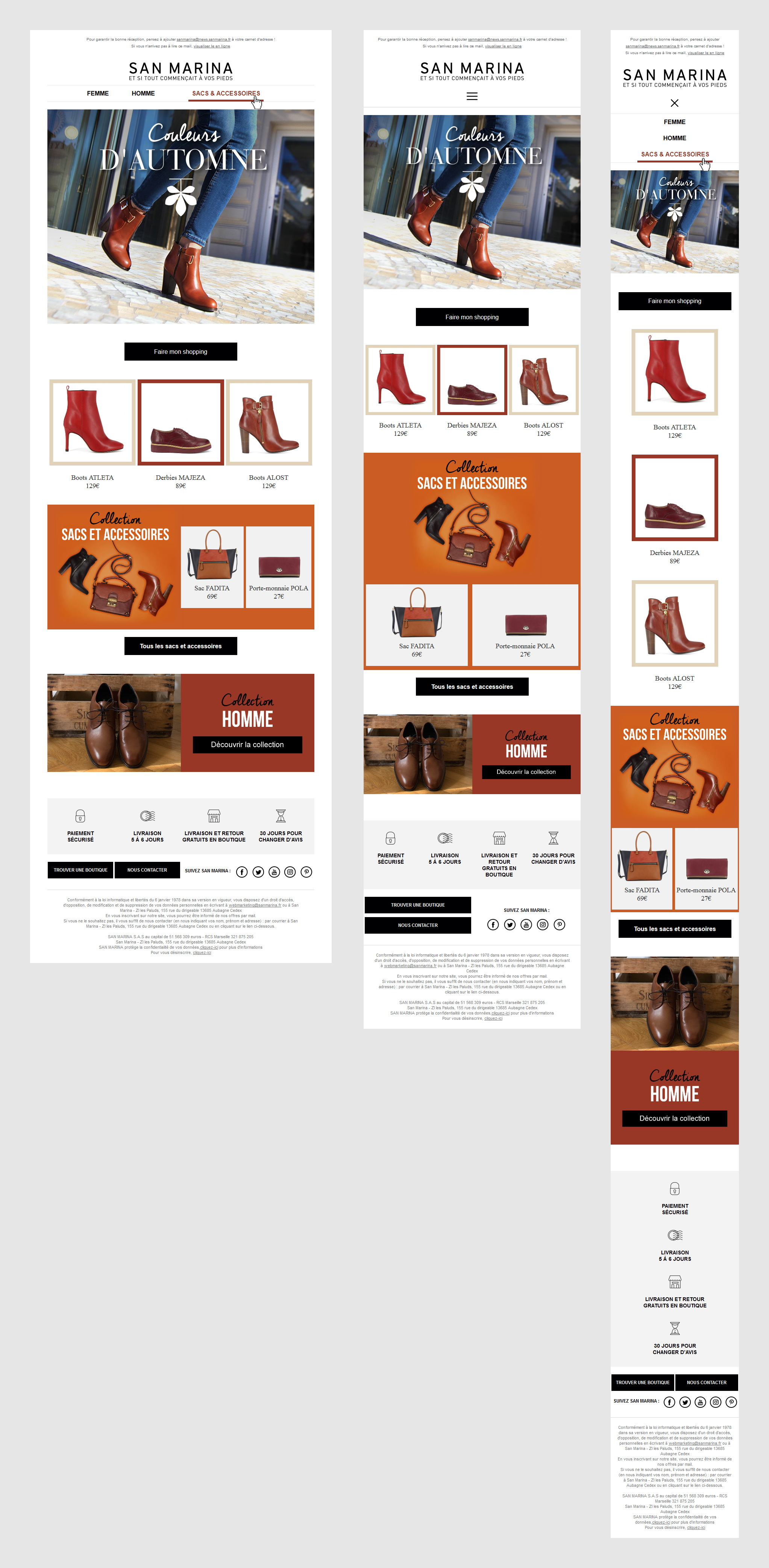
Our “Jumper” email encourages recipients to do something, they are probably afraid of. Especially in this email, we encourage them to look at our online comparison of mobile tariffs available on the market and find for them the one that suits them the most, which can even help them save significant amount of money. Because we realize that trying new things isn't usually easy, we want them to do the first step and we will take care of the rest.
Couleurs d'automne
baptiste
-
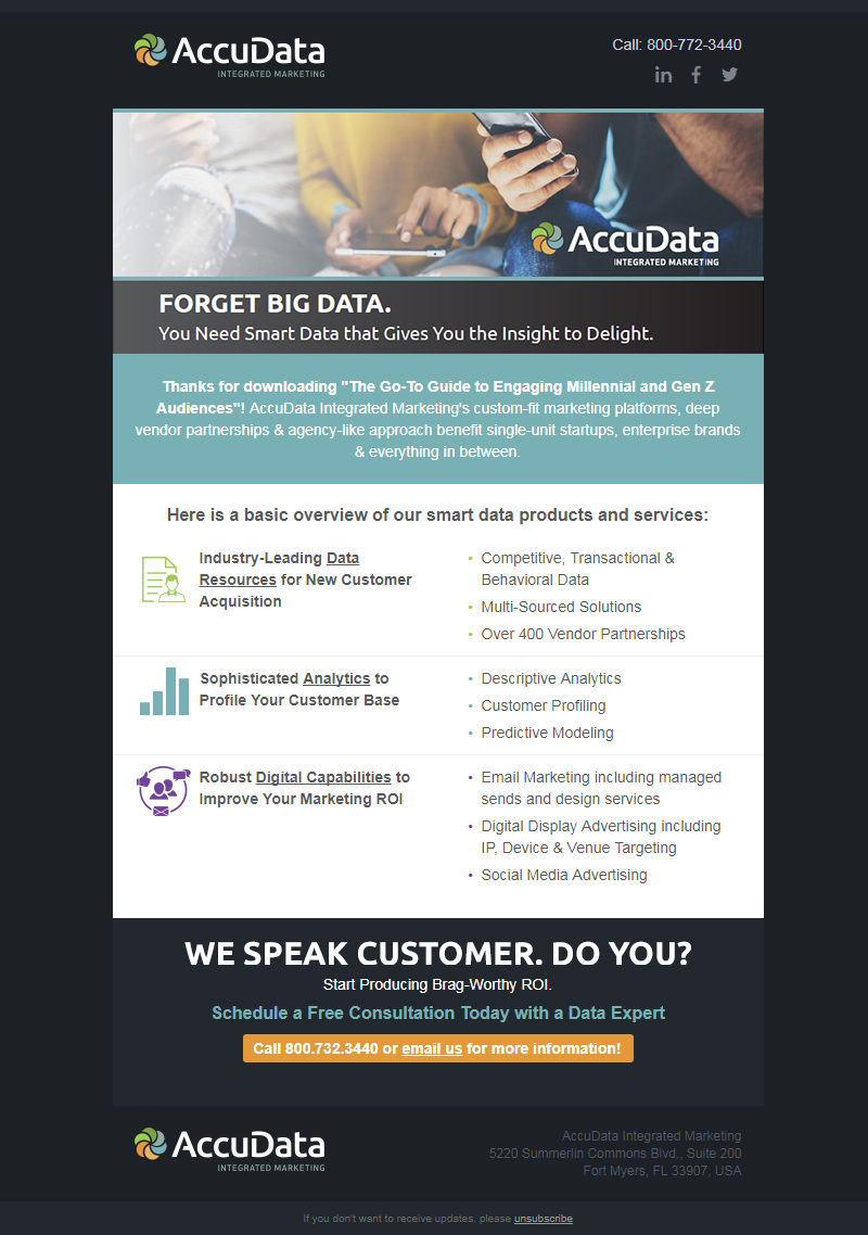
This email was 1 of 4 in a lead nurturing strategy designed to introduce the company to incoming leads from a native ad campaign.
SmartData Overview
Jes214
-
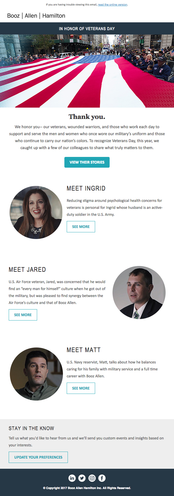
As one of the largest defense consulting firms in the world, our clients and colleagues share a common thread: military service. We used this Veterans Day email to honor their commitment and thank them for their sacrifices by telling some of those stories of service. This clean design leverages video to highlight and showcase the faces of military service across our firm and provide readers with personal stories they connect with immediately. See the full email and view the videos associated with this campaign: https://litmus.com/builder/769d3b3
In Honor of Veteran's Day
maddybrady
-
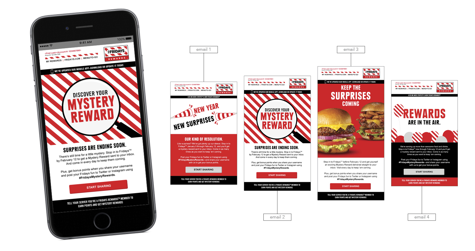
The creative for this campaign was developed around the spirit of the holidays, specifically New Years. Copy included starting the year off right by receiving an instant Mystery Reward for coming in to Fridays. Once the email hit member’s inbox the campaign became omnichannel through calls to action for members sharing their engagement through social media channels about which mystery reward they received. Email communications pointed directly to receiving mystery rewards after each dining experience. The creative leveraged the use of LiveClicker for members to view the scratch off capabilities and advanced animated GIFs. Once the campaign launched there were multiple email sends and other channel support to continue the awareness. In total there were emails directly on the membership drive, thank you follow up emails, the 1,000-point super bonus promotion emails including progress reports, SMS messages to members, and SMS push notifications. Nearly 400,000 New Members in 41 days.
TGI Fridays Rewards Program 2017 Q1 Membership Drive
tsaks
-

This is an interactive e-mail that shows the hero up top with a gif that moves the eyes through a short quiz which helps to recommend a product based on their selections. The style is clean and minimalistic with easily digestible content and product features. View Online: http://enews.cellucor.com/q/_IFV3UKQJT_6-VSKRo9d7aao7GArmKO8thiU1ErQ6PA1Tm-QKGnkRRG7b
Interactive Goals Campaign
bhupp
-

This email is the best because it is suggesting some new year resolutions for people to do. Then linking them to product pages to buy. This is interactive because there are 6 different sticky notes you can click on to go to different categories.
New Year Resolution from Tanga
tangamdaole
-

My email is the best because it is a visual and effective direct response creative. It features the CTA at the top, warm imagery, icons and other elements that make it digestible and easy to navigate.
AmeriSpec Email
cecarverjr
-
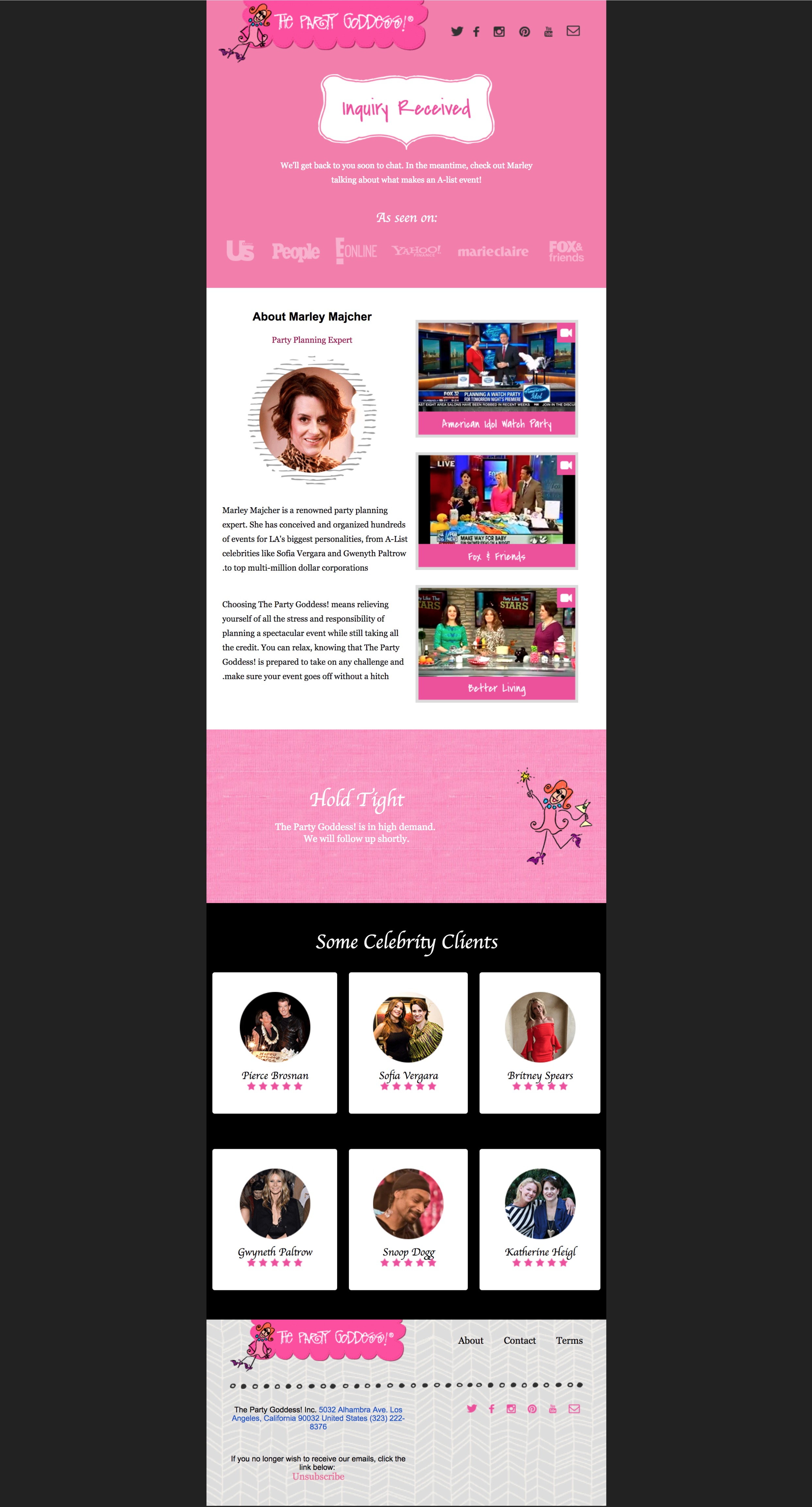
Consumer psychology fuels this design. It is sent after clients enquire with The Party Goddess. It is designed to provide them more information about our services, and prepare them for the sales pitch they are about to receive. In our testing, customer conversion rate has increased by 23% since adopting this email. We find customers engage with the videos's and polling of our audience suggests this increases our authority in the area. Long story short, this email has driven outcomes, and that's the true measure of a truely great piece of marketing collateral.
Thank you for your enquiry
Josh Strawczynski
-
This newsletter provides our readers with technical papers and updates that are relevant to them. We dynamically send out content to readers that match their buyer profiles, for example white paper for technicians or pricing updates for procurement. The theme is on reinforcing our tag lines of ‘Ingenious Transformation’ and ‘Source Advantage’.
Industry Update: Qenos news
qenosexsource
-

The Educator Series is for educators, parents, advocates, and anyone who are blind, low vision, visually impaired, or with multiple disabilities - who are interested in professional development opportunities, curriculum ideas, adaptive teaching resources, and other practical ideas for use in the classroom or at home
A Glimpse of Educator Series for the Blind and Deafblind
tuongchau.cai
-

This design is for a local hot yoga studio. It incorporates banners for all the classes and a schedule
Enso Yoga Newsletter Design
suska
-
A fully responsive, personalised call for entries to the New Zealand Direct Marketing Awards 2017. Part of a suit of call for entry and reminder emails employing gifs, css animation and video in the header to grab attention. I used CSS to cycle through the HUE of this png in the header to create a very smooth colour transition. To view the email online > > http://view.exacttarget.com/?qs=aaa72f22268445076113a67a08ca64d069d017028c0d2ed3c8f491df735d1e1ef225b242139da934e318e003948f8697f5b515a609ab39f9ce18553980c69623fbd6c9971083a962f2f2460ce236ee35
NZDM Awards 2017
justin biddle
-

My newsletter is easy and fun to read, contains informational links to other resources, and promotes my Laughter Wellness presentations without being heavy-handed.
The Smile Side of Life Holiday Newsletter
Westwind16
-
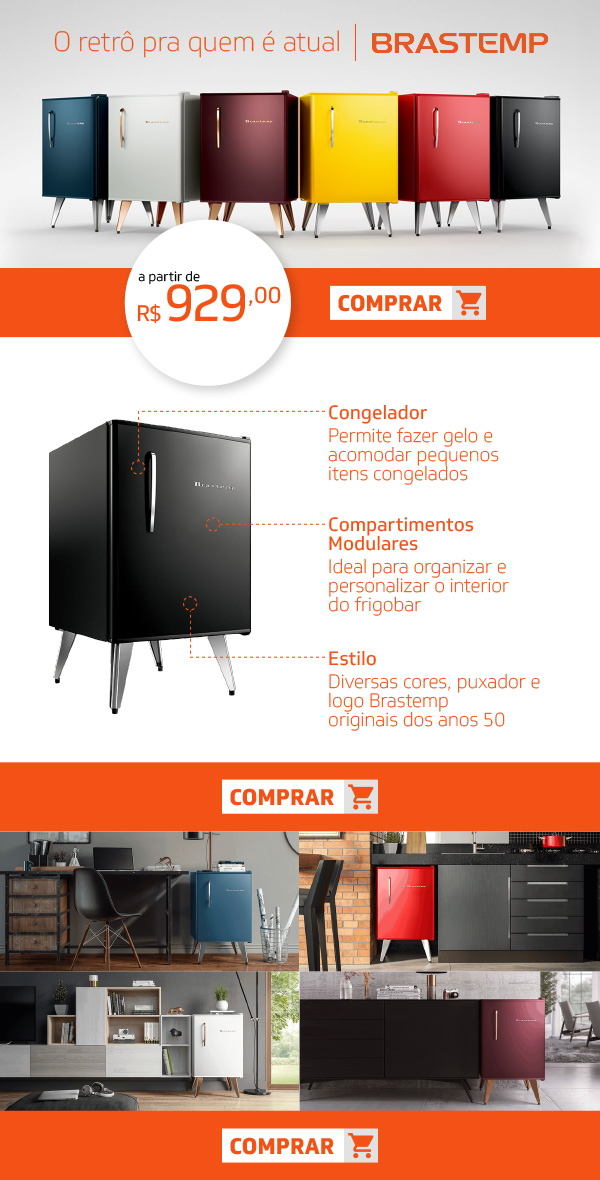
With the aim of realizing the sale, this email marketing is simple and focused on the sales pitch.
Frigobar Retro Brastemp
Frederico Berghan
-

We didn't have any budgets or fancy packaging to offer customers bundles, so we programmed buy buttons with products preloaded and discount applied through it. We also used soft imagery to get the essence of our products across and the language was conversational, with the British people in mind who don't mind reading.
Pawwsome Christmas Discount Bundles Enclosed
nubeals
-

Great Giveaways for customer using personalized products with logo, message & more
Great Giveaways mailer
rkoparde
-

Personally I think that minimal, punchy mailers make the best impact. Our Florist Business weekly mailer attracts the attention of thousands of subscribers, turning over high open and click rates due to its content and chic design.
Florist Business Magazine
emilymaltby
-
I'm very proud of the gif I created for this email that shows what are goals are for our equity fund raise. I created the gif using Canva. Email link: http://mailchi.mp/epichybridtraining/an-epic-opportunity-to-invest-in-the-future-of-fitness
An EPIC opportunity to invest in the future of fitness
paulbuijs
-

This is an dynamic monthly newsletter designed for KelbyOne. The email content would change based on subscriber location and member status. The email uses background images and is completely mobile responsive. The email also displays correctly in all major email clients, Gmail, Yahoo, AOL, Outlook, Hotmail, Apple Mail and their mobile apps both on Android and iOS.
KelbyOne Newsletter
Adblinz21
-
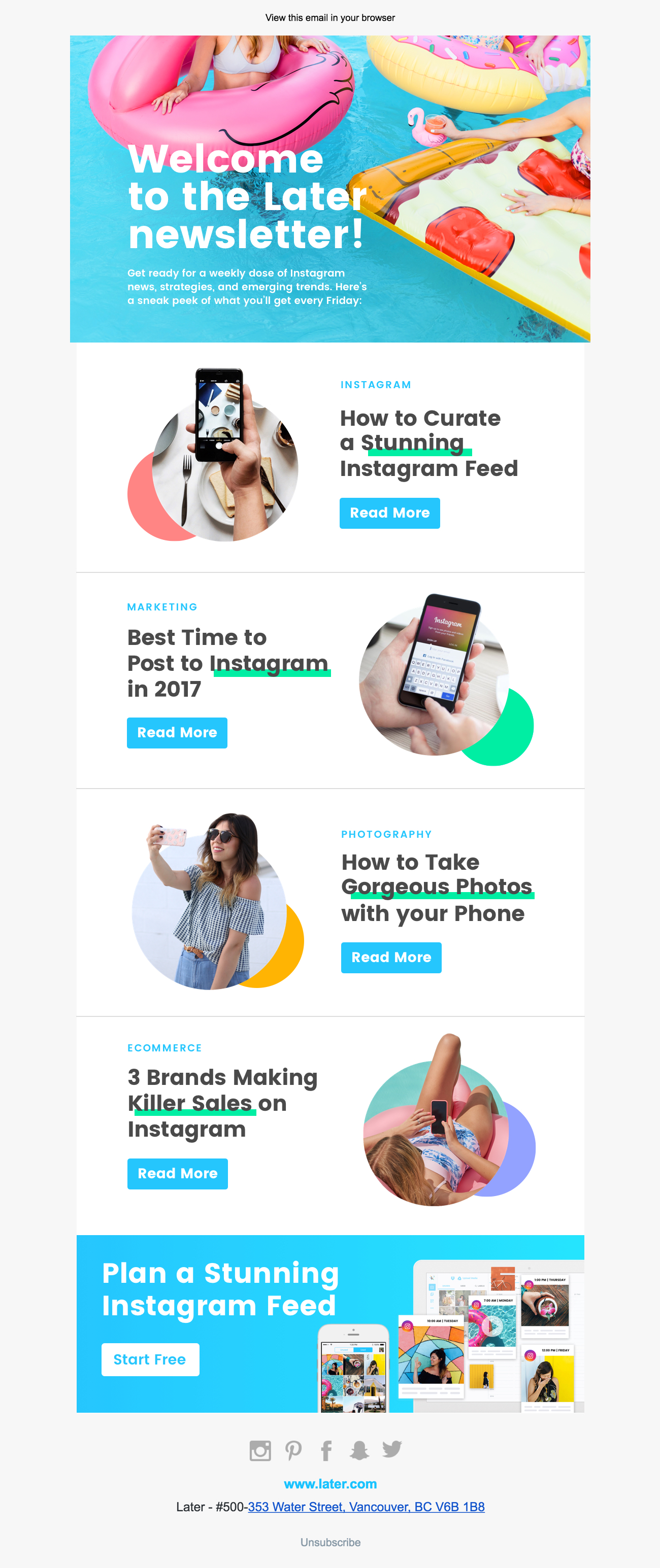
Welcome to the Later Newsletter! When a viewer signs up for our email newsletter via our blog or social media, they receive this email as a one-view resource of all of Later's social media knowledge. We found that it was successful as it gives a new viewer an introduction to the amazing social media marketing content we feature every week on our blog. The design pops, catches the eye and most importantly – on brand to Later's product and relatable to our social savvy and lifestyle oriented audiences. Image size and ratio allows the email to works brilliantly on both desktop and mobile as well.
Welcome to the Later Newsletter!
ChinFromLater
-
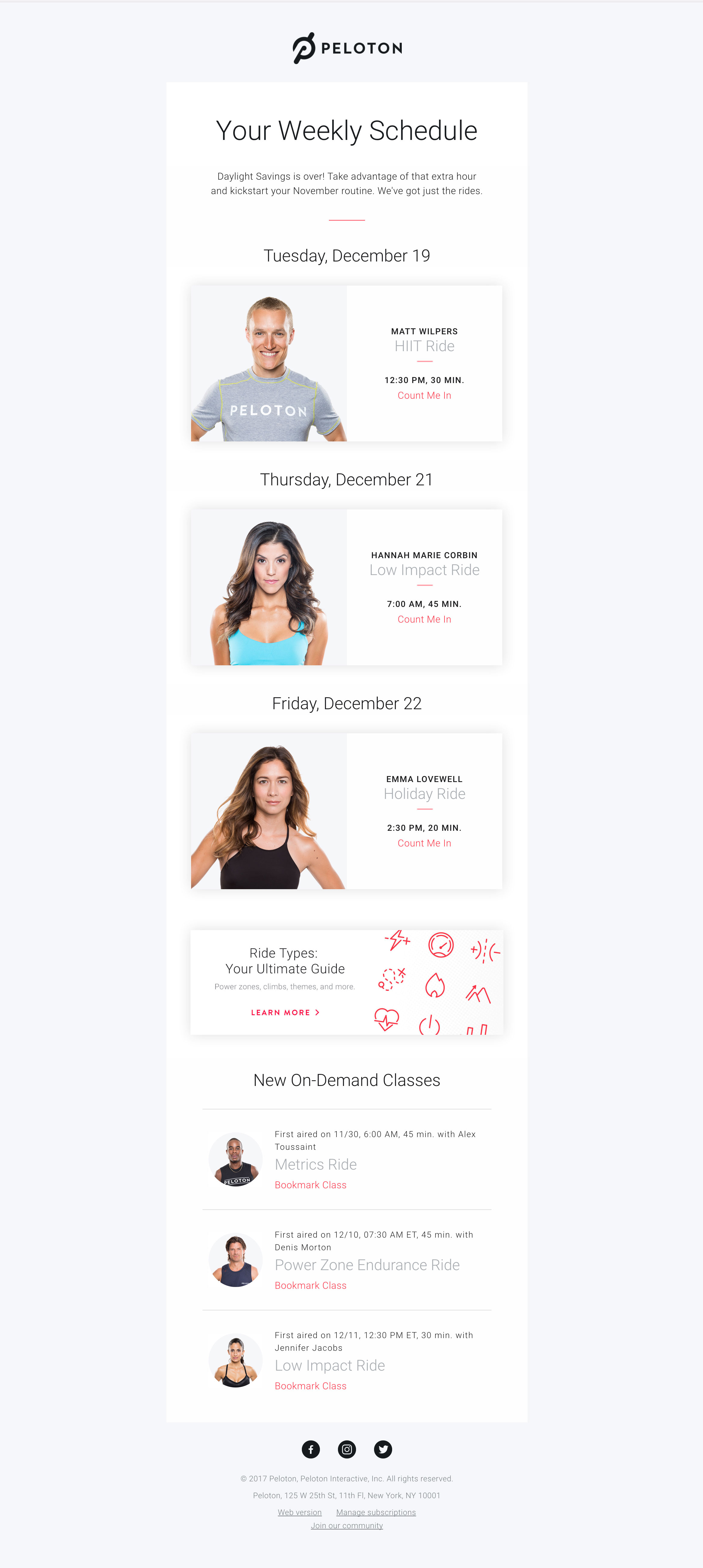
Peloton is a fitness company focused on bringing the best workout experience through immersive live studio classes and state-of-the-art equipment. We designed a fully responsive email detailing upcoming classes that riders may like based on their workout preferences. Every week this email sends upcoming ride info personalized to each member’s tastes, motivating them to plan their week ahead. Ride types and instructors dynamically update every week.
Peloton Weekly Schedule
mgc87
-
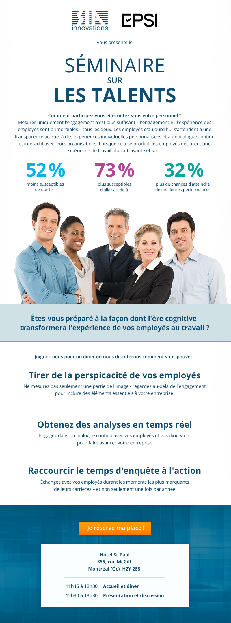
We believe this landing page contains all the crucial information without being daunting which makes it the best email. The main information is in the head of the email. Important statistics are provided and written in bold to catch customers interest, and allow them to skim through quickly and know the subject of the email. The "save my spot" button is in a bright color to attract attention.
SIA_Talent_seminar_nl
pertinence media

